Color
Color is an important element in Web page development. A poor choice of color may ruin the whole Web page's design. The text color must contrast well with the background color. Never put light-colored text on a light background or put dark-colored text on a dark background. Otherwise, the user would not be able to read the text.
Another issue is the color for links. It is important to set the value for the links to a value that is suitable for the background color. There are three different values for the links: unvisited, visited, and active links. The default value for each link parameter in Netscape Communicator is dark blue for an unvisited link, purple for a visited link, and red for an active link. It is important for the users to distinguish between links so that they know which links they have already visited and which ones they have not.
Text
There are several attributes that we can be added to text: bold, italic, underline, and blink. Among the four, bold is the most commonly used in that it puts emphasis on the text and therefore, makes the text stand out. Sometimes, blink is also used to make the text stand out. This is not recommended by most Web developers unless the blinking text is less than two words (Flanders and Willis, 1996). This is because a blinking text will become very difficult to read as it gets longer. However, blinking is often used to indicate an error or warning.
Font and font size is also very important to the design. Font and font size are not required in the Hypertext Markup Language (HTML) document. The default values, values that the user specified in his Web browser, will be used to display the page. It is better for the Web developer to set the values instead of using the default values. To set the font and font size value, one can use the tag in HTML. However, the font size value is specified by adding and subtracting to the default size that the user specified in the browser. To avoid an arbitrary calculation of font size, a Cascading Style Sheet (CSS) can help.
Style
First and second-generation page. According to Siegel, a first generation page has a linear structure (Siegel, 1997). A typical first generation page displays a sequence of text and images from top-to-bottom, left-to-right separated with returns and other data-stream separators like bullets and horizontal rules. Most first generation pages had lines of text going from one side of a page to the other side of a page that ran on for pages. They were separated by meaningless blank lines. A second-generation page is similar to a first generation page but have additional icons, images, buttons and banners. They use a top-down, bullet-list, and menu-driven model to present a hierarchy of information.
Third generation page. A third generation page is a combination of typographic and visual layout principles with a creative design. Third generation pages use a visual theme to entice and guide. They tend to make a site feel familiar and easy to navigate with quality content and high production values.
Page Size
The most efficient designs for general Internet audiences tend to use careful layouts of text and links with relatively small graphics. These pages load quickly. Most experts suggest that the graphics used for a page should not exceed 30K for easy loading (MicroVision Development, Inc, 1997).
Most human interface researchers recommend that the length of a page should be less than two screen-loads, which feature local navigational links at both the beginning and end of the page layout (Siegel, 1997). However, long Web pages are often easier for users to print and to download, since teh users do not need to print or download multiple files to collect information on a topic.
Pages with lots of text should always be designed to print properly. If the page is too wide several words of text from each line along the right margin of the page maybe lost when printing. Table 1 shows the maximum width and height for a page layout (Siegel, 1997).
Dimensions of a Page
| Dimensions | Print Well | Screen Usage |
| Maximum Width | 535 pixels | 595 pixels |
| Maximum Height (one screen) | 295 pixels | 295 pixels |
Table 1. Relationships between the size of a printable page and actual display page.
Graphics
The Graphic Interchange Format (GIF) was adopted in the early 1990s by the original designers of the World Wide Web for its efficiency and widespread familiarity. Today the majority of graphics on the Web are in GIF format. GIF supports 256 or fewer colors, transparent color, interlaced GIF graphics, animation, and lossless compression. Lossless compression happens when the pixels are compressed and decompressed without any lost of pixels, so the image remains the same.
Another graphics file format commonly used on the Web is the Joint Photographic Experts Group (JPEG) compression scheme to minimize graphics file size. The developer can choose the degree of compression he wishes to apply to an image in JPEG format, but in doing so the user also is choosing the image quality. JPEG supports full-color (24 bit), interlacing, and compression.
In general, GIF files are good for diagrammatic images; images that are used as icons and animations. GIF is also suitable if transparency and animation are necessary for the image. JPEG files give good results for large, complex images like most photographs and medical images. Table 2 shows the comparison between GIF and JPEG format.
GIF vs. JPEG
| Functionality | GIF files | JPEG files |
| Color bits | 8 bits (256 colors) | 24 bits |
| Transparent color | Yes | No |
| Animation | Yes | No |
| Interlacing | Yes | Yes |
| Compression | No | Yes |
Table 2. Functionality of GIF files and JPEG files
Consistency
Establish a layout grid and a style for handling text and graphics, then stick with it to build a consistent rhythm and unity across all the pages of a site. Repetition gives a site a consistent graphic identity that reinforces a distinct sense of place, and that makes a site more memorable. A consistent approach to layout and navigation allows readers to quickly adapt to the design, and to confidently predict the location of information and navigation controls across the pages of the site. Figure 1 shows how consistency can be established by using the same color for a section of the site.
Example of Consistent Layout
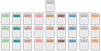
Figure 1. Consistent layout for a site.
If a graphical theme was chosen, use it throughout the site. For example, Metadesign's (http://www.metadesign.com) home page banner (Figure 2) sets the graphic theme for the site, and introduces distinctive typography and a set of navigation icons.
MetaDesign's Main Banner

Figure 2. Banner used in Metadesign's front page.
Figure 3 shows a banner at the top of an interior page in Metadesign's site. Note how the typography and icon theme is carried through to all interior banners. There is no confusion about whose site the users are navigating through.
MetaDesign Sub-Page's Banner
Figure 3. Banner located on the top of each sub-page.
 |
 |
 |