
Figure: The checkboxes control which event types are displayed in the two panels.
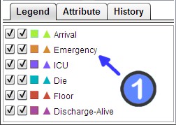
The bottom of the Control Panel contains three tabs. The Legend tab controls the display options for event types. Users can specify which event types to display, rename them, and specify the color-coding for each event type.
The two columns of checkboxes allow users to select whether the event type is shown in the Overview Panel and Timeline Panel, respectively. By default, LifeFlow displays all event types in both panels. The checkboxes allow the user to show/hide specific event type. To show an event type in the Overview Panel, check the leftmost checkbox. To hide an event type in the Overview Panel, uncheck the leftmost checkbox. Similarly, use the second column of checkboxes to control the display of event types in the Timeline Panel.
Figure: The checkboxes control which event types are displayed in the two panels.
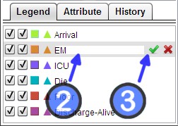
When working with complex sets of data and information, it is very important to establish consistent naming conventions. However, in some cases, the source data may not have meaningful names. To address these issues, LifeFlow allows users to rename, or annotate, event types. To accomplish this:
Users may change the color of an event type - for example, to better highlight that event type in the LifeFlow visualization. To do this:

Figure: Choosing color
The order of event types in the legend panel also controls the visualization in two ways.
In the LifeFlow Overview Panel, records are merged into groups, and the events are visualized as vertical bars in the specified colors. The labels of the Y -axis indicate the number of records within the groups. The labels of the X-axis indicate the elapsed time corresponding to the records in the groups. Users can explore the visualization by zooming, scrolling, and modifying how data is displayed in scale and time units.
The vertical and horizontal scrollbars enable users to zoom in to an interesting portion of the dataset. The scale can be specified by the users with the top control by typing a number in the text field, and selecting appropriate units from the pull-down menu.
Users can select records by clicking on an individual record, or a group of records, in either the Overview Panel or the Timeline Panel.
After some records are selected, users can choose to remove the selection or keep only the selection and remove the rest from the buttons in the Control Tab of the Control Panel.
The Overview Panel enables users to explore the elapsed time between two events, when the mouse pointer hovers between two vertical bars.
Beside the distribution, LifeFlow displays statistics about the distribution as tooltip showing in the Control Panel. The statistics calculated are mean, median, and standard deviation (SD).
So, for example, LifeFlow user might discover that for a selected subset of patients, the time between the event ICU and Floor has a mean of 4 days 1:21:40, a median of 3 days 2:59:00, and a standard deviation of 3 days 6:35:23.
Right-click brings up a menu which allows users to further explore the data distribution:
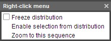
Figure: The right-click menu.
Freezing the distribution marks the distribution on the display until the users unfreeze it, which is done by unchecking the freeze option in the same menu. After freezing, the mouse cursor does not necessarily have to stay in the portion between two bars. The users can freeze several distributions which they are interested in.
This feature is useful when the users want to select a subset of the records with some constraints related to the distribution. An example to apply the feature is to select the records with the elapse time between event Admission and event ICU no longer than 2 days.


LifeFlow supports filtering the records by event count and sub-sequence. The Filtering tab can be reached from the Control tab by clicking the tabs All -> Filter.
When users click on "Filter" button, only records that pass the specified filters are selected. Users then can use the buttons "Remove them" and "Remove others" to remove or keep the selected records.

Figure: Use filter feature to select records with 2 or more ICU.
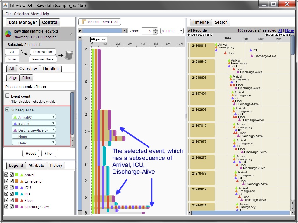
Figure: User filter feature to select records with the subsequence Arrival, ICU, Discharge-Alive.
To facilitate the analysis focusing on an important event, LifeFlow supports the alignment of records by type of event. The alignment feature enables users to explore patterns in the sequence of events which occur before and after a specific type of event. Using the sample data to illustrate this concept, LifeFlow allows the user to visualize events occurring before, and after, admission to the ICU. In this scenario, admission to the ICU can be thought of as the baseline for exploring patterns in the patient records.
In the Align tab (Control -> All -> Align), the users can align the records by one occurrence, or all occurrences, of the specified event. When the users align by all occurrences, records with multiple occurrences of the specified event are shown multiple times. Note that the records are implicitly filtered out, or excluded from display, if the record does not contain the specified type of event. For example, you might wish to explore records for patients having at least two admissions to the ICU. In this scenario, LifeFlow filters the patient records to show ONLY those patients with at least two ICU events, and shows patterns of events both BEFORE and AFTER the second ICU event.
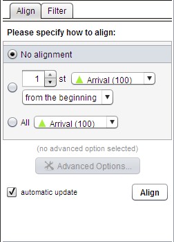
Figure: Align tab.
LifeFlow provides the following Alignment options: No alignment, align by one occurrence, and align by all occurrences.
By default, the LifeFlow Overview and Timeline panels display all events with no alignment.

Figure: Default setting, no alignment.
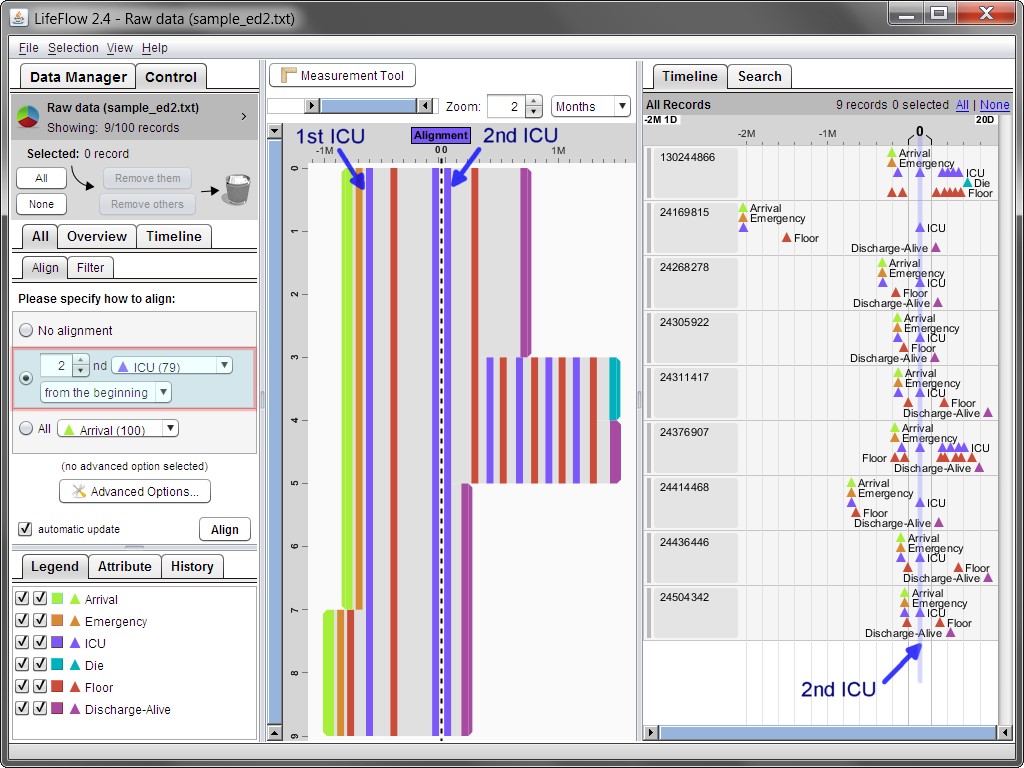
Figure: Aligning the records by the 2 nd ICU event. Note that the records which have less than 2 ICU events are implicitly filtered out.
For example, you might wish to explore patterns for all records with ICU event. Since that each record can have multiple ICU events, say n ICU events. Aligning by all occurrences duplicates multiple rows n times in the visualization and align the rows by different ICU event.