Designing Information-Abundant Websites:
Issues and Recommendations

Ben Shneiderman Revised: February 26, 1997
Human-Computer Interaction Laboratory,
Department of Computer Science & Institute for Systems Research

University of Maryland
College Park, MD 20742
ben@cs.umd.edu

To Appear: International Journal of Human-Computer Studies (1997)
Special Issue on Human-Computer Interaction & the World Wide Web

Gradually I began to feel that we were growing something almost organic in a new kind of reality, in cyberspace, growing it out of information . . . a pulsing tree of data that I loved to climb around in, scanning for new growth.

Mickey Hart, Drumming at the Edge of Magic: A Journey into the Spirit of Percussion, 1990

Look at every path closely and deliberately.
Try it as many times as you think necessary.
Then ask yourself, and yourself alone, one question...
Does this path have a heart?
If it does, the path is good; if it doesn't it is of no use.

Carlos Castaneda The Teachings of Don Juan

Abstract: The abundance of information on the World Wide Web has thrilled some, but frightened others. Improved website design may increase users' successful experiences and positive attitudes.This review of design issues identifies genres of websites, goals of designers, communities of users, and a spectrum of tasks. Then an Objects/Actions Interface Model is offered as a way to think about designing and evaluating websites. Finally, search and navigation improvements are described to bring consistency, comprehensibility, and user control.

Keywords: website design, World Wide Web, user interfaces, human-computer interaction, search, navigation, query previews

Note: This article is extracted and adapted from the forthcoming Third edition of Designing the User Interface: Strategies for Effective Human- Computer Interaction, Reading, MA: Addison Wesley Longman Publishers, Copyright 1998.

1 Introduction

The deluge of Web pages has generated dystopian commentaries on the tragedy of the flood of information. It has also produced utopian visions of harnessing the same flood for constructive purposes. Within this ocean of information there are also lifeboat Web pages with design principles, but often the style parallels the early user interface writings in the 1970s. The well-intentioned Noahs, who write from personal experience as website designers, often draw their wisdom from specific projects, making their advice incomplete or lacking in generalizability. Their experience is valuable but the paucity of empirical data to validate or sharpen insight means that some guidelines are misleading. As scientific evidence accumulates, foundational cognitive and perceptual theories will structure the discussion and guide designers in novel situations.

It will take a decade until sufficient experience, experimentation, and hypothesis testing clarify design issues, so we should be grateful for the early and daring attempts to offer guidance. One of the better guides (Lynch, 1995) offers this advice:

It is helpful but does not tell designers what to do or how to evaluate the efficacy of what they have done. Lynch goes on to give constructive advice about not being too broad or too deep, finding the proper length of pages, using gridded layouts, and the challenge of "balancing the power of hypermedia Internet linkages against the new ability to imbed graphics and motion media within networked WWW pages." He has sorted out the issues better than most but still leaves designers with many uncertainties.

Jakob Nielsen (1995d) goes a step further by reporting on his case study of designing a website for Sun Microsystems to showcase their products and company. His usability testing approach revealed more specific problems and the website discusses nine different versions of the home page. The subjective data reveals problems and highlights key principles, for example "Users consistently praised screens that provided overviews of large information spaces." Empirical testing should be able to reveal what kinds of overviews are most effective and whether performance times, error rates, or retention are enhanced by certain overviews.

Until the empirical data and experience from practical cases arrive, we can use knowledge from other user interface design domains such as menu systems and hypertext (Koved & Shneiderman, 1986; Shneiderman & Kearsley, 1989; Norman, 1991; Rivlin et al, 1994; Isakowitz et al., 1995; Nielsen, 1995a). Designers may be helped by the theoretical framework of the Objects/Actions Interface Model (Shneiderman, 1997) and the results from information retrieval research (Belkin & Croft, 1992; Marchionini, 1995).

Refinement of the Web is more than a technical challenge or commercial goal. As governments offer information plus services online and educational institutions increase their dependence on the Web, effective designs will be essential. Universal access is an important economic and policy issue, but it is also a fundamental design issue. Designers must accommodate small and large displays, monochrome and color, slow and fast transmission, and various browsers that may not support desired features. The pressure for lowest-common-denominator design is often outweighed by the desire to assume larger displays, use more detailed and more numerous graphics, support Java applets, and employ newer browser features. Fortunately, balanced approaches that enable users to indicate their environment and preferences are possible. Several versions of the interface can be developed for relatively small incremental costs.

Providing text-only versions for users with small displays and low-bandwidth access is likely to be strongly recommended for many years to come. Users with low-cost devices, users in developing countries with poor communication infrastructure, users wanting low-bandwidth wireless access, users with small personal display devices, and users with handicaps constitute a large proportion of the potential users.

Accommodating diverse users should be a strong concern for most designers since it enlarges the market for commercial applications and provides democratic access to government services. Access by way of telephone or voice input/output devices will serve handicapped users and enlarge access. Access to websites might also come from wristwatch projection displays, wallet-sized pocket PCs, or personal video devices mounted on eyeglasses.

This paper presents an analysis of genres, goals, users and tasks, followed by a model to guide designers, and recommendations for improving search and navigation. My hope is that it will encourage enough research to replace these analyses with rigorous empirical data plus refined theories and validated guidelines.

2 Genres and Goals for Designers

As in any media, criteria for quality vary with the genre and authors' goals. A dizzying diversity of websites are emerging from the creative efforts of bold designers who merge old forms to create new information resources, communication media, business services, and entertainment experiences. Websites can range from a one-page personal biography (Figure 1) to millions of pages in the Library of Congress's American Memory project organized by the National Digital Library program (Figure 2).
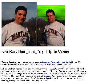
Figure 1: One page personal biography of Ara Kotchian, a student at the University of Maryland (used with permission).
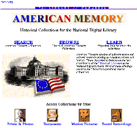
Figure 2: American Memory home page from the Library of Congress, offering more than 5 000 000 images, texts, videos, ect., by the year 2000.

Common high-level goals include visual appeal, comprehensibility, utility, efficacy, and navigability, but finer discriminations come into play if we examine the categories of websites.

A primary way of categorizing websites is by the originator's identity: individual, group, university, corporation, nonprofit organization, or government agency. The originator's identity gives a quick indication of what the likely goals are and what contents to expect: corporations have products to sell, museums have archives to promote, and government agencies have services to offer.

A second way of categorizing websites is the number of Web pages or amount of information that is accessible (Table 1): one-page bios and project summaries are small, organization overviews for internal and external use are medium, and airline schedules and the phone directory are large.

Table 1: Website genres with approximate sizes and examples

Number of Web pages Example genres
1-10 Personal bio
Project summary
Restaurant Review
Course outline
5-50 Scientific paper
Conference program
Photo portfolio/exhibit
Organization overview
50-500Book or manual
Corporate annual report
City guide/tour
Product catalog/advertisement
500-50,000 Photo library
Technical reports
Museum tour
Music/film databases
5,000-50,000 University guide Newspaper/magazine
50,000 - 500,000 Phone directory Airline schedule
>500,000 Congressional digest Journal abstracts
> 5,000,000Library of Congress NASA archives

Taxonomies of websites from many perspectives are likely. The Yahoo home page, with its thematic categories, provides a starting point, and it changes as the Web grows (Figure 3).
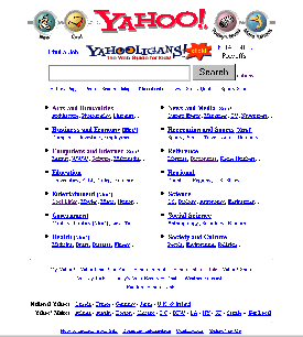
Figure 3: Yahoo index page showing a 14-item thematic categorization with 51 second-level links, and more than 300 other links.

A third way of categorizing websites is by goals of the originators, as interpreted by the designers (Table 2).

Table 2: Website goals tied to typical organizations

Sell products: publishers, airlines, department stores

Advertise products: NBC, Ford, IBM, Microsoft, Sony

Inform and announce: universities, museums, cities

Provide access : libraries, newspapers, scientific organizations

Offer services: governments, public utilities

Create discussions: public interest groups, magazines

Nurture communities: political groups, professional associations

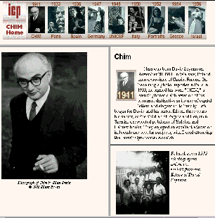
These may be simple information presentation in a self-publishing style where quality is uncontrolled and structure may be chaotic. Information may be an index to other websites or it may be original material. Carefully polished individual life histories (Figure 4) and impressive organizational annual reports are becoming common as expectations and designer experience increases.

Figure 4: Life history of the photographer David Seymour ("Chim") with a time line showing eight segments of his work. Presented by the International Center of Photography in New York, NY.

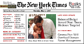
As commercial usage increases, elegant product catalogs, eye-catching advertisements, and lively newsletters will become the norm. Commercial and scientific publishers will join newspapers (Figure 5) and magazines in providing access to information while exploring the opportunities for feedback to editors, discussions with authors, and reader interest groups.

Figure 5: New York Times on-line, creating a condensed page layout to fit the typical home user.

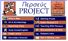
Digital libraries of many varieties are appearing (Figure6), but full recognition of their distinct benefits and design features is emerging more slowly. Entertainment websites are growing as fast as the audience gets online.

Figure 6: Perseus digital library, contains ancient Greek texts in original and English forms with maps, photos, architectural plans, vases, coins, etc., for students and researchers.

A fourth way of categorizing websites is by measures of success. For individuals, the measure of success for an online resume may be getting a job or making a friend. For many corporate websites the publicity is measured in number of visits which may be millions per day, independent of whether users benefit. For others, the value is directly in promoting sales of other products such as movies, books, events, or automobiles. Finally, for access providers who earn fees from hourly usage charges, success is measured by the thousands of hours of usage per week. Other measures include diversity of access as defined by the number of users or their countries of origin, or whether the users came from university, military, or commercial domains.

3 Users and their Tasks

As in any user interface design process, we begin by asking: Who are the users? and What are the tasks? Even when broad communities are anticipated, there are usually implicit assumptions about users being able to see and read English. Richer assumptions about users' age group or educational background should be made explicit in order to guide designers. Just as automobile advertisements are directed to college-age males, young couples, or mature female professionals, websites are more effective when directed to specific audience niches. Gender, age, economic status, ethnic origin, educational background, and language are primary audience attributes. Physical disabilities such as poor vision, hearing, or muscle control call for special designs.

Specific knowledge of science, history, medicine, or other disciplines will influence design. A website for physicians treating lung cancer will differ in content, terminology, writing style, and depth from a website for patients. Communities of users might be museum visitors, students, teachers, researchers, journalists, or professionals. Their motives may range from fact-finding to browsing, professional to casual, or serious to playful.

Knowledge of computers or websites can also influence design, but more important is the distinction between first-time, intermittent and frequent users of a website. First-time users need an overview to understand the range of services and to know what is not available, plus buttons to select actions. Intermittent users need an orderly structure, familiar landmarks, reversibility, and safety during exploration. Frequent users demand shortcuts or macros to speed repeated tasks, compact in-depth information, and extensive services to satisfy their varied needs (Kellogg and Richards, 1995).

Since many applications focus on educational services, appropriate designs should accommodate teachers and students from elementary through university levels. Adult learners and elderly explorers may also get special services or treatments.

Evidence from a survey of 13,000 Web users conducted by Georgia Tech (Pitkow and Kehoe, 1996) shows that the average age of respondents is 35, the median income is above $50,000, and 80% are male. A remarkable 72% are daily users, and are likely to have a professional connection to computing or education. These profiles have shifted from previous surveys and will probably continue moving towards a closer match with the population at large. Of course, the survey was voluntary and drew upon the Web community, so the sample is biased, but still thought provoking.

Identifying the users' tasks also guides designers in shaping a website. Tasks can range from specific fact-finding to more unstructured open-ended browsing of known databases and exploration of the availability of information on a topic:

Specific fact-finding (Known item search)
Find the Library of Congress call number of Future Shock
Find the phone number of Bill Clinton
Find the highest resolution LANDSAT image of College Park at noon on Dec. 13, 1997

Extended fact-finding
What other books are by the author of Jurassic Park?
What kinds of music is Sony publishing?
Which satellites took images of the Persian Gulf War?

Open-ended browsing
Does the Mathew Brady Civil War photo collection show the role of women?
Is there new work on voice recognition in Japan?
Is there a relationship between carbon monoxide levels and desertification?

Exploration of availability
What genealogy information is at the National Archives?
What information is there on the Grateful Dead band members?
Can NASA datasets show acid rain damage to soy crops?

The great gift of the Web is its support for all these possibilities. Specific fact finding is the more traditional application of computerized databases with query languages like SQL, but the Web has dramatically increased the capability of users to browse and explore. It is an equal challenge to support users seeking specific facts and to help users with poorly formed information needs who are just browsing.

A planning document for a website might indicate that the primary audience is North American high school environmental-science teachers and their students, with secondary audiences consisting of other teachers and students, journalists, environmental activists, corporate lobbyists, policy analysts, and amateur scientists. The tasks might be identified as providing access to selected LANDSAT images of North America clustered by and annotated with agricultural, ecological, geological, and meteorological features. Primary access might be by a hierarchical thesaurus of keywords about the features (e.g. floods, hurricanes, volcanoes) from the four topics. Secondary access might be geographical with indexes by state, county, and city, plus selection by pointing at a map. Tertiary access might be by specifying latitude and longitude.

This focus on tasks leads to a model (Section 4) for designers that emphasizes objects and action in the task domain and their presentation in an interface. It also suggests possible improvements in search and navigation (Section 5).

4 Objects/Actions Interface Model for Website Design

Complex problems are often resolved by hierarchical decomposition into manageable units. For example, health problems can be discussed in terms of objects and actions in the human body. The objects are muscular, skeletal, circulatory, and other systems, which in turn might be described by organs, tissues, and cells. Similarly, the actions include digestive processes that can be decomposed into chewing, swallowing, and so on, which in turn might be described by muscle movements or chemical processes.
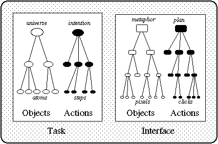
The Objects/Actions Interface (OAI) Model (Shneiderman, 1997) follows a hierarchical decomposition of objects and actions in the task and interface domains (Figure 7). It can be a helpful guide to website designers in decomposing a complex information problem and fashioning a comprehensible and effective website.

OBJECTS/ACTIONS INTERFACE MODEL
[figure
Figure 7: Objects/Actions Interface Model as a basis for web site design. The hierarchically decomposed task objects and actions become represented by interface objects and actions. Designers must choose the most effective metaphors and create visual representations that allow users to decompose their action plan into a series of detailed clicks or keystrokes.

The task of information seeking is complex, but it can be described by hierarchies of task objects and actions related to the information. Then the designer can represent the task objects and actions with hierarchies of interface objects and actions. For example, a music library might be presented as a set of objects such as collections, which have shelves, and then songs. Users may perform actions such as entering a collection, searching the index to a shelf, and reading the score for a song. The interface for the music library could have hierarchies of menus or metaphorical graphical objects accompanied by graphical representations of the actions, such as a magnifying glass for a search. Briefly, the Objects/Actions Interface Model encourages designers of websites to focus on four components:


Task
Structured information objects (e.g. hierarchies, networks)
Information actions (e.g. searching, linking)
Interface
Metaphors for information objects (e.g. bookshelf, encyclopedia)
Handles (affordances) for actions (e.g. querying, zooming)

The boundaries are not always clear, but this decomposition into components may be helpful in organizing and evaluating websites. This section describes the OAI Model, gives examples of decompositions of object and actions, and presents a case study with the Library of Congress.

4.1 Design of task objects and actions

Information seekers pursue objects relevant to their tasks and apply task action steps to achieve their intention. While many would describe a book as a sequence of chapters and a library as a hierarchy organized by the Dewey Decimal System, books also have book jackets, tables of contents, indexes, etc. and libraries have magazines, videotapes, special collections, manuscripts, etc. It would be still harder to characterize the structure of university catalogs, corporate annual reports, photo archives, or newspapers because they have still less standardized structures and more diverse access paths.

In planning a website to present complex information structures, it helps to have a clear definition of the atomic objects and then the aggregates. Atoms can be a birthdate, name, job title, biography, resume, or technical report. With image data, an atomic object might be a color swatch, icon, corporate logo, portrait photo, or music video.

Information atoms can be combined in many ways to form aggregates such as a page in a newspaper, a city guidebook, or an annotated musical score. Clear definitions are helpful to coordinate among designers and inform users about the intended levels of abstraction within each project. Information aggregates are further combined into collections and libraries that form the universe of concern relevant to a given set of tasks. Strategies for aggregating information are numerous. Here is a starting list of possibilities:

Short unstructured lists
City guide highlights, organizational divisions, current projects (and this list)
Linear structures
Calendar of events, alphabetic list, human body slice images from head to toe,

orbital swath
Arrays or tables
Departure city-arrival city-departure date
Hierarchies, trees
Continent - country - city (e.g. Africa, Nigeria, Lagos)
Concepts (e.g. sciences - physics - semiconductors - gallium arsenide)
Multi-trees, faceted retrieval
Photos indexed by date, photographer, location, topic, film type
Networks
Journal citations, genealogies, World Wide Web

These aggregates can be used to describe structured information objects, such as an encyclopedia, which is usually seen as a linear alphabetical list of articles, with a linear index of terms pointing to pages. Articles may have a hierarchical structure of sections and subsections, and cross references among articles create a network.
Some information objects, such as a book table of contents, have a dual role since they may be read to understand the topic itself or browsed to gain access to a chapter. In the latter role they represent the actions for navigation in a book.
The information actions enable users to follow paths through the information. Most information resources can be scanned linearly from start to finish, but their size often dictates the need for shortcuts to relevant information. Atomic information actions include:

- Looking for Hemingway's name in an alphabetical list
- Scanning a list of scientific article titles
- Reading a paragraph
- Following a reference link

Aggregate information actions are composed of atomic actions:

- Browsing an almanac table of contents, jumping to a chapter on sports and scanning for skiing topics
- Locating a scientific term in an alphabetic index and reading articles containing the term
- Using a keyword to search a catalog to gain a list of candidate book titles
- Following cross reference from one legal precedent to another, until no new relevant precedents appear
- Scanning a music catalog to locate classical symphonies by 18th century French composers

These examples and the list in Section 3 create a diverse space of actions. Some are learned from youthful experiences with books or libraries, others are trained skills such as searching for legal precedents or scientific articles. These skills are independent of computer implementation, acquired through meaningful learning, demonstrated with examples, and durable in memory.

4.2 Design of interface objects and actions

Since many users and designers have experience with information objects and actions on paper and other traditional media, designing an appropriate computer interface can be a challenge. Physical attributes such as the length of a book or size of a map, that vanish when the information is concealed behind a screen, need to be made apparent for successful use. So website designers have the burden of representing the desired attributes of traditional media, but also the opportunity of applying the dynamic power of the computer to support the desired information actions. Successful designers can offer users compelling services that go well beyond traditional media, such as multiple indexes, fast string search, history keeping, comparison, and extraction.

Metaphors for interface objects: The metaphoric representation of traditional physical media is a natural starting point: electronic books may have covers, jackets, page turning, bookmarks, position indicators, etc. and electronic libraries may show varied size and color of books on shelves (Pejtersen, 1989). These may be useful starting points, but greater benefits will emerge as website designers find newer metaphors and handles for showing larger information spaces and powerful actions.

Richer environments include libraries with doors, help desk, rooms, collections, and shelves, and the City of Knowledge with gates, streets, buildings, and landmarks. Of course the information superhighway is often presented as a metaphor, but rarely developed as a visual search environment. Metaphors can be appealing, but designers should exercise caution to ensure their utility in presenting high-level concepts, suitability for expressing middle level objects, and efficacy in suggesting pixel-level details (Cotton and Oliver, 1993; McAdams, 1996; Weinman, 1996).

Design of computerized metaphors extends to support tools for the information seeker. Some systems provide maps of information spaces or at least some kind of overview to allow users to grasp the relative size of components and discover what is not in the database. History stacks, bookmarks, help desks, and guides offering tours are common support tools in information environments. Communications tools can be included to allow users to send extracts, ask for assistance from experts, or report findings to colleagues.


Handles for interface actions: The central challenge for many users is to formulate an appropriate action plan based on the visible action handles such as the labels, icons, buttons, or image regions. In an early study of a library catalog command interface, we found that none of the subjects could formulate the six step plan to find all the books by the author of the novel Looking for Mr. Goodbar. A Web interface might provide visible action handles to suggest which plans were possible and how to construct them.

Intermediate-level plans such as author, title, or subject searches are made explicit with buttons, but other plans such as searching by date, language, or publisher could also be made more visible by a form fill-in interface or by widgets attached to the display of a catalog record.
Lower-level actions can be shown as a turned page corner to indicate next page operation, a highlighted term for a link, a magnifying glass to zoom in or open an outline. Other action handles might be a pencil to indicate annotation, a funnel to show sorting, a coal-car to indicate data mining, or filters to show progressive query refinement. Sometimes the action handle is merely a pull-down menu item or a dialog box offering rich possibilities. The ensemble of handles should allow users to compose their action plan conveniently from a series of clicks and keystrokes.

4.3 Case study with the Library of Congress

The OAI Model is still in need of refinement plus validation, but it may already be a useful guide for website designers and evaluators. It offers a way to decompose the many concerns that arise and provides a framework for structured design processes and eventually software tools. It is not a predictive model, but a guide to designers about how to break a large problem into many smaller ones and an aid in recognizing appropriate features to include in a website. In my experience, designers are most likely to focus on the task or interface objects, and the OAI Model has been helpful in bringing out the issues of permissible task actions and visible representations of interface actions.

In the early 1990s, we worked with U. S. Library of Congress staff to develop a touchscreen catalog interface to replace the difficult-to-learn command-line interface. In this project, the design was relatively simple; the task objects were the set of catalog items that contained fields about each item. The task actions were to search the catalog (by author, title, subject, and catalog number), browse the result list, and view detailed catalog items. The interface objects were a search form (with instructions and a single data entry field), result lists, brief catalog items, and detailed catalog items. The interface actions were represented by buttons to select the type of search, to scroll the result lists, and to expand a brief catalog entry into a detailed catalog entry. Additional actions, also represented by buttons, were to start a new search, get help, print, and exit. Even in this simple case, explicit attention to these four domains helped us to simplify the design.

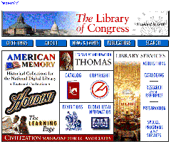
In the more ambitious case of the Library of Congress website, many potential task objects and actions were identified; more than 150 items were proposed for inclusion on the homepage. The policy and many design decisions were made by a participative process involving the Librarian of Congress, an 18-person Policy Committee, four graphic designers, and staff from many divisions. The current design (Figure 12) for the hierarchy of task objects is rich, including the catalog, exhibits, copyright information, Global Legal Information, the THOMAS database of bills before Congress, and the vast American Memory resources, but it does not include the books. The exclusion of books is a surprise to many users, but copyright is usually held by the publishers and there is no plan to make the full text of the books available. Conveying the absence of expected objects or actions is also a design challenge.

For brevity we focus on the American Memory component. It will contain 200 collections whose items may be searchable documents, scanned page images, and digitized photographs, videos, sound, or other media. A collection also has a record that contains its title, dates of coverage, ownership, keywords, etc. Each item may have a name, number, keywords, description. etc. The task actions are rich and controversial. They begin with the actions to browse a list of the collection titles, and search within a collection, and retrieve an item for viewing. However, searching across all collections is difficult to support and is not currently available. Early analysis revealed that collection records might not have dates or geographic references, thereby limiting the ways that the collection list could be ordered and presented. Similarly, at the next level down, the item records may not contain the information to allow searching by date or photographer name, and restricting search to specific fields is not always feasible.

Continuing within the American Memory component, the interface objects and actions were presented explicitly on the homepage (Figure 2). Since many users seek specific types of objects, the primary ones were listed explicitly and made selectable: Prints & Photos, Documents, Motion Pictures, and Sound Recordings. The interface actions were stated simply and are selectable: Search, Browse, and Learn (about using the collections for educational purposes). Within each of the these objects and actions, there were further decompositions based on what was possible and what a detailed needs analysis had revealed as important.

At the lowest level of interface objects were the images and descriptive text fields. At the lowest level of interface actions were the navigation, home page, and feedback buttons.

The modest nature of the OAI Model means that it can lead to varying outcomes, but it would be unreasonable to assume that there is one best organization or decomposition of a website. In dealing with complex resources and services, it offers designers a way to think about solving their problems.

5 Search and Navigation Actions

The dilemma of the Web is the difficulty in finding what you need among the abundant sources of information. Since searching can be a complex task, improved search user interfaces and appropriate consistency across multiple systems will be an important contribution (Smith, Newman and Parks, 1997 [this issue]). The proposed four-phase framework for search is a contribution toward improved search user interfaces. The emergence of information visualization strategies for viewing and manipulating large collections is changing the way many search problems are carried out. For networked environments, query previews reduce the zero-hit problem and facilitate browsing of large information spaces (Doan et al., 1996). Finally, search and navigation are facilitated by effective screen layout and linkage structure that reduces the number of steps to locate an item.

5.1 Four-phase framework for search

Searching textual databases can be confusing for users because of the diverse task situations and numerous interface features. Popular search systems for the World Wide Web (such as Lycos, Opentext, or Alta Vista) and stand-alone search systems usually provide a simple interface inviting users to type in keywords and then providing a relevance-ranked list of 10 to 50 result items. This is appealing in its simplicity, but users are often frustrated as they do not know what the results mean, nor can they control aspects of the search. Evidence from empirical studies shows that users perform better and have higher subjective satisfaction when they can view and control the search (Koenemann and Belkin, 1996).
Furthermore, when using multiple search systems, users find a disturbing variety and inconsistency in features. For example, a search for the string 'user interface' could produce a:

- search on the exact string 'user interface'
- probabilistic search for 'user' and 'interface'
- probabilistic search for 'user' and 'interface' with some weighting if the terms are in close proximity
- boolean search on 'user' AND 'interface'
- boolean search on 'user' OR 'interface'
- error message indicating missing AND/OR operator or other delimiters

In many systems there is little or no indication as to which interpretation was chosen and whether stemming, case matching, stop words, or other transformations were applied. Often, the results are displayed in a relevance ranked manner that is a mystery to many users (and sometimes a proprietary secret).

An analogy to the evolution of automobile user interfaces might clarify the situation. Early competitors offered a profusion of controls and each manufacturer had a distinct design. Some designs, such as having a brake that was far from the gas pedal, were dangerous. Furthermore, if you were accustomed to driving a car with the brake to the left of the gas pedal, and your neighbor's car had the reverse design, it might be risky to trade cars. It took a half century to achieve good design and appropriate consistency in automobiles, but let's hope we can make the transition faster for text-search user interfaces.

To coordinate design practice, a four-phase framework seems possible to satisfy the needs of first-time, intermittent, and frequent users accessing a variety of textual libraries (Shneiderman, Croft, and Byrd, 1997). Finding common ground will be difficult; not finding it will be tragic. While early adopters of technology are willing to push ahead to overcome difficulties, the middle and late adopters will not be so tolerant. The future of search services on the World Wide Web and elsewhere may depend on how well user frustration and confusion are reduced, while enabling them to reliably find what they need in the rapidly surging sea of information.

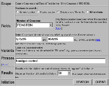
The four-phase framework gives great freedom to designers to offer features in an orderly and consistent manner. The phases are formulation (expressing the search), initiating action (launching the search), review of results (reading messages and outcomes), and refinement (formulating the next step).

1) formulation includes the:
- source: search the appropriate libraries and collections
- fields for limiting the source: structured fields such as year, media, or language, and text fields such as titles or abstracts of documents
-phrases to allow entry of names such as George Washington or Environmental Protection Agency, and concepts such as abortion rights reform or gallium arsenide
-variants.: to allow relaxation of search constraints such as case sensitivity, stemming, partial matches, phonetic variations, abbreviations, or synonyms from a thesaurus.
2) action, which may be performed
- explicitly by a button with consistent label (such as "Search"), location, size, and color.
- implicitly by changes to a parameter of the formulation phase which immediately produces a new set of search results. These dynamic queries, in which users adjust query widgets to produce continuous updates, have proven to be effective and satisfying.
3) review of results in which users
- read explanatory messages
- view textual lists
- manipulate visualizations.
- control of the size of the result set and which fields are displayed
- change sequencing (alphabetical, chronological, relevance ranked,...)
- explore clustering (by attribute value, topics,...)
4) refinement
- meaningful messages guide users in progressive refinement; for example, if the two words in a phrase are not found near each other, then easy selection of individual words or variants should be offered
- changing search parameters should be convenient
- search results and the setting of each parameter can be saved, sent by email, or used as input to other programs, for example visualization or statistical tools.

The four-phase framework can be applied by designers to make the search process more visible, comprehensible, and controllable by users. This is in harmony with movement toward direct manipulation in which the state of the system is made visible and under user control. Novices may not want to see all the components of the four phases initially, but if they are unhappy with the search results, they should be able to view and change them easily. A revised interface for the Library of Congress' THOMAS system (Figure 8), shows how it might be applied to text searching on full-text searching of proposed legislation.

Figure 8: A revised interface for the Library of Congress' THOMAS system, showes how the four-phase framework might be applied to text searching on full-test searching of proposed legislation.

Textual search interfaces are only one approach to finding information on the Web. Visual information seeking is likely to play an increased role as network bandwidth and screen resolution increases, and as designers create effective strategies for presenting comprehensible, predictable, and controllable interfaces. Some hypertext and menu-selection notions can be reengineered to fit the Web context, others will have to be invented specifically for this novel environment.

5.2 Exploration with Information Visualization:

Substantial progress in recent research on information visualization is likely to have a profound effect on commercial systems. Visual overviews of an entire database by starfields (zoom-able scattergram of color points), tree diagrams, treemaps (nested rectangles that show hierarchies), parallel coordinates, network diagrams, and other strategies are making visual browsing and dynamic filtering viable. As users select widgets such as sliders, buttons, and maps, the result list is changed, often within 100 milliseconds, thereby enabling rapid exploration (Ahlberg & Shneiderman, 1994; Shneiderman, 1994; Shneiderman, 1996). The Visual Information Seeking strategy is: Overview first, zoom and filter, then details-on-demand.

Visualizations are also being created to show three-dimensional search environments (Card et al., 1996) and to present text search results (Hemmje et al., 1994; Rao et al., 1995; Wise et al., 1995). Research efforts are being widely applied to visualization of websites, traversal histories, and search results (Tauscher and Greenberg, 1997 [this issue]). While visualizations can be powerful they can also be complex and confusing, but research is improving our understanding of what works and when.

5.3 Query Previews:

For large collections, especially when searching across the Web, search actions can be split into two phases. First, a rapid rough search that previews only the number of items in the result set, and then a query refinement phase that allows users to narrow their search and retrieve the result set (Doan et al., 1996).

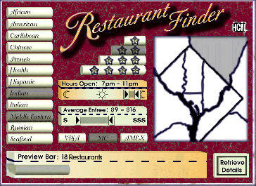
For example, in searching for a restaurant (Figure 9) the query preview screen gives users limited choices with buttons for the type of food (e.g. Chinese, French, Indian), double-boxed range sliders to specify average price of a main course and the times that the restaurant is open, and maybe a map to specify rough regions. As users make selections among these attributes, the query preview bar at the bottom of the screen is updated immediately to indicate the number of items in the result set. Users can quickly discover that there are no cheap French restaurants in downtown New York, or that there are many Caribbean restaurants open after midnight. When the result set is too large, users can restrict their criteria and when the result set is too small they can relax the constraints.

Figure 9: Restuarant finder demonstrates the query preview idea. User can quickly adjust the parameters and see the effect on the size of the preview bar at the bottom. Zero-hit or mega-hit results are immediately visible and users can always be sure that their search will provide an appropriate number of results (Graphic disign by Teresa Cronell) (Doan et al., 1996).

Query previews require database maintainers to provide an updated table of contents that users can download from the server. Then users can perform rapid searches on their client machines. The table of contents contains the number of items satisfying combinations of attributes, but the size of the table is only the product of the cardinality of the attributes, which is likely to be much smaller than the number of items in the database. With twelve kinds of restaurants, eight regions, three kinds of charge cards, a simple table of contents would contain only 288 entries. Storing the table of contents burdens users who may have to keep tables of contents (1000 to 100,000 bytes) for each database that they search. Of course the size of the table of contents can be cut down dramatically by simply having fewer attributes or fewer values per attribute. These burdens seem moderate when weighed against the benefits, especially if users search a database repeatedly. The table of contents is only as big as a typical image in a website and it can be automatically downloaded for use when Java applets are used.

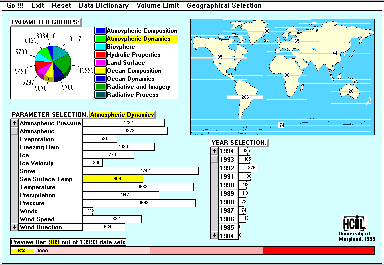
Query previews are being implemented for a complex search on NASA environmental databases. Users of the existing system must understand the numerous and complex attributes of the database that is distributed across eight archival centers. Many searches result in zero hits because users are uncertain about what data is available, and broad searches take many minutes while yielding huge and unwieldy result displays. The query preview uses only three parameters: dates (clustered into 20 one-year groups), locations (clustered into eight geographic regions), and 171 scientific parameters (cloud cover, ocean temperature, ozone, etc.) (Figure 10). This comes to a total of 20 * 8 * 171 = 27360 data values in the table of contents. In the prototype, users can quickly discover that the archive held no ozone measurements in Antarctica before 1979. Once a reasonable sized result set is identified, users can download the details about these data sets for the query refinement phase.

Figure 10: NASA query preview applies this technique to a complex search for professional scientists. The set of more than 20 parameters is distilled down to three, thus helping speed search and reduce wasted efforts. Users select values for the parameters and immediately see the size of the result bar on the bottom, thus avoiding sero-hit and mega-hit queries.

5.4 Compactness and high branching factors

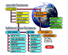
The most discussed issues in webpage design are length and number of links (branching factor). A very long page with no links is appealing only if users are expected to read the entire text sequentially. This is rarely the case, so some form of home or index page to point to fragments is necessary. Meaningful structures that guide users to the fragments they want is the goal, but excessive fragmentation disrupts those who wish to read or print the full text. As the document and website grow, the number of layers of index pages can grow as well, which is a severe danger. One way to reduce disorientation is to provide users with a visual overview of the web site (Figure 11).

Figure 11: Network diagram of the Lycos search web site is called a sitemap.

A higher branching factor is almost always preferred for index pages, especially if it can save an extra layer that users must traverse. The extra layers are more disorienting than longer index pages, as was demonstrated in menu selection studies (Norman, 1991). In a redesign for the Library of Congress homepage (http://www.loc.gov) (Figure 12) the seven links to general themes were replaced with a compact display with 31 links to specific services. The Yahoo home page has almost 100 links in a compact two-column presentation.

Figure 12: Library of Congress home page reflects the changing policies that emphasize the educationally oriented resources of the 200 American Memory special collections.

Within a page, compact vertical design to reduce scrolling is recommended (Staggers, 1993). While some white space can help organize a display, often webpages contain harmful dead space that lengthens the page without benefit to users. A typical mistake is a single left-justified column of links that leaves the right side of the display blank, thus forcing extra scrolling and preventing users from gaining an overview. A second common mistake is to use excessive horizontal rules or blank lines to separate items (Horton et al., 1996).

5.5 Sequencing, clustering, and emphasis:

Within a page, especially the highly visible homepage of an organization, designers must carefully consider the sequencing, clustering, and emphasis for objects. Users expect the first item in a page to be an important one and are likely to select it. Clustering related items shows meaningful relationships. More important items can be emphasized with large fonts, color highlights, and surrounding boxes. In the Library of Congress homepage, the American Memory collections were emphasized by placing them first and giving them a large fraction of the space. Public services such as the catalog and THOMAS (for searching legislation) were clustered in the center, and library services were clustered on the right side.

6 Conclusions

Careful website design makes the difference between a must-see, top-ten site and a worst webpage award. Specifying the users and setting goals come first, followed by design of information objects and actions. Next, designers can create the interface metaphors (bookshelf, encyclopedia. shopping mall) and the handles for actions (scrolling, linking, zooming). Finally, the webpage design can be created in multiple visual formats and international versions, while providing access for handicapped or poor readers. Every design project, including website development, should be subjected to usability testing (Nielsen, 1995bcd). and other validation methods, plus monitoring of use to guide revision.

The World Wide Web is still in the Model T stage of development. Strategies for blending text, sound, images, and video are in need of refinement, and effective rhetorics for hypermedia are only now being created. Many results from other user interface topics such as menu selection, direct manipulation, and screen design can be applied to website design. On the other hand, the novel communities of users, innovative databases, ambitious services, emphasis on linking and navigation, and intensive use of graphics present fresh challenges and rich opportunities to researchers to validate hypotheses in this environment. Theories of information structuring are emerging as are standards for representing traversal actions. The creative frenzy on the Web is likely to present new opportunities for design research for many years to come.

Controlled experimental studies are effective for narrow issues, but field studies, data logging, and online surveys are attractive alternative research methods in the wide-open Web. Focus groups, critical incident studies, and clinical interviews may be effective for hypothesis formation. Other opportunities include sociological studies about impact of Web use on home or office life, and political studies of its influence on democratic processes. Broader concerns such as copyright violation, invasion of privacy, pornography, or criminal activity merit attention as the impact of the World Wide Web increases. We can influence the direction of technology and its societal impact, but only if we have the scientific foundation to understand the issues.

Acknowledgments: With great pleasure I acknowledge the helpful comments from many people during the evolution of this review: Maryle Ashley, Richard Beigel, Jason Ellis, Cheryl Graunke, Richard Greenfield, Rina Levy, Gary Marchionini, David Nation, Catherine Plaisant, Arkady Pogostkin, and Joe Reiss. Anonymous reviews for this Special Issue, nicely distilled by Cliff McKnight and Simon Buckingham Shum, were invaluable in improving the paper. I appreciate support from the Library of Congress, NASA (NAG52895), and the National Science Foundation (EEC94-02384 and IRI96-15534).

References

AHLBERG, C. and SHNEIDERMAN, B.(1994).
Visual information seeking: Tight coupling of dynamic query filters with starfield displays, Proc. CHI'94 Conference: Human Factors in Computing Systems, ACM, New York, NY, 313-321 + color plates.
BELKIN, N. J. and CROFT, B. W. (1992).
Information filtering and information retrieval: Two sides of the same coin?, Communications of the ACM, 35,12, 29-38.
BERNERS-LEE, T., CAILLIAU, R., LUOTONEN, A., and NIELSEN, H. F., and SECRET,A. (1994).
The world wide web, Communications of the ACM 37, 8, 76-82.
CARD, S. K., ROBERTSON, G. G., and YORK, W. (1996).
The WebBook and the WebForager: An information workspace for the World Wide Web, Proc. CHI96 Conference: Human Factors in Computing Systems, ACM, New York, NY, 111-117.
COTTON, B. and OLIVER, R. (1993).
Understanding Hypermedia: From Multimedia to Virtual Reality, Phaidon Press, London, UK .
DOAN, K., PLAISANT, C., and SHNEIDERMAN, B. (1996).
Query previews for networked information services,Proc. Advanced Digital Libraries Conference, IEEE Computer Society, Los Alamitos, CA (May 1996), 120-129.
ENGELBART, D. (1984).
Authorship provisions in AUGMENT, Proc. IEEE CompCon Conference,, 465-472.
FLYNN, L. (1995).
Making searches easier in the web's sea of data, New York Times (October 2, 1995).
HEMMJE, M., KUNKEL, C. and WILLETT, A. (1994).
LyberWorld - A visualization user interface supporting fulltext retrieval, In CROFT, W. B. and VAN RIJSBERGEN, C. J. (Editors),Proc. 17th Annual International Conference on Research and Development in Information Retrieval (ACM SIGIR 94) , Springer Verlag , Heidelberg, Germany, 249-257.
HORTON, W., TAYLOR, L., IGNACIO, A., and HOFT, N. L. (1996).
The Web Page Design Cookbook, John Wiley & Sons, Inc., New York, NY.
ISAKOWITZ, T., STOHR, E. A., and BALASUBRAMANIAN, P. (1995).
RMM: A methodology for hypermedia design, Communications of the ACM 38, 8 (August 1995), 34-44.
KELLOGG, W. A. and RICHARDS, J. T. (1995).
The human factors of information on the internet, In NIELSEN, J. (Editor), Advances in Human-Computer Interaction: Volume 5, Ablex Publ., Norwood, NJ, 1-36.
KOVED, L. and SHNEIDERMAN, B. (1986).
Embedded menus: Selecting items in context, Communications of the ACM 29, 4 (April 1986), 312-318.
LEMAY, L. (1995).
Teach Yourself Web Publishing with HTML in a Week, Sams Publishing, Indianapolis, IN.
LYNCH, P. J., Yale (1995).
University C/AIM WWW Style Guide, http://info.med.yale.edu/caim/StyleManual_Top.HTML (September 5, 1995).
MARCHIONINI, G. (1995).
Information Seeking in Electronic Environments, Cambridge University Press, UK.
MCADAMS, M. (1995).
Information design and the new media, ACM interactions II.4 (October 1995), 38-46.
NIELSEN, J. (1995a).
Multimedia and Hypermedia, Academic Press, San Diego, CA.
NIELSEN, J. (1995b).
A home-page overhaul using other web sites, IEEE Software 12, 3 (May 1995), 75-78.
NIELSEN, J. (1995c).
Using paper prototypes in home-page design, IEEE Software 12, 4 (July 1995), 88-97.
NIELSEN, J. (1995d).
Sun studies of WWW design, http://www.sun.com/sun-on-net/uidesign/
NORMAN, K. (1991).
The Psychology of Menu Selection: Designing Cognitive Control at the Human/Computer Interface, Ablex, Norwood, NJ.
PEJTERSEN, A. M. (1989).
A library system for information retrieval based on a cognitive task analysis and supported by an icon-based interface, Proc. ACM SIGIR Conference , ACM, New York, NY, 40-47.
PITKOW, J. and KEHOE, C. (1996).
GVU's 6th WWW User Survey, http://www.cc.gatech.edu/gvu/user_surveys/ .
RAO, R., PEDERSEN, J., HEARST, M., MACKINLAY, J., CARD, S., MASINTER, L.,HALVORSEN, P.-K., and ROBERTSON, G. G. (1995).
Rich interaction in the digital library. Communications of the ACM 38, 4, 29-39.
RIVLIN, E., BOTAFOGO, R., and SHNEIDERMAN, B. (1994).
Navigating in hyperspace: Designs for a structure-based toolbox, Communications of the ACM 37, 2 (February 1994), 87-96.
SHNEIDERMAN, B. (1994).
Dynamic queries for visual information seeking, IEEE Software 11, 6, 70-77.
SHNEIDERMAN, B. (1996).
The eyes have it: A task by data type taxonomy of information visualizations, Proc. IEEE Symposium on Visual Languages '96, IEEE, Los Alamitos, CA (September 1996), 336-343.
SHNEIDERMAN, B. (1997).
Designing the User Interface: Strategies for Effective Human-Computer Interaction: Third edition, Addison-Wesley, Reading, MA (1997).
SHNEIDERMAN, B., BYRD, D., and CROFT, B. (1997).
Clarifying search: A user interface framework for text searches, DLib Magazine (January 1997), http://www.dlib.org.
SHNEIDERMAN, B. and KEARSLEY, G. (1989).
Hypertext Hands-On! An Introduction to a New Way of Organizing and Accessing Information, Addison-Wesley, Reading, MA.
SMITH, P., NEWMAN, I., and PARKS, L. (1997).
Virtual hierarchies and virtual networks: Some Lessons from hypermedia usability research applied to the World Wide Web, Special Issue of International Journal of Human-Computer Studies, <issue and page numbers to befinalised>, S. Buckingham Shum and C. McKnight (Eds.).
STAGGERS, N. (1993).
Impact of screen density on clinical nurses' computer task performance and subjective screen satisfaction, International Journal of Man-Machine Studies 39, 5 (November 1993), 775-792.
TAUSCHER, L. and GREENBERG, S. (1997).
How people revisit web pages: empirical findings and implications for the design of history systems, Special Issue of International Journal of Human-Computer Studies, <issue and page numbers to befinalised>, S. Buckingham Shum and C. McKnight (Eds.).
WEINMAN, L., Designing Web Graphics, New Riders Publishing, Indianapolis, IN (1996).
WISE, J. A., THOMAS, J. J., PENNOCK, K., LANTRIP, D., POTTIER, M., SCHUR, A., and CROW, V. (1995).
Visualizing the non-visual: Spatial analysis and interaction with information from text documents, Proc. IEEE Information Visualization '95, IEEE Computer Press, Los Alamitos, CA, 51-58.

Figure 1: One page personal biography of Ara Kotchian, a student at the University of Maryland (used with permission). (http://www.cs.umd.edu/projects/hcil/People/ara/index.html)

Figure 2: American Memory home page from the Library of Congress, offering more than 5,000,000 images, texts, videos, etc. by the year 2000. (http://lcweb2.loc.gov/ammem)

Figure 3: Yahoo index page showing a 14-item thematic categorization with 51 second level links, and more than 30 other links. (http://www.yahoo.com)

Figure 4: Life history of the photographer David Seymour ("Chim") with a time line showing eight segments of his work. Presented by the International Center of Photography in New York, NY (http://www.icp.org/chim/chim2.html)

Figure 5 New York Times online, creating a condensed page layout to fit the typical home user. (http://www.nytimes.com)

Figure 6: Perseus digital library, contains ancient Greek texts in original an English forms with maps, photos, architectural plans, vases, coins, etc. for students and researchers. (http://www.perseus.tufts.edu)

Figure 7: Objects/Actions Interface Model as a basis for website design. The hierarchically-decomposed task objects and actions become represented by interface objects and actions. Designers must choose the most effective metaphors and create visual representations that allow users to decompose their action plan into a series of detailed clicks or keystrokes.

Figure 8: A revised interface for the Library of Congress' THOMAS system, shows how the four-phase framework might be applied to text searching on full-text searching of proposed legislation. (http://www.cs.umd.edu/projects/hcil/People/bas/experiment/test10.html)

Figure 9: Restaurant finder demonstrates the query preview idea. Users can quickly adjust the parameters and see the effect on the size of the preview bar at the bottom. Zero-hit or mega-hit results are immediately visible and users can always be sure that their search will produce an appropriate number of results (Graphic design by Teresa Cronnell) (Doan et al., 1996). (ftp://ftp.cs.umd.edu/pub/hcil/Screen-dumps/Preview-bar/restaurant-finder.gif)

Figure 10: NASA query preview applies this technique to a complex search for professional scientists. The set of more than twenty parameters is distilled down to three, thus helping speed search and reduce wasted efforts. Users select values for the parameters and immediately see the size of the result bar on the bottom, thus avoiding zero-hit and mega-hit queries. (ftp://ftp.cs.umd.edu/pub/hcil/Screen-dumps/Preview-bar/qp2.gif)

Figure 11: Network diagram of the Lycos search service website is called a sitemap. (http://www.lycos.com/sitemap.html)

Figure 12: Library of Congress home page reflects the changing policies that emphasize the educationally-oriented resources of the 200 American Memory special collections. (http://www.loc.gov)

Web Accessibility