- .pad addgroupmember $id3 $gid
- .pad ic $gid -members
- 254 255 266
-
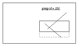
- .pad removegroupmember $id0 $gid
- .pad ic $gid -members
- 255 266
-
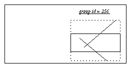
- .pad getgroup $id2
- 256
-
This document in organized into the following sections:
create [21] Create new items
delete [23] Delete existing items
find[31] Search for items by various keys
isvisible [55] Return true if the specified item is visible.
itemconfigure Configure existing items
lower[60] Push an item lower in the drawing order
pick[65] Find the item under a point
popcoordframe[66] Pop a relative coordinate frame off of the stack
pushcoordframe[68] Add a new relative coordinate frame to the stack
raise[69] Bring an item higher in the drawing order
resetcoordframe[75] Reset coordinate frame stack to empty
setid[82] Change the id of an item
text[91] Modify text item
type [93] Get the type of an item
-aliases [1] (Read-only) Returns all aliases of the item
-arrow [7] Whether to draw arrow heads with this item
-arrowshape [8] The shape of drawn arrow heads
-height [26] Height of an item. Normally computed, but can be set to squash/stretch item
-html [27] The HTML item associated with an htmlanchor
-htmlanchors [28] The anchors associated with an HTML page
-image [29] Image data associated with item (allocated by image alloc)
-info [30] A place to store application-specific information with an item
-ismap [31] True if an htmlanchor is an image map
-lock [35] Locks an item so it can not be modified or deleted
-state [53] State of an item (such as visited, unvisited, etc.)
-sticky [54] Specifies if an item should stay put when the view changes
-text [56] The text of any item containing text
-timerrate [57] Frequency timerscript should fire
-timerscript [58] Script associated with an item that fires at regular intervals
-title [59] Some items only: Title of an item
-url [63] The URL associated with an item
-width [68] Width of an item. Normally computed, but can be set to squash/stretch item
-zoomaction [70] A script that gets evaluated when an item is scaled larger or smaller than a set size
animate [1] Animate item options asynchronously
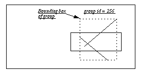
bbox [10] Get the bounding box of an item
coords [20] Change the coordinates of an item
getsize [44] Get the size of an item (possibly within portals)
rotate [76] Rotate an item
scale [77] Change the size of an item relatively
slide [88] Move an item relatively in (x, y)
-anchor [3] The part of the item that -position refers to
-position
-angle [5] Specifies absolute rotation of item
-anglectr [6] Specifies absolute rotation of item, rotating about specified point
-position [47] The absolute position of the object (x, y, scale)
-position
center [15] Change the view so as to center an item
centerbbox [16] Change the view so as to center a bounding box
getview [47] Get the current view (possibly within portals)
getzoom [48] Get the current view magnification (possibly within portals)
moveto [62] Change the view (possibly within portals)
zoom [99] Zoom the view around a specified point
-lookon [36] Specifies the pad widget this item sees
-view [65] Specifies the view this item sees
-viewscript [66] A script that gets evaluated whenever the view is changed
addtag [5] Add a tag to an item
deletetag [23] Delete a tag from an item
dtag [23] Synonym for deletetag
gettags [45] Get the tags an item has
hastag [51] Determine if an item has a particular tag
-tags [55] List of tags associated with an item
bind [11] Create, modify, access, or delete event bindings
bindtags [12] Specify whether events should go to the most-specific or most-general description
focus [32] Set the focus for keyboard events
modifier [61] Manipulate user-defined modifiers
-events [20] True if item receives events, false otherwise
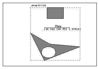
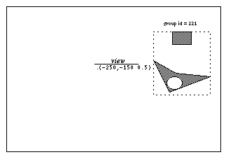
addgroupmember [2] Add an item to a group
getgroup [38] Get the group an item belongs to
removegroupmember [72] Remove an item from a group
-divisible [16] True if events go through a group to its members
-members [38] The list of members of a group
grid [50] Manage item layout in a grid as with the Tk grid command
layout [58] Layout items once
tree [92] Manage item layout with a dynamic graphical-fisheye view tree
damage [22] Specify that a group of items needs to be redrawn
update [94] Force any requested render requests to occur immediately
-alwaysrender [2] True if the item must be rendered, even if the system is slow and the item is small
-border [10] Specifies border color of item
-borderwidth [11] Specifies width of border
-capstyle [12] Specifies how to draw line ends
-clipping [13] Controls if items are clipped to their bounding box when rendered
-dither [15] Render with dithering
-faderange [21] Range over which an item fades in or out
-fill [23] Specifies fill color of item
-font [24] Specifies font to use for text
-joinstyle [32] Specifies how to draw the joints within multi-point lines
-layer [33] The layer an item is on
-noisedata [42] Specifies parameters to render item with noise
-maxsize [37] The maximum size an item is rendered it (absolute or relative to window size)
-minsize [41] The minimum size an item is rendered it (absolute or relative to window size)
-pen [45] Specifies pen color of item
-penwidth [46] Specifies width of pen
-relief [49] Specifies how border should be rendered (raised, flat, sunken, ridge, groove)
-transparency [61] Transparency of an item. 0 is completely transparent, 1 is completely opaque
-visiblelayers [67] The layers that are visible within this view (just for portals and surface, item #1)
border [13] Manipulate a fake 3D border for use in a render callback
color [18] Manipulate a color for use in a render callback
render [73] Configure and use renderer
renderitem [74] Render an item in a render callback
-renderscript [50] A script that gets evaluated every time an item is rendered
-bb [9] A script that gets evaluated to specify the bounding box of an item
cache [14] Control item cache
read [71] Read a .pad file
write [98] Write a .pad file (all the items on a widget)
-file [22] File an item should be defined by
-writeformat [69] Controls whether disk-based item is written out by copy or reference
configure [19] Modify the pad widget
font [33] Manipulate fonts and the font path
html [52] Manipulate and query an html page and its anchors.
image [53] Manipulate images
info [54] Get type-specific information about an item
layer [57] Manipulates layers
random [70] Generates a random integer
setlanguage [84] Set the language to be used for future callback scripts
settoplevel [87] Set the language to be used by the top-level interpreter
sound [89] Manipulate and play sounds
windowshape [97] Modify the shape of the top-level window that a pad widget is in
-donescript [17] A script to evaluate when a background action has completed
-errorscript [19] A script to evaluate when a background action has an error
-reference [48] What item an alias references
-updatescript [62] A script to evaluate when a background action has made progress
clock [17] Create a clock to measure elapsed milliseconds
getdate [37] Get the current date in unix format
getpads [42] Get a list of all pad widgets currently defined
line2spline [59] Generate points for a spline that approximate a line
noise [63] Generate 'perlin' noise
padxy [64] Convert a window point (x, y) to pad coordinates
spline2line [90] Generate points for a line that approximate a spline
urlfetch [95] Retrieve a URL over the internet in the background
warp [96] Warp (move) the core pointer
-command [14] Callback for widgets
-editable [18] True if text item is editable
-from [25] Starting value of valuator widget
-linesize [34] Amount widget should change to represent a line change
-memberlabels [39] List of labels for a pull-down or pop-up menu
-menubar [40] Menubar associated with a frame
-orientation [43] Orientation of widget (horizontal or vertical.)
-pagesize [44] Amount widget should change to represent a page change
-to [60] Ending value of valuator widget
-value [64] Current value of valuator widget
printtree [67] Print all the items on the pad surface in their internal tree structure
addoption [4] Create a new option for an existing type
addtype [6] Create a new item type
pad command is the sole addition which is described below. In addition, the Pad++ distribution comes with an application written entirely in Tcl called PadDraw. This application is a general-purpose drawing and demo program that shows many capabilities of the pad widget. There are two scripts which can be used to run Pad++. 'pad' is a script which sets the appropriate environment variables and runs padwish, giving a Tcl prompt. 'paddraw' is started by running the paddraw script which automatically runs padwish and starts the Tcl PadDraw program. When running PadDraw by executing paddraw, the Tcl interpreter is not available.
padwish [options] [arg arg ...]Valid options are:
-colormap colormap
-display display
-geometry geometry
-help
-language
-name name
-norgb
-sharedmemory
-sync
-visual visual
--
pad [pathName [options]]
pad command creates a new window (given by the pathName argument) and makes it into a Pad++ widget. If no pathName is specified, a unique top-level window name will be generated. Additional options may be specified on the command line or in the option database to configure aspects of the Pad++. The pad command returns the name of the created window. At the time this command is invoked, there must not exist a window named pathName, but pathName's parent must exist.Once a Pad++ widget is created, there are five ways of writing Tcl code for it. They are:
-width and -height control the geometry of the widget.
pad .pad creates a widget named .pad, and a command named .pad. For example, to find out what the current view on the pad widget is, use the getview command with: .pad getview.
create sub-command. For example, .pad create line 0 0 10 10 creates a line from the origin to the point (10, 10).
itemconfigure sub-command. For example, supposing that the previous line had an id of 2, we could change its pen color and width with: .pad itemconfigure 2 -pen red -penwidth 5
This version of Pad++ works with either Tcl7.5/Tk4.1 or Tcl7.6/Tk4.2.
Note that in this reference manual, optional parameters are listed in square brackets, [...]. While this is traditional for reference documentation, the Tcl/Tk documentation uses ?...? to denote optional parameters in order to avoid confusion with the meaning of [...] in the Tcl language. We decided to risk the confusion with Tcl for the increased clarity of square brackets.
background
Background
-background
.pad config -background gray50
closeEnough
CloseEnough
-closeEnough
cursor
Cursor
-cursor
debugBB
DebugBB
-debugBB
debugEvent
DebugEvent
-debugEvent
debugGen
DebugGen
-debugGen
debugOut
DebugOut
-debugOut
.pad config -debugOut foo" will cause all future debug output to be appended to the Tcl variable 'foo'.
debugRegion
DebugRegion
-debugRegion
defaultEventHandlers
DefaultEventHandlers
-defaultEventHandlers
defaultRenderLevel
DefaultRenderLevel
-defaultRenderLevel
desiredFrameRate
DesiredFrameRate
-desiredFrameRate
-alwaysrender) flag, and some objects may be rendered at low resolution. The default is 20 frames/second.
dissolveSpeed
DissolveSpeed
-dissolveSpeed
doubleBuffer
DoubleBuffer
-doubleBuffer
fastPan
FastPan
-fastPan
fontCacheSize
fontCacheSize
-fontCacheSize
gamma
Gamma
-gamma
height
Height
-height
heightmmofscreen
HeightMMOfScreen
-heightmmofscreen
interruptible
interruptible
-interruptible
maxZoom
MaxZoom
-maxzoom
mediumObjSize
MediumObjSize
-mediumObjSize
-smallObjSize configuration option.)
refinementDelay
RefinementDelay
-refinementDelay
smallObjSize
SmallObjSize
-smallObjSize
-mediumObjSize configuration option.)
sync
Sync
-sync
units
Units
-units
width
Width
-width
widthmmofscreen
WidthMMOfScreen
widthmmofscreen
pad command creates a new Tcl command whose name is pathName. This command may be used to invoke various operations on the widget. It has the following general form:
pathName animate subcommand [args ...]
animate command is the key to a sophisticated animation engine that allows asynchronous animations of most options of items on the Pad++ surface. An item can be moved across the screen while its color is being changed while another is being rotated. This all happens in the background so that Pad++ continues to process events while animations happen.
			set txt [.pad create text -text "Hello World" -pen yellow \
				-pos {0 -50 0.2} -anchor center]
			set txtpath [.pad anim create path -path {{0 -50 0.2} {0 -50 5}} \
				-endtime 2]
			set txtchannel [.pad anim create channel -object $txt \
				-path $txtpath -option -pos]
			.pad anim start $txtchannel
create AnimationUnit [option value ...]
					set path [.pad anim create path -path {0 1}]
					set channel [.pad anim create channel -path $path]
					.pad anim configure $channel -endtime 3
Path configuration options:
-path [path]: path is the set of "points" that defines the values to be visited by the curve. The "points" define a "polyline" in one, two, or three dimensions.
Example:
						.pad anim config -path {1.0 2.0 3.0}
						.pad anim config -path {{1.0 2.0} {3.0 4.0} {5.0 6.0}}
						.pad anim config -path {{1.0 2.0 3.0} {4.0 5.0 6.0} \
							{7.0 8.0 9.0}}
-timepath [timepath]:
Timepath is a set of time value pairs that define both the values and the time that each value should be reached. This allows one to more exactly specify the the timing of the animation and to produce animations that do not operate at a constant speed. One use for such animations is when one wants to simulate a physics-like animation by calculating position of an object at specific times to define an animation. If a path is specified with -endtime instead of -endtime, the first value of each data set is treated as a time. Times must increase in value from one data set to the next. Each data set must contain at least two values, a time value and one, two, or three values to specify the configuration values defining the path.
Examples:
						.pad anim config -timepath {{1.0 2.0} {3.0 4.0} {5.0 6.0}}
						.pad anim config -timepath {{1.0 2.0 3.0} {4.0 5.0 6.0} \
							{7.0 8.0 9.0}}
(See bouncing ball example below.)
-begintime [timeInSec]Time, in seconds, that defines when the first value of the path is obtained
-endtime [timeInSec]: Time, in seconds, that defines when the last value of the path is obtained
-intime [inTime]:
One may want to have the animation start somewhere other than at the first value of the path. This can be accomplished be specifying the -endtime which must lie between -endtime and -endtime (inclusive). In combination with -endtime, a slice of an animation can be specified.
-order orderThe number of parameters per entry in the path. Order may be 1, 2, or 3, and must match the order of the option the path is used with.
-outtime [inTime]:
One may want to have the animation end somewhere other than at the last value of the path. This can be accomplished be specifying the -endtime which must lie between -endtime and -endtime (inclusive). In combination with -endtime, a slice of an animation can be specified.
-post [postCondition]This specifies what happens when the current time passes -endtime. The possible values for this option are: constant, cycle, or oscillate
-endtime, the last value of the path is applied.
-endtime, the interpolated value is projected back to the first value in the path, and the path is cycled through from the beginning.
-endtime, the interpolated value is reflected from the final value in the path, toward the first value.
-pre [preCondition]:
This specifies what happens when the current time is before -endtime. The possible values for this option are: constant, cycle, or oscillate
-endtime, the first value of the path is applied.
-endtime, the interpolated value is projected to the last value in the path, and the path is cycled through from the end toward the beginning.
-endtime, the interpolated value is reflected back from the first value in the path, toward the final value.
-siso [boolean]Indicates whether to apply a slow-in-slow-out effect to the animation. Default value is "0" (off).
Example:
					set rec [.pad create rectangle 0 0 100 100 -fill blue]
					set recp [.pad anim create path -path {{-100 0 1} {100 0 1}} \
						-endtime 2 -siso 1]
					set recc [.pad anim create chan -path $recp -object $rec \
						-option -pos]
					.pad anim start $recc
Channel configuration options:
-path [pathToken]pathToken specifies the animation path to be applied to the channel's option
-object [tagOrId]tagOrId specifies the object/objects that are to be affected by the channel
-option [option]
Option specifies the item configuration option that will be animated by interpolating along the animation path. The channel's path must be of the same order as the option. This means that if the option to be animated is -endtime, the path is a single list of values (i.e. -path {1.0 2.0 4.0 8.0}), if the option is -endtime, the path should be a list of lists containing three values each (i.e. -path {{1.0 3.0 4.0} {2.0 1.0 7.0} {5.0 8.0 10.0}} ).
Presently supported options that one may want to animate:
Order 1:
Order 3:
-begintime [timeInSec]
Sets the -endtime of the path associated with the channel. This is just a convenience. Beware that if you set the -endtime of a channel, all channels using this same path are affected. (See -endtime for paths, above)
-endtime [timeInSec]
Sets the -endtime of the path associate with the channel. This is just a convenience. Beware that if you set the -endtime of a channel, all channels using this same path are affected. (See -endtime for paths, above)
Animation configuration options:
-members [listOfChannelsAndAnimations]:Used to add animatables to an animation. Both channels and animations are animatable and can be a member of an animation. An animation cannot be a member of itself.
Example:
.pad anim config anim0 -members "chan0 chan1 anim1"
-begintime [timeInSec]:
If an animation (anim0) is a member of another animation (anim1), -endtime specifies the delay time after anim1 is started, that anim0 should be started
-endtime [timeInSec]
By default, this is the amount of time for all animatables to finish their animation. If set to a value less than the default, all animatables will stop at the parent animation -endtime. If set to a value greater than the default, there is no noticeable effect.
-speedfactor [speedFactor]By default this is 1.0. If one sets it to 2, the animation will be played twice as fast etc.
configure AnimationUnit [option value ...]
create command.
.pad anim config path0 -endtime 10
delete AnimationUnit
start AnimationUnit
interrupt AnimationUnit
getinterpval timeInSec
-endtime or -begintime of a channel, it is the path that is associated with the channel that is actually affected. Be careful that the affected path is not also being used in another channel that needs a different -endtime and -begintime. If it is, make another path with the same data and the desired -endtime and -begintime.
.pad anim start channelToken', each channel has its own timer. So if you have several channels playing in overlapping time, you have several timers going. If you place several channels into a parent animation, when you play that animation all the channels are played using one timer. If you place animations within a parent animation, when the child animations are playing, each uses its own timer.
-rposition does not account for the -angle of the group. So the orientation of the motion of item 5 is not rotated with the group.
######################################################################
# IMPROVED HELLO WORLD ANIMATION
# Here is an animation to illustrate the combining of
# channels and animations into a single animation.
######################################################################

# Set up hello world channel
set txt [.pad create text -text "Hello World" -pen yellow \
		-pos {0 -50 0.2} -anchor center]
set txtpath [.pad anim create path -path {{0 -50 0.2} {0 -50 5}} \
		-endtime 2]
set txtchannel [.pad anim create channel -object $txt -path $txtpath \
		-option -pos]

# Make four rectangles
for {set i 0} {$i<4} {incr i} {
		.pad create rectangle 0 0 100 100 -fill black -pos {0 50 1} -tags rect$i
}

# Make a two paths, one first order and one third order
set p0 [.pad anim create path -path {0 180 90}]
set p1 [.pad anim create path -path {{0 0 0} {255 0 0} {0 255 0} \
		{0 0 255} {0 0 0}} -post cycle]

# Make two channels for each object.
# One channel for changing -angle
# the other for changing -fill

set j 0
for {set i 0} {$i<8} {incr i 2} {
		set obj [.pad find withtag rect$i]
		set c$i [.pad anim create channel -object $obj -option -angle \
			-path $p0 -begintime 0 -endtime 6]
		set c[expr $i+1] [.pad anim create channel -object $obj -option -fill  \
			-path $p1 -begintime 3 -endtime 12]
		incr j
}

# Make three animations containing only channels
# and one animation containing channels and the
# other animations
set a0 [.pad anim create anim -members "$c0 $c1" -endtime 10 \
		-begintime 2.5]
set a1 [.pad anim create anim -members "$c2 $c3" -endtime 10 \
		-begintime 5.0]
set a2 [.pad anim create anim -members "$c4 $c5" -endtime 10 \
		-begintime 7.5]
set a3 [.pad anim create anim -members "$txtchannel $c6 $c7 $a0 $a1 $a2" \
		-endtime 10 -begintime 0]

.pad anim start $a3
#################################################
# BOUNCE:
# This example shows a bouncing ball animation.
# Kinematic equations are used to calculate the
# path for a bouncing ball that looses energy.
# A -timepath is created and applied to an oval
# in a rectangular box.
#################################################

.pad moveto 0 500 0.2

set box     [.pad create rectangle -165 -50 165 1400 -penwidth 20]
set ball    [.pad create oval 0 0 100 100 -fill blue -pos "0 0 1"]
set boxBall [.pad create group -members "$ball $box"]

set t  0.0
set a  -98.0
set v0 500.0
set x0 0.0
set tpath ""
set delT 0.01
set coefRes 0.90

set endt [expr 2.0*$v0/$a]
set endit [expr abs(int($endt/$delT))]
set refTime 0.0

for {set j 1} {$j < 20} {incr j 1} {
		for {set i 0} {$i <= $endit} {incr i 1} {
			set t [expr $i*$delT ]
			lappend tpath "[expr $refTime + $t] 0 [expr ((0.5)*$a*$t*$t \
				+ $v0*$t + $x0)] 1"
		}

		set v0 [expr ($v0*pow($coefRes,$j))]
		set refTime [expr $refTime + $t]
		set endt [expr 2.0*$v0/$a]
		set endit [expr abs(int($endt/$delT))]
}

	set ballpath [.pad anim create path -timepath $tpath \
		-endtime [expr $refTime + $t] -intime 5]
	set ballchan [.pad anim create channel -object $ball -path $ballpath \
		-option -rpos]
	set ballanim [.pad anim create animation -members $ballchan]

# run the animation with:

.pad anim start $ballanim


####################################################
# USING A POLYLINE TO DEFINE A PATH:
# Here is an example of using a polyline to define
# a -path (a -timepath could be created by adding
# times in the "for" loop creating the pathlist).
####################################################

# To use the script, create a polyline (try one in the
# form of a big spiral), make sure it is selected,
# then enter the following code:

set coordlist [.pad coords [.pad find withtag selected]]
if {$coordlist == ""} {
		set coordlist {0 0 100 0 100 100 0 100 0 0}
}
set len [llength $coordlist]
set curscale [lindex [.pad getview] 2]

set pathlist ""
for {set i 0} {$i < $len} {incr i 2} {
		lappend pathlist "[lindex $coordlist $i] [lindex $coordlist \
			[expr $i + 1]] $curscale"
}

# Here is an example of using "pathlist" to
# create an animation to move a rectangle

set obj       [.pad create rectangle 0 0 50 50 -fill red]
set coordPath [.pad anim create path -path $pathlist]
set rectChan  [.pad anim create channel -path $coordPath -object $obj \
		-option -pos -endtime 10]
set myanim    [.pad anim create anim -members $rectChan]

.pad anim start $myanim


##############################################
# USING A TIMEPATH
# Here is an example of using the coordinates
# to make a -timepath from coordPath, enter:
# This assumes that the previous example has
# already been run.
##############################################

set timepathlist ""
set time 0.0
for {set i 0} {$i < $len} {incr i 2} {
		lappend timepathlist "[expr $time + log(int($i+1))] \
			[lindex $coordlist $i] [lindex $coordlist [expr $i + 1]] $curscale"
		set time [expr $time + (1.0/($i+1.0))]
	}

	set coordPath [.pad anim create path -timepath $timepathlist]
	set rectChan  [.pad anim create channel -path $coordPath -object $obj \
		-option -pos]
	set mytanim   [.pad anim create anim -members $rectChan]

.pad anim start $mytanim
pathName addgroupmember [-notransform] tagOrId groupTagOrId
removegroupmember, and getgroup commands). Returns an empty string.
pathName addmodifier modifier
addmodifier is an obsolete command and will be removed in the next release. Replace all uses of addmodifier with the 'modifier add' command.
addoption [-nowrite] typename optionname optionscript default
addtype, or the special word "all" which means that this option applies to all types. When optionscript is called, the following arguments will be added on to the end of the script:
write command is executed. Note that the option will only be written out if the value is different than the default. If -nowrite is specified, then this option won't be written out. See the section APPLICATION-DEFINED ITEM TYPES AND OPTIONS in the Programmer's Guide for more information. (Also see the addtype command.)
[5]
pathName addtag tagToAdd tagOrId ...
eval .pad addtag foo [.pad find withtag bar]
addtype typename createscript
addoption command.)
[7] pathName
allocborder color
allocborder is an obsolete command and will be removed in the next release. Replace all uses of allocborder with the 'border alloc' command.
alloccolor color
alloccolor is an obsolete command and will be removed in the next release. Replace all uses of alloccolor with the 'color alloc' command.
allocimage file [-norgb]
allocimage is an obsolete command and will be removed in the next release. Replace all uses of allocimage with the 'image alloc' command.
bbox [-sticky] tagOrId [tagOrId tagOrId ...]
bbox returns the bounding box of the item as it appears for the current view. That is, the bounding box will be different when the view is different. If -sticky is specified, then the bounding box returned is independent of the current view (i.e., it returns the bounding box as if the view was "0 0 1").
bbox will refer to the bounding box of the portion of the surface that is currently visible (based on the view and window size).
bind tagOrId [sequence [command]]
bind command. I.e., you can do everything you can with the canvas with exactly the same syntax, but you can also do more.
focus command below for more on this).
bindtags command. The default is that a binding associated with the all tag is invoked first, followed by one binding for each of the item's tags (in order), followed by a binding associated with the item's id. If there are multiple matching bindings for a single tag, then only the most specific binding is invoked. A continue command in a binding script terminates that script, and a break command terminates that script and skips any remaining scripts for the event, just as for the bind command.
pad window using the Tk bind command, then they are invoked in addition to bindings created for the pad's items using the bind widget command. The bindings for items will be invoked before any of the bindings for the window as a whole.
bind command makes, Pad++ makes a few more. As with the Tk bind command, all substitutions are made on two character sequences that start with '%'. The special Pad++ substitutions are:
<Modify> events, it specifies the command that caused the modification. For <PortalIntercept> events, it specifies the name of the event type generating the PortalIntercept. Standard Tcl event names, such as ButtonPress or ButtonRelease are used. This can be used by PortalIntercept events to only let certain event types go through the portal. Note that only a single PortalIntercept event is generated for a Button, Motion, ButtonRelease sequence, so these three events can not be distinguished in this manner.
<create>: This event gets fired whenever new pad items are created. Because items that this is attached to don't have id's yet, it only makes sense to attach this event to a tag. Then this event gets fired immediately after any item of the relevant tag is created. Example:
			.pad bind foo <Create> {puts "A foo was created, id=%O"}
			.pad create rectangle 0 0 50 50 -tags "foo"
				=> A foo was created, id=5
<Modify>: This event gets fired whenever an item is modified. Modification occurs whenever an item's configuration options are changed, and whenever the following commands are executed on an item: coords, itemconfigure, scale, slide, text, and moveto (on a portal) The %I macro specifies the command that caused the modification. Example:
			.pad bind foo <Modify> {puts "A foo was modified, cmd=%I"}
			.pad create rectangle 0 0 50 50 -tags "foo"
			.pad itemconfigure foo -pen red
				=> A foo was modified, cmd=itemconfigure
<Delete>: This event gets whenever an item is deleted. It is typically used to clean up application resources associated with the item that was deleted.
<Write>: This event fires whenever an item is written out with the pad write command. While Pad++ knows how to generate the Tcl code necessary to recreate itself, items are often part of an application with associated data structures, etc. When an item is written out, it is frequently necessary to write out these associated structures. Sometimes, the application may prefer to substitute its code for pad's. This event provides a mechanism to augment or replace (possibly with an empty string) the Tcl code written out to recreate a pad item.
<Write> event returns is appended on to the string pad uses to write out that object. In addition, the application may modify the special global Tcl variable, Pad_Write which controls whether the item will get written out. This defaults to 1 (true), but may be set to 0 (false) by the event binding. In addition, the <Write> event gets fired on the special tags "preWrite" and "postWrite" at the beginning and end of the file, respectively, to allow an application to write out code at the ends of the file. Example:
<PortalIntercept>: This event gets fired just before an event passes through a portal. If the event handler executes the break command, then the event stops at the portal and does not pass through. Example:
bind reference pages. A sequence contains a list of modifiers which are direct mappings to hardware such as the shift key, control key, etc. Event handlers fire only for sequences with modifiers that are active, as defined by the hardware.
addmodifier command (and may be deleted if they are no longer needed with the pad deletemodifier command.) Then, the modifier can be used in the pad bind command just like a system defined modifier. There may be at most one active user-defined modifier per pad widget. The active user-defined modifier is set with the setmodifier command (and may be retrieved with the getmodifier command). The current modifier may be set to "" (the default) in which case no user-defined modifier is set. Example:
bindtags tagOrId [type]
border subcommand arg ...
border alloc <bordercolor>
render command for an example of how to use a border).
border free <bordertoken>
allocborder.
[14] pathName
cache subcommand arg ...
cache in tagOrId
cache out tagOrId
cache configure [option [value] ...]
-dir dirSpecifies the directory to use for the cache. The actual directory will be <dir>/<pid> where pid is the process id of Pad++. It will be removed when the process exits. The cache should be on a local disk for reasonable I/O performance. It is not set by default and caching is disabled until the cache dir is explicitly set by the application.
-size sizeSize is the total memory available to the cache manager before it starts to cache out objects. It defaults to two megabytes. Caching can be disabled by setting size to zero.
-viewmultiple viewmultipleViewmultiple specifies a multiple of the view area the cache manager should use when deciding object visibility for purposes of caching. Its default value is 2 (so objects visible within twice the view are not cache out candidates). Setting it to 1 will cause images to be potentially get cached out when not in the view.
-delay delayDelay specifies the interval (in seconds) the cache manager should check and perform any actual cache outs. Its default value is 5 seconds. Setting it to 0 will cause immediate cache outs.
[15] pathName
center [-twostep] tagOrId [time x y [z [portalID ...]]]]
centerbbox [-twostep] x1 y1 x2 y2 [time [x y [z [portalID ...]]]]
z). If -twostep is specified, then make animation in two steps if appropriate (i.e., points not too close). The two steps are such that it zooms out to the midpoint between the two points far enough so that both start and endpoints are visible, and then zooms to the final destination. If time is specified, then make a smooth animation to the item in time milliseconds. The view is changed so that the bounding box appears at the position determined by (x, y), both of which are in the range (0.0 ... 1.0). Here, 0.0 represents the left or bottom side of the window, and 1.0 represents the right or top side of the window. (x, y) specifies the portion of the item that should appear at the portion of the screen, relatively. So, specifying (0, 0) puts the lower left corner of the bounding box on the lower left corner of the screen. (1, 1) puts the upper right corner of the bounding box on the upper right corner of the screen. x and y default to (0.5, 0.5), i.e. the center of the screen. If a list of portalID's is specified, change the view within the last one specified.
clock [clockName [reset | delete]]
color subcommand arg ...
color alloc <file>
render command).
color free <colortoken>
alloccolor.
[19] pathName
configure [option] [value] [option value ...]
Tk_ConfigureInfo for information on the format of this list). If option is specified with no value, then the command returns a list describing the one named option (this list will be identical to the corresponding sublist of the value returned if no option is specified). If one or more option-value pairs are specified, then the command modifies the given widget option(s) to have the given value(s); in this case the command returns an empty string. Option may have any of the values accepted by the pad command. See the section on WIDGET-SPECIFIC OPTIONS for a description of all the options and their descriptions.
coords [-objectcoords] [-append] [-nooutput] tagOrId [x0 y0 ...]
coords command generates a <Modify> event on the items modified by it (see the bind command for a description of the <Modify> event). Locked items may not be modified by the coords command (see the -lock itemconfigure option). The coords command can only be used on line, rectangle, polygon and portal items.
   set id [.pad create line -200 200]

   for {set i -20} {$i <= 20} {incr i} {
      set x [expr $i * 10 ]
      set y [expr 0.5 * ($i * $i)]
      .pad coords -append -nooutput $id $x $y
   }
[21] pathName create type [option value ...]
damage [tagOrId]
update procedure is called. Returns an empty string.
delete tagOrId [tagOrId ...]
delete command generates a <Delete> event on the items modified by it (see the delete command for a description of the <Delete> event). Locked items may not be modified by the delete command (see the -lock itemconfigure option).
pathName deletemodifier modifier
deletemodifier is an obsolete command and will be removed in the next release. Replace all uses of deletemodifier with the 'modifier delete' command.
pathName deletetag tagToDelete tagOrId [tagOrId ...]
dtag is an alias for deletetag
eval .pad deletetag foo [.pad find withtag bar]
[26] pathName
drawborder border type width x1 y1 x2 y2
drawborder is an obsolete command and will be removed in the next release. Replace all uses of drawborderwith the 'render draw border' command.
drawimage imagetoken x y
drawimage is an obsolete command and will be removed in the next release. Replace all uses of drawimage with the 'render draw image' command.
drawline x1 y1 x2 y2 [xn yn ...]
drawline is an obsolete command and will be removed in the next release. Replace all uses of drawline with the 'render draw line ' command.
drawpolygon x1 y1 x2 y2 [xn yn ...]
drawpolygon is an obsolete command and will be removed in the next release. Replace all uses of drawpolygon with the 'render draw polygon' command.
drawtext string xloc yloc
drawtext is an obsolete command and will be removed in the next release. Replace all uses of drawtext with the 'render draw text' command.
find [-groupmembers] [-regexp | -glob] searchCommand \
[arg arg ...] ["&&" | "||"] [searchCommand [arg arg ...]]
.pad find -regexp withtag 5*" will look for the object with an id of 5.
withtag searchCommand without a regular or glob-style expression. The slowest finds occur when regular or glob-styles expression are used on string arguments. In this case, for every item on the surface, the regular or glob-styles expression is compared to the particular attribute of each object.
allReturns all the items on the pad.
above tagOrId: Returns the items above (after) the one given by tagOrId in the display list. If tagOrId denotes more than one item, then the lowest (first) of these items in the display list is used to search above. If the search type is a regular expression or glob-style search which denotes more than one item, then the first tag will be used, based on alphabetical order, and then the highest (last) of these items is used to search above.
below tagOrIdReturns the item just before (below) the one given by tagOrId in the display list. If tagOrId denotes more than one item, then the first (lowest) of these items in the display list is used.
closest x y [halo]Returns the items closest to the point given by x and y. If halo is specified, then any items closer than halo to the point will be returned. Halo must be a non-negative number. If halo is not specified, then only items overlapping the point (x, y) will be returned.
withinfo infoIf a regular expression or glob-style search is used, this returns all the items for which their info itemconfigure option matches the pattern info. If an exact search is used, this returns all the items for which their info itemconfigure option is the same as the string info.
withlayer layerIf a regular expression or glob-style search is used, this returns all the items for which the name of their layer matches the pattern layer. If an exact search is used, this returns all the items in which the name of their layer is the same as the string layer.
withname nameIf a regular expression or glob-style search is used, this returns all the items for which their name matches the pattern name. If an exact search is used, this returns all the items for which their name is equal to the string name. A name is a URL for an HTML item, and a filename for textfile and image items.
withsticky typeReturns all the items that are sticky type.
withtag tagOrIdIf tagOrId is a number, this returns that item. If a regular expression or glob-style search is used, this returns all the items for which their tag matches the pattern tagOrId. If an exact search is used, this returns all the items for which their tag is equal to the string tagOrId.
withtext textIf a regular expression or glob-style search is used, this returns all the items for which their text matches the pattern text. If an exact search is used, this returns all the items for which their text is equal to the string text.
withtype typeIf a regular expression or glob-style search is used, this returns all the items for which their type matches the pattern type. If an exact search is used, this returns all the items for which their type is equal to the string type.
enclosed x1 y1 x2 y2Returns all the items completely enclosed within the rectangular region given by x1, y1, x2, and y2. x1 must be no greater then x2 and y1 must be no greater than y2.
overlapping x1 y1 x2 y2Returns all the items that overlap or are enclosed within the rectangular region given by x1, y1, x2, and y2. x1 must be no greater then x2 and y1 must be no greater than y2.
.pad find withtag selected
focus [tagOrId [portalID ...]]
font subcommand [args ...]
This command is used for manipulating fonts. Fonts are specified using a logical font naming scheme similar to Java's, rather than using a platform-specific filename as a font name.
font bbox string font [fontheight]
render draw text command. The list has the form "x1 y1 x2 y2" such that the text is within the region bounded by x1 on the left, x2 on the right, y1 on the bottom, and y2 on the top. The bounding box is affected by the render configure -font and -fontheight commands.
font path [[+]path]
font loadbitmaps font
.pad loadbitmaps Helvetica-Bold".
font maxbitmapsize size
font names
freeborder border
freeborder is an obsolete command and will be removed in the next release. Replace all uses of freeborder with the 'border free' command.
freecolor color
freecolor is an obsolete command and will be removed in the next release. Replace all uses of freecolor with the 'color free' command.
freeimage imagetoken
freeimage is an obsolete command and will be removed in the next release. Replace all uses of freeimage with the 'image free' command.
getdate
pathName getgroup tagOrId
addgroupmember, and removegroupmember commands).
getlevel
getlevel is an obsolete command and will be removed in the next release. Replace all uses of getlevel with the 'render configure -level' command.
getmag tagOrId
getmag is an obsolete command and will be removed in the next release. Replace all uses of getmag drawtext with the 'render configure -mag' command.
pathName getmodifier
getmodifier is an obsolete command and will be removed in the next release. Replace all uses of getmodifier with the 'modifier get' command.
[42] pathName
getpads
getportals
getportals is an obsolete command and will be removed in the next release. Replace all uses of getportals with the 'render configure -portals' command.
getsize tagOrId ?portalID ...?
gettags tagOrId
gettextbbox string
freeborder is an obsolete command and will be removed in the next release. Replace all uses of freeborder with the 'border free' command.
[47] pathName
getview [portalID ...]
moveto to set the current view).
[48] pathName
getzoom [portalID ...]
getview command. (See moveto to set the current view).
grab [-root | -path pathName | -win winId] \
[-dim {width height}] x y width height
image [53] command and Image Items.) The grab command takes a region (x, y, width, height) which specifies the area to grab. Note that y represents the top of the region. The region can be relative to a specific Tk window, any other X window, or the entire screen. By default, the region is relative to the pad widget window. The region actually grabbed is clipped to the specified window (or to the screen for root grabbing.)
			set imagedata [.pad grab 0 0 200 200]
			.pad create image -image $imagedata
grid option arg [arg ...]
grid command arranges one or more objects in rows and columns and treats them as a group. It is based on the Tk grid geometry manager and its behavior and Tcl syntax are very similar to it. In pad, all grid commands are sub-commands of the pad command. See the section on GRID ITEMS for a complete description of this command, and how to create and use grids.
hastag tag tagOrId
html subcommand arg ...
html configure tagOrId [option [value] ...]
-source (read only)Returns the HTML source of the page
-type (read only)Returns the mime type of the page contents
-lastchangedate (read only)Returns the last time the html source was modified, as specified by the server.
-length (read only)Returns the length of the html source in characters.
html anchor configure tagOrId [option [value] ...]
-html (read only)Returns the id of the html page this anchor is associated with.
-image (read only)Returns the image token this anchor is represented by if the anchor is an image anchor.
-ismap (read only)Returns true if the anchor is an imagemap.
-name (read only)Returns the name of the anchor
-stateReturns the current state of the anchor (unvisited, visited, or active).
-url (read only)The URL this anchor is linked to.
image subcommand arg ...
image alloc <file>
image alloc can always read gif file formats. In addition, if Pad++ is compiled with the appropriate libraries, it can also read jpeg and tiff image file formats, and will automatically determine the file type. The image may have transparent pixels. This returns an image token which can be used by related commands.
image free <imagetoken>
image alloc.
image names
image configure <imagetoken> [option [value] ...]
-dimensions (read only)Returns a list of the dimensions of the image data (width, height).
-name (read only)Returns the file the image data token was created from.
-rgb (can set only to 0)Normally, image data are stored internally with their full rgb colors in addition to a colormap index. This allows images to be rendered with dithering, but takes 5 bytes per pixel. If the -norgb option is specified, then the original rgb information is not stored with the image and the image can not be rendered with dithering, but only takes 1 byte per pixel.
				set imagedata [.pad image alloc "foo.gif"]
				.pad create image -image $imagedata -anchorpt "0 0"
				.pad create image -image $imagedata -anchorpt "200 0"
[54] pathName
info subcommand
status render
status sharedmemory
[55] pathName
isvisible tagOrId [portalId ...]
[56] pathName
itemconfigure [-nondefaults] tagOrId [option [value] ...]
ic is an alias for itemconfigure
itemconfigure [-nondefaults] tagOrId [option [value] ...]
configure command except that it modifies item-specific options for the items given by tagOrId instead of modifying options for the overall pad widget. If no option is specified, then this command returns a list describing all of the available options for the first item given by tagOrId. If the -nondefaults flag is specified, then only those options modified by an application will be returned. If option is specified with no value, then the command returns the value of that option. If one or more option-value pairs are specified, then the command modifies the given widget option(s) to have the given value(s) in each of the items given by tagOrId; in this case the command returns an empty string. If value is an empty string, then that option is set back to its default value.
create command when the item(s) were created; see the sections below starting with OVERVIEW OF ITEM TYPES for details on the legal options. Note that the itemconfigure command generates a <Modify> event on the items modified by it (see the itemconfigure command for a description of the <Modify> event). Locked items may not be modified by the itemconfigure command (see the -lock itemconfigure option).
layer subcommand [args ...]
-visiblelayers [67] itemconfigure option.)
layer create <layer>
layer delete <layer>
layer names
layout subcommand [args ...]
layout align <type> [-anchor] [-coords {x y ...} [-overlaponly]] \
tagOrId [tagOrId ...]
foo" so they are aligned on top:
.pad layout align -top foo
layout distribute <type> [-space space] tagOrId [tagOrId ...]
layout position [-time animationTime] x1 y1 <type> x2 y2 tagOrId \
[tagOrId ...]
foo" so they have the same lower left corner as item #72. Then, all the objects with the tag "bar" are moved so that their upper right corner is at the same position as the lower left corner of item #72.
.pad layout position 0 0 72 0 0 foo
.pad layout position 0 0 72 11 bar
layout size <type> [-ref tagOrId] [-scale scale] tagOrId [tagOrId ...]
layout snap grid tagOrId [tagOrId ...]
line2spline error x1 y1 ... xn yn
spline2line.)
lower [-one] [-layer] tagOrId [belowThis]
layer [57] command for more information about layers.)
pathName modifier subcommand [args ...]
bind command for a more complete description. There are several subcommands:
modifier create <modifier>
modifier delete <modifier>
modifier get
modifier set <modifier>
modifier create' command.
moveto [-twostep] xview yview zoom [time [portalID ...]]
getview to get the current view). Note that the moveto command generates a <Modify> event if a portal's view is changed (see the bind command for a description of the <Modify> event).
noise index
			set coords ""
			set noiseindex_x 0.1928
			set noiseindex_y 100.93982
			set noiseincr 0.052342
			for {set i 0} {$i < 100} {incr i } {
				set x [expr 500.0 * [.pad noise $noiseindex_x]]
				set y [expr 500.0 * [.pad noise $noiseindex_y]]
				lappend coords $x
				lappend coords $y
				set noiseindex_x [expr $noiseindex_x + $noiseincr]
				set noiseindex_y [expr $noiseindex_y + $noiseincr]
			}
			eval .pad create line $coords
padxy [-sticky] [-portals] winx winy [-gridspacing value]
pick [-divisible] [-indivisible] winx winy
<PortalIntercept> event will be fired which will determine if the event will pass through that portal. By default, the pick command uses the divisibility of individual groups to determine if group members should be picked. However the -divisible or -indivisible flags (only one of which may be specified) override group's divisibility. If -divisible is specified, then group members will be picked from any group the point hits. If -indivisible is specified, then group objects and not group members will be picked.
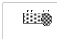
% .pad create line 0 0 100 100
22
.pad create rectangle 30 30 80 80
23
.pad addmodifier Pick
.pad bind all <Pick-ButtonPress-1> {
event_Press %i %j %x %y %O
}
proc event_Press {i j x y obj} {
# Get the group object not the group members
# underneath the point x y
set container [.pad pick -indivisible $x $y]
puts "container $container object: $obj coords: ($i, $j)"
}
.pad setmodifier Pick
Now, group the line and rectangle:
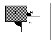
% .pad create group -members "22 23"
24
 Now, click on the line, the system response with:
container 24 object: 22 coords: (37.5, 36)
Now, click on the line, the system response with:
container 24 object: 22 coords: (37.5, 36)
 Now, click on the rectangle, system response with:
container 24 object: 23 coords: (66.5, 28)
Now, change the pick command as:
set container [.pad pick -divisible $x $y]:
Then click on the line:
container 22 object: 22 coords: (52.5, 52)
Click on the rectangle:
container 23 object: 23 coords: (63.5, 30)
Now, click on the rectangle, system response with:
container 24 object: 23 coords: (66.5, 28)
Now, change the pick command as:
set container [.pad pick -divisible $x $y]:
Then click on the line:
container 22 object: 22 coords: (52.5, 52)
Click on the rectangle:
container 23 object: 23 coords: (63.5, 30)
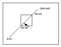
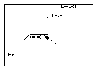
popcoordframe
pushcoordframe and resetcoordframe. Returns the frame popped off the stack.
printtree
pushcoordframe tagOrId
pathName pushcoordframe x1 y1 x2 y2
			for {set i 0} {$i < 50} {incr i} {
				set id [.pad create rectangle 10 10 80 80 -penwidth 2]
				.pad pushcoordframe $id
			}
			.pad resetcoordframe
popcoordframe and resetcoordframe. Returns the current coordinate frame.
raise [-one] [-layer] tagOrId [aboveThis]
layer [57] command for more information about layers.)
   If we use the -one option:
   .pad raise -one 24

       The original position turns to be:
[70] pathName random min max
read filename
pathName removegroupmember [-notransform] tagOrId
addgroupmember, and getgroup commands). Returns an empty string.
render subcommand arg ...
render command is used to manipulate the state of the renderer, and to render onto the screen during a renderscript. This command can only be called within a render callback.
render scale dz
render translate dx dy
render draw border bordertoken relief width x1 y1 x2 y2
render draw filledborder bordertoken relief width x1 y1 x2 y2
border commands). This command can only be called within a render callback. Border must have been previously allocated by border. Type must be one of "raised", "flat", "sunken", "groove", "ridge", "barup", or "bardown". The 'draw border' command draws just the border while the 'draw filledborder' command draws the border with the inside filled with the color of the border. The following example creates an object that draws a border:
				set border [.pad allocborder #803030]
					.pad create rectangle 0 0 100 100 -renderscript {
					.pad render draw border $border raised 5 0 0 100 100
				}
render draw image imagetoken x y
render draw line x1 y1 x2 y2 [xn yn ...]
render draw polygon x1 y1 x2 y2 [xn yn ...]
render draw text string x y
render configure [option [value] ...]
-capstyle capstyleSets the capstyle of lines for drawing within render callbacks. Capstyle may be any of: "butt", "projecting", or "round".
-joinstyle joinstyleSets the joinstyle of lines for drawing within render callbacks. Joinstyle may be any of: "bevel", "miter", or "round".
-linewidth widthSets the linewidth (in current units) to width for future drawing with render callbacks. The actual width of the line will depend on the size of the object and the magnification of the view. If width is 0, then the line is always drawn 1 pixel wide.
-color color
Sets the color for future drawing with render callbacks. Color must have previously been allocated by color alloc.
-font fontname
Sets the font for future drawing with render callbacks. This affects the result of the font bbox command. Fontname must specify a filename which contains an Adobe Type 1 font, or the string "Line" which causes the Pad++ line-font to be used. Defaults to "Times-12".
-fontheight height
Sets the height of the font for future drawing with render callbacks. Height is specified in the current pad units. This affects the result of the font bbox command.
-level (read-only)Returns the current render level. (See the sections on Refinement and Region Management and Screen Updating in the Programmer's Guide for more information about render levels).
-mag (read-only)Returns the current magnification of tagOrId for this specific render (it could be rendered multiple times if visible through different portals). Magnification is defined as the multiplication of the current view (including portals) with the object's size (from the -position itemconfigure option).
-portals (read-only)Returns the list of the portals the current object is being rendered within.
renderitem [tagOrId]
renderitem is not called, then the object will not be rendered. If tagOrId is specified, then all the items specified by tagOrId are rendered (and the current item is not rendered unless it is in tagOrId). This function may only be called during a render callback. Returns an empty string.
resetcoordframe
pushcoordframe and popcoordframe. Returns an empty string.
rotate tagOrId angle [xctr yctr]
scale tagOrId [scaleAmount [ctrx ctry [animationTime]]]
scale command generates a <Modify> event on the items modified by it (see the scale command for a description of the <Modify> event). Locked items may not be modified by the scale command (see the -lock itemconfigure option).
setcapstyle capstyle
setcapstyle is an obsolete command and will be removed in the next release. Replace all uses of setcapstyle with the 'render configure -capstyle' command.
[79] pathName
setcolor color
setcolor is an obsolete command and will be removed in the next release. Replace all uses of setcolor with the 'render configure -color' command.
setfont fontname
setfont is an obsolete command and will be removed in the next release. Replace all uses of setfont with the 'render configure -font' command.
[81] pathname
setfontheight height
setfontheight is an obsolete command and will be removed in the next release. Replace all uses of setfontheight with the 'render configure -fontheight' command.
[82] pathname
setid tagorid id
[83] pathName
setjoinstyle joinstyle
joinstyle is an obsolete command and will be removed in the next release. Replace all uses of joinstyle with the 'render configure -joinstyle' command.
[84] pathName
setlanguage language
settoplevel command.)
[85] pathName
setlinewidth width
setlinewidth is an obsolete command and will be removed in the next release. Replace all uses of setlinewidth with the 'render configure -linewidth' command.
pathName setmodifier modifier
setmodifier is an obsolete command and will be removed in the next release. Replace all uses of setmodifier with the 'modifier set' command.
pathName settoplevel language
setlanguage command.)
slide tagOrId [dx dy [animationTime]]
slide command generates a <Modify> event on the items modified by it (see the slide command for a description of the <Modify> event). Locked items may not be modified by the slide command (see the -lock itemconfigure option).
 .set id [.pad create line 0 0 200 200]
sound subcommand args ...
.pad sound load file
.pad sound play sound_token [-volume volume]
sound load" command. This returns a token that is used to stop the sound if needed. If volume is specified (at a range of [0-100]), then the sound is played at the given volume (temporarily overriding the system configuration). Short sounds are played asynchronously. There are no guarantees, but in practice, sounds under about a half second are played in the background, and this function immediately. In the future, there will be better control over this.
.pad sound stop play_token
.pad sound configure [option [value] ...]
-sounds (read-only)This returns a list of the currently loaded sounds.
-volume master
-volume {left right}This sets the volume of all sounds to be played. If a single parameter is given, it is treated as the master volume, and sets the sound for both channels. If two parameters are given (as a two-element list), they set the left and right speaker volumes separately. In all cases, this returns a list of the left and right speaker volumes. Volumes are specified in the range [0-100].
spline2line error x1 y1 ... xn yn
line2spline.)
text tagOrId option [arg ...]
text command generates a <Modify> event on the items modified by it (see the text command for a description of the <Modify> event). Locked items may not be modified by the text command (see the -lock itemconfigure option). The following command options are available:
compare index1 op index2
delete index1 [index2]
get index1 [index2]
index index [char]
insert index chars
mark option [arg arg ...]
mark names
Returns a list whose elements are the names of all the marks that are currently set.
mark set markName index
Sets the mark named markName to a position just before the character at index. If markName already exists, it is moved from its old position; if it doesn't exist, a new mark is created. This command returns an empty string.
mark unset markName [markName ...]
Remove the mark corresponding to each of the markName arguments. The removed marks will not be usable in indices and will not be returned by future calls to
pathName mark names. This command returns an empty string.
[92] pathName tree subcommand [args ...]
tree subcommand.
setfocus subcommand for more information.
addnode childtagOrId parenttagOrId
Adds childtagOrId to parenttagOrId as a child. If childtagOrId already has a parent, this command also removes childtagOrId from that parent. When it is added to the tree, the item's current zoom is recorded, and is used in all future calculations in the dynamic tree layouts. This means that an item's size when it is added to the tree is the size that it will have when it has a focus of 1.0. (See the tree setscale command to modify the size of an item after it has been added to a tree.)
animatelayout tagOrId [-view view]
Used in conjunction with computelayout, this command performs the animated layout of a tree. It may be given a view, which forces the system to animate the system view while the tree animation is taking place. Use getlayoutbbox to calculate a view for the finished animation. See computelayout for specific implementation instructions.
Using animatelayout with the -view option forces an animation of the view as the tree is animating. The view animates from the current view to the one specified as the tree animation is taking place.
animateview tagOrId [value]
Sets the animateView flag at tagOrId. Controls whether or not a layout will animate the view when layout is called at tagOrId.
connect tagOrId
Draws links from tagOrId to its parent, and from tagOrId's children to tagOrId.
computelayout tagOrId
Computes the final layout state for a dynamic tree. This places final layout state information in the tree, some of which can be accessed in order to control the layout. For information on accessing some of this information, see the getlayoutbbox command.
This code computes the future layout of a tree, then animates its view so that the center of the tagOrId's future position is in the center of the screen at the end of the animation. Note that any treenode which is a descendant of tagOrId will return valid information on a call to get layoutbbox. Other nodes are not guaranteed to have valid information.
						.pad tree computelayout $node
						set futureBbox [.pad tree getlayoutbbox $node]
						set view [bbcenter $futureBbox]
						.pad tree animatelayout -view $view
create tagOrId
Creates a treenode to monitor tagOrId. Creates default layout for treenode. Adds tagOrId to the padroot, in preparation for placement somewhere else in the hierarchy.
createroot
Creates an invisible root node which is used to organize subtrees of information, and returns the pad id of the dummy object at that node. Used to connect several nodes together so that they appear to be root nodes at the same level. Because this is an invisible node, no links will be drawn to it.
delete [-subtree] tagOrId
Delete the tagOrId and its associated pad object, layout, and link. By default, when there is no subtree option, tagOrId's children are promoted to be children of tagOrId's parent. If the -subtree option is used, the entire subtree and all of its associated data and pad objects are deleted.
getchildren tagOrId
Returns a list of the ids of the pad objects which are children of tagOrId
getfocus tagOrId
Returns the focus value at a tagOrId, which is a number on the interval [0.0, 1.0]
getlayoutbbox tagOrId
Returns the approximate bbox tagOrId will have at the end of the current animation. This is only valid when used after computelayout, and before any manipulation of any member of the tree. Moving or resizing any object affected by computelayout will cause a few bugs in the animation of those objects when animatelayout is called. The system will not break, but any moved object will first instantly move to the position it held when computelayout was called, and then will animate to the position computelayout determined for that object. Relative sizing of objects will be ignored by the system.
getlink tagOrId
Return the id of the item which graphically links tagOrId to its parent.
getparent tagOrId
Return the id of the parent of tagOrId.
getroot tagOrId
Gets the root node of tagOrId's hierarchy - the node which resides just below the padroot.
isnode tagOrId
Returns a boolean indicating whether or not tagOrId has a treenode attached to it, and is therefore a member of a hierarchy.
layout tagOrId [-view view]
Performs a recursive layout of the subtree rooted at tagOrId. If the -view option is used, the tree will animate to the view provided.
lower tagOrId [belowtagOrId]
Controls the position of tagOrId in the order of its siblings. If belowtagOrId is not provided, tagOrId is moved to the bottom of the list. If belowtagOrId is provided, tagOrId is moved to a position just above (after) belowtagOrId.
raise tagOrId [abovetagOrId]
Controls the position of tagOrId in the order of its siblings. If abovetagOrId is not provided, tagOrId is moved to the top of the list. If abovetagOrId is provided, tagOrId is moved to a position just above (after) abovetagOrId.
removenode [-subtree] tagOrId
Removes the treenode and layout objects associated with tagOrId. If the -subtree is not included, tagOrId's information is removed, and tagOrId's children are promoted. If the -subtree option is used, the entire treenode hierarchy is removed.
reparent [-subtree] tagOrId parenttagorid
Reparents tagOrId to belong to parenttagorid. The default case, in which the -subtree option is not used, reparents tagOrId, and promotes any children tagOrId may have to be children of tagOrId's original parent. If the -subtree option is used, the subtree rooted at tagOrId is moved.
setanimatespeed tagOrId milliseconds
Sets the time for an animation to occur. If this number is 0, the animation will proceed immediately to the end state. During an animation, if any event is detected, the animation will proceed to the end state. Thus, a double click on a treenode forces the animation to happen instantaneously.
setfocus tagOrId [value [levels [falloff]]]
Set the focus value at a tagOrId. This must be a number on the range [0,1]. If no value is provided, the focus is set to 1.0. The levels parameter controls the number of levels this focus is allowed to spread. The falloff parameter is a multiplier which controls the portion of focus which is passed on to the next level of recursion. For example, if this number is 0.75, then focus*0.75 of the focus is passed on at the next level of recursion.
setfocusmag tagOrId value
Recursive set command - works on the entire subtree of the tagOrId is is given. Set the magnification difference between an object of focus 0 and an object of focus 1.
setlinkmode mode
If mode is "fixed", this sets the penwidth of treelinks to fixed width 1 pixel. If mode is "scaling", then penwidth scales. The change is applied to all descendants of the specified treenode
setscale tagOrId value
Set the scale that an object will have when its focus is 0. This is the smallest size that an object will have in a dynamic tree. When a tree tagOrId is created, this value is automatically set to the z value of the object.
setspacing tagOrId xvalue [yvalue]
Set the x and y spacing at a tagOrId. This is the amount of spacing between a tagOrId and its spatial neighbors.
[93] pathName
type tagOrId
update [-dissolve speed [withRefinement]]
urlfetch URL ?option value ...?
   	pathName urlfetch Token
   where valid options are:
        -file <filename>
		-var <variable>
        -updatescript <updateScript>
        -donescript <doneScript>
        -errorscript <errorScript>
urlfetch returns a token that can be used to interact with this retrieval. This token is appended to updateScript, doneScript and errorScript when the scripts are executed.
urlfetch and it is the responsibility of the caller to free it (with unset). The third method is to use the second form of urlfetch by passing it url token during an updatescript callback in which case it will return the data retrieved by that fetch. Three code segments follow which show the use of urlfetch.
		#
		# urlfetch example using a file
		#
		proc done {filename token} {
			set file [open $filename "r"]
			...  # handle file
		}
		set file "foo"
		.pad urlfetch http://www.cs.unm.edu -file $file \
			-donescript "done $file"

		#
		# urlfetch example using a Tcl global variable
		#
		proc done {token} {
			global foo

			...  # handle data in "foo"
			unset foo     ;# no longer need URL data
		}
		.pad urlfetch http://www.cs.unm.edu -var foo \
			-donescript "done"
		#
		# urlfetch example using a token to incrementally
		# handle data as it comes in.
		#
		proc update {token} {
			set data [.pad urlfetch $token]
			...  # handle incremental data
		}
		.pad urlfetch http://www.cs.unm.edu \
			-updatescript "update" -donescript "done"
warp dx dy
windowshape [innercoords outercoords]
.pad windowshape {0 50 50 50 25 0} {0 50 50 50 25 0}
[98] pathName
write [-format type] [-relative] file [tagOrId tagOrId ...]
read command.) If type is "text", then the Tcl code that is used to recreate the items is written. If type is "binary-interchange", then a custom binary format is used. Both formats are intended to be readable by all future versions of Pad++. The text format is somewhat larger and slower to read, while the binary format is somewhat smaller and faster to read. The binary file format is described in the document doc/fileformat.txt.
<Write> event for each item it writes. The return string from the <Write> event handler will be appended to whatever string this function writes out for each item. See the bind command for more information on this.
zoom zoomFactor padXloc padYloc [animateTime [portalID ...]]
create and itemconfigure widget commands. See the itemconfigure command for the syntax to use these options.The available item types are:
This is a summary of every itemconfigure option in alphabetical order. Each option either applies to every possible item type, or has a list of item types to which it applies
-aliases [1] (Read-only) Returns all aliases of the item
-alwaysrender [2] True if the item must be rendered, even if the system is slow and the item is small
-anchor [3] The part of the item that -position refers to
-position
-angle [5] Specifies absolute rotation of item
-anglectr [6] Specifies absolute rotation of item, rotating about specified point
-arrow [7] Whether to draw arrow heads with this item
-arrowshape [8] The shape of drawn arrow heads
-bb [9] A script that gets evaluated to specify the bounding box of an item
-border [10] Specifies border color of item
-borderwidth [11] Specifies width of border
-capstyle [12] Specifies how to draw line ends
-clipping [13] Controls if items are clipped to their bounding box when rendered
-command [14] Callback for widgets
-dither [15] Render with dithering
-divisible [16] True if events go through a group to its members
-donescript [17] A script to evaluate when a background action has completed
-editable [18] True if text item is editable
-errorscript [19] A script to evaluate when a background action has an error
-events [20] True if item receives events, false otherwise
-faderange [21] Range over which an item fades in or out
-file [22] File an item should be defined by
-fill [23] Specifies fill color of item
-font [24] Specifies font to use for text
-from [25] Starting value of valuator widget
-height [26] Height of an item. Normally computed, but can be set to squash/stretch item
-html [27] The HTML item associated with an htmlanchor
-htmlanchors [28] The anchors associated with an HTML page
-image [29] Image data associated with item (allocated by image alloc)
-info [30] A place to store application-specific information with an item
-ismap [31] True if an htmlanchor is an image map
-joinstyle [32] Specifies how to draw the joints within multi-point lines
-layer [33] The layer an item is on
-linesize [34] Amount widget should change to represent a line change
-lock [35] Locks an item so it can not be modified or deleted
-lookon [36] Specifies the pad widget this item sees
-maxsize [37] The maximum size an item is rendered it (absolute or relative to window size)
-members [38] The list of members of a group
-memberlabels [39] List of labels for a pull-down or pop-up menu
-menubar [40] Menubar associated with a frame
-minsize [41] The minimum size an item is rendered it (absolute or relative to window size)
-noisedata [42] Specifies parameters to render item with noise
-orientation [43] Orientation of widget (horizontal or vertical.)
-pagesize [44] Amount widget should change to represent a page change
-pen [45] Specifies pen color of item
-penwidth [46] Specifies width of pen
-position [47] The absolute position of the object (x, y, scale)
-reference [48] What item an alias references
-relief [49] Specifies how border should be rendered (raised, flat, sunken, ridge, groove)
-renderscript [50] A script that gets evaluated every time an item is rendered
-position
-state [53] State of an item (such as visited, unvisited, etc.)
-sticky [54] Specifies if an item should stay put when the view changes
-tags [55] List of tags associated with an item
-text [56] The text of any item containing text
-timerrate [57] Frequency timerscript should fire
-timerscript [58] Script associated with an item that fires at regular intervals
-title [59] Some items only: Title of an item
-to [60] Ending value of valuator widget
-transparency [61] Transparency of an item. 0 is completely transparent, 1 is completely opaque
-updatescript [62] A script to evaluate when a background action has made progress
-url [63] The URL associated with an item
-value [64] Current value of valuator widget
-view [65] Specifies the view this item sees
-viewscript [66] A script that gets evaluated whenever the view is changed
-visiblelayers [67] The layers that are visible within this view (just for portals and surface, item #1)
-width [68] Width of an item. Normally computed, but can be set to squash/stretch an item
-writeformat [69] Controls whether disk-based item is written out by copy or reference
-zoomaction [70] A script that gets evaluated when an item is scaled larger or smaller than a set size
[2] -alwaysrender boolean
-position); it may have any of the forms accepted by Tk_GetAnchor. For example, if anchorPos is "center" then the object is centered on the point; if anchorPos is "n" then the object will be drawn so that its top center point is at the positioning point. This option defaults to center.
-anchor, -position, -rposition, and -scale itemconfigure options.)
rotate command.)
rotate command.)
[8] -arrowshape shape
[9] -bb boundingboxScript
[11] -borderwidth width
butt: The ends are drawn square, at the end point.
projecting: The ends are drawn square, past the endpoint.
round: The ends are rounded.
nodither: The image is never rendered with dithering.
dither: The image is always rendered with dithering.
refinedither: The image is initially rendered without dithering, and then refined with dithering.
[16] -divisible boolean
[18] -editable boolean
[19] -errorscript script
[20] -events boolean
Line" which causes the Pad++ line-font to be used. Defaults to "Times-12".
[25] -from value
-to, -linesize and -pagesize itemconfigure options.)
[26] -height height
[28] -htmlanchors
[29] -image imagetoken
image free" command if it is no longer being used. (Also see the image command.)
[31] -ismap
bevel: The joints are drawn without protruding. They are cut-off and sharp.
miter: The joints are drawn protruding to a point.
round: The joints are rounded.
-from, -to and -pagesize itemconfigure options.)
[35] -lock lock
coords, delete, itemconfigure, scale, slide, and text.
.pad ic 5 -minsize 55%
			.pad create menu -memberlabels {"Content" "Index" "Help"} \
				-text "Help"
[40] -menubar menubar
.pad ic 5 -minsize 55%
noisedata is a four element list of numbers of the form:
	DrawRoughLine(x1, y1, x2, y2, Pos, Freq, Amp, Steps) :
		step  = 1.0/Steps;
		mag   = length(x1,y1,x2,y2);
		theta = direction(x1,y1,x2,y2);

		xmag = Amp * sin(theta) * mag;
		ymag = Amp * cos(theta) * mag;

		vertex(x1, y1);

		for (a = step; a < steps; a += step) {
			n = noise(Pos);
			vertex(lerp(a,x1,x2) + n*xamp, lerp(a,y1,y2) + n*yamp);
			Pos += Freq;
		}
		vertex(x2, y2);
[43] -orientation orientation
horizontal" or "vertical".
[44] -pagesize value
-from, -to and -pagesize itemconfigure options.)
[45] -pen color
-position {x y scale}
-pos is an alias for -position
-position which depends on the coordinates of the item. For a "center" anchor (the default), the position will be the center of the coordinates. Other items (that don't have coordinates) have a default position of "0 0 1". (Also see the -anchor, -anchorpt, -rposition, and -scale itemconfigure options.)
-position option may alternatively be given the special token "center" which means that the item should positioned and scaled so that it biggest dimension fills up 75% of the window, and it is centered. (This is dependent on the current view, and the current window dimensions.)
[49] -relief relief
[50] -renderscript TclScript
		.pad itemconfigure 22 -renderscript {
			puts "Before"
			.pad renderitem
			puts "After"
		}
-renderscript option. If a
-renderscript callback triggers a render which causes that item to be redrawn, the system will be in an endless render loop. To avoid this problem, items do not implicitly trigger damage within a
-renderscript callback. If you do want to explicitly damage an item within a -renderscript callback, you must use the damage command. Be very careful to avoid infinite render loops.
-rposition {x y scale}
-rpos is an alias for -rposition
-position itemconfigure option, but (x, y, scale) are relative to the current group's position (whereas they are absolute for -position.) If setting this option on an item that is not a member of a group, then it behaves identically to -position. If setting this option on an item that is a member of a group, then the item will actually appear at a position that is first specified by the item's position, and then transformed by the group's position. Note that this option can be difficult to use and generally is not recommend. (Also see the -anchor, -anchorpt, -position, and -scale itemconfigure options.)
-anchor, -anchorpt, -position, and -rposition itemconfigure options.)
1') makes the sticky item "stick" to the screen, independent of the current view. That is, as the view pans and zooms, sticky items appear effectively stuck to the screen. The different kinds of sticky constraints are described in detail below. Sticky items are rendered in their normal stacking order, and thus sticky items can appear above or below non-sticky items. (See the getview and moveto commands.) Defaults to 0 (false).
1'). These don't move at all as the view changes.
z'). These do not zoom, but they pan normally. That is, they when the view changes, their (x, y) position does not change, but their scale is recalculated so their size does not change. This can be appropriate for handles or labels where you don't want their size to change, but you do want them to stay with other related objects. As a result of this, the old 'handle' object type has now been deleted. The previous handles never worked quite right within portals (they left screen junk), and their functionality is almost completely replaced by sticky z objects. Note that one thing sticky z objects can not do that handles did do is that sticky z objects don't scale only at the top-level view. Since they are otherwise regular objects, they can appear scaled within portals.
				set rect [.pad create rectangle 0 0 100 100 -fill white]
				.pad create rectangle 0 0 6 6 -fill red -pos "0 0 1" -sticky z
				.pad create rectangle 0 0 6 6 -fill red -pos "100 0 1" -sticky z
				.pad create rectangle 0 0 6 6 -fill red -pos "0 100 1" -sticky z
				.pad create rectangle 0 0 6 6 -fill red -pos "100 100 1" -sticky z
x'). This is like sticky z, but the items also don't pan horizontally.
y'). This is like sticky z, but the items also don't pan vertically.
view'). This is like sticky z, but the items always stays within the view - and the constrained position is remembered, so that the object does not "want" to stay in its original position as it does with the other sticky types. Instead, once it is moved to stay within the view, the new position is its preferred position, and it sticks there.
[58] -timerscript TclScript
[59] -title title
[60] -to value
-from, -linesize and -pagesize itemconfigure options.)
[61] -transparency value
[63] -url urlname
[64] -value value
[65] -view {x y zoom}
moveto command.)
none" which means that no layers are visible. (See the -layer itemconfigure option that all items have.)
[69] -writeformat [copy | reference]
renderitem function at any point to render the object. See the description of -renderscript for an example. The deletion of items during a zoomaction is delayed until after the current render is finished.
		proc grow {} {
			.pad ic rect -transparency 0
			.pad pushcoordframe rect
			set image_token [.pad image alloc images/unm_logo_orig.gif]
			.pad create image -image $image_token -anchor sw -tags "image"
			.pad popcoordframe
			.pad renderitem
		}

		proc shrink {} {
			.pad ic rect -transparency 1
			set image_id [.pad find withtag image]
			if {$image_id != ""} {
				set image_token [.pad ic image -image]
				.pad freeimage $image_token
				.pad delete image
			}
			.pad renderitem
		}

		proc testzoomaction {} {
			.pad create rectangle 0 0 341 222 -pen black -fill yellow3 \
				-zoomaction {250 grow shrink} -tags "rect"
		}
pathName create alias [option value option value ...]Aliases refer to the item specified by the -reference option . If the reference is not specified, or is deleted, then the alias item is not rendered. Note that aliases are still somewhat buggy, and their behavior on groups of items is not guaranteed. The following options are supported for aliases:
-reference [48] What item an alias references
Note that when the -width or -height of an alias set, the alias is clipped to those dimensions rather than being squashed or stretched as most items are.
Button items are widgets that can be pressed and let go. If the pointer is over the button when the mouse button is released, an associated script will be fired. Buttons are created with widget commands of the following form:
pathName create button [option value option value ...]Buttons are one of several widgets that are designed to mirror the functionality and usage of the standard widgets in Java's Abstract Windowing Toolkit (AWT). When buttons are created, they automatically get the tag "Button". Buttons have default event handlers which define their behavior. These event handlers are defined on the tag "Button" for the "Run" event mode. See the section on Default Bindings for more details about the event bindings.
The following options are supported for buttons:
-command [14] Callback that is executed when button is pressed
-fill [23] Specifies fill color of button
-font [24] Specifies font to use for text
-pen [45] Specifies pen color of button
-relief [49] Specifies how border should be rendered (raised, flat, sunken, ridge, groove)
-state [53] State of the button (normal, active, or disabled)
-text [56] The text of the button
pathName create canvas [option value option value ...]Canvases are one of several widgets that are designed to mirror the functionality and usage of the standard widgets in Java's Abstract Windowing Toolkit (AWT). When buttons are created, they automatically get the tag "Canvas". Canvases have no default event handlers which define their behavior.
The following options are supported for canvases:
-fill [23] Specifies fill color of canvas
pathName create checkbox [option value option value ...]Checkboxes are one of several widgets that are designed to mirror the functionality and usage of the standard widgets in Java's Abstract Windowing Toolkit (AWT). When checkboxes are created, they automatically get the tag "Checkbox". Checkboxes have default event handlers which define their behavior. These event handlers are defined on the tag "Checkbox" for the "Run" event mode. See the section on Default Bindings for more details about the event bindings.
The following options are supported for checkboxes:
-command [14] Callback that is executed when checkbox is pressed
-fill [23] Specifies fill color of checkbox
-font [24] Specifies font to use for text
-pen [45] Specifies pen color of checkbox
-relief [49] Specifies how border should be rendered (raised, flat, sunken, ridge, groove)
-state [53] State of the checkbox (normal, active, or disabled)
-text [56] The text of the checkbox
pathName create checkboxmenuitem [option value option value ...]Checkboxmenuitems are one of several widgets that are designed to mirror the functionality and usage of the standard widgets in Java's Abstract Windowing Toolkit (AWT). When checkboxmenuitems are created, they automatically get the tag "CheckboxMenuItem". Checkboxmenuitems have default event handlers which define their behavior. These event handlers are defined on the tag "CheckboxMenuItem" for the "Run" event mode. See the section on Default Bindings for more details about the event bindings.
The following options are supported for checkboxmenuitems:
-command [14] Callback that is executed when menuitem is pressed
-fill [23] Specifies fill color of menuitem
-font [24] Specifies font to use for text
-pen [45] Specifies pen color of menuitem
-relief [49] Specifies how border should be rendered (raised, flat, sunken, ridge, groove)
-state [53] State of the menuitem normal, active, or disabled)
-text [56] The text of the menuitem
Choicemenu items are widgets that implement a pop-up menu. They contain a list of menuitems or checkboxmenuitems. When they are pressed, the member menuitems and checkboxmenuitems are displayed and may be selected. They always display the value of the currently selected menuitem or checkboxmenuitem. Choicemenus are created with widget commands of the following form:
pathName create choicemenu [option value option value ...]Choicemenus are one of several widgets that are designed to mirror the functionality and usage of the standard widgets in Java's Abstract Windowing Toolkit (AWT). When choicemenus are created, they automatically get the tag "ChoiceMenu". Choicemenus have default event handlers which define their behavior. These event handlers are defined on the tag "ChoiceMenu" for the "Run" event mode. See the section on Default Bindings for more details about the event bindings.
The following options are supported for choicemenus:
-command [14] Callback that is executed when choicemenu is pressed
-fill [23] Specifies fill color of choicemenu
-font [24] Specifies font to use for text
-members [38] The list of members of a choicemenu
-pen [45] Specifies pen color of choicemenu
-relief [49] Specifies how border should be rendered (raised, flat, sunken, ridge, groove)
-state [53] State of the choicemenu (normal, active, or disabled)
-text [56] The text of the choicemenu
set c1 [.pad create menuitem -text "Times"]
set c2 [.pad create menuitem -text "Helvetica"]
set c3 [.pad create menuitem -text "Courier"]
.pad create choicemenu -members "$c1 $c2 $c3" -text "Font"
Frame items are widgets that act like top-level windows within Pad++. They are used to group a collection of items. They are similar to panels, except they window dressing that is used to manipulate the frame. Frames are created with widget commands of the following form:
pathName create frame [[x1 y1 x2 y2] option value option value ...]Frames are one of several widgets that are designed to mirror the functionality and usage of the standard widgets in Java's Abstract Windowing Toolkit (AWT). When frames are created, they automatically get the tag "Frame". Frames have default event handlers which define their behavior. These event handlers are defined on the tag "Frame" for the "Run" event mode. See the section on Default Bindings for more details about the event bindings.
Unlike group items, frames do not set their size based on their contents. Rather, they are fixed size as specified by the command line coordinates, or by the -width [68] and -height [26] itemconfigure options. Frames have their own coordinate system where (0, 0) specifies the panels lower left corner. Adding items to a frame adds them relative to the frame's coordinate system.
The frame window dressing gives a pseudo-3D titlebar and border which can be used to move and resize the frame.
The following options are supported for frames:
-divisible [16] True if events go through the frame to its members
-fill [23] Specifies fill color
-members [38] The list of members of the frame
-menubar [40] Menubar associated with a frame
addgroupmember [2] and removegroupmember [72] commands that can be used to add and remove items from the frame.
Items of type grid arrange one or more items in rows and columns and treats them as a group. It is based on the Tk grid geometry manager and its behavior and Tcl syntax are very similar to it. In pad, all manipulations of a grid once it is created are affected through the grid sub-command. Note that rows and columns start from the top left corner of the grid (as in the Tk grid). The complete grid sub-command is described in this section.
Grids are created with widget commands of the following form:
pathName create grid [slaves...]Grid creation is slightly different from creation of other pad objects. Instead of the normal command-line option-value pairs a list of slaves and their grid configuration can be specified (see the section below on sub-commands and slave configuration). Grids are special group objects and inherit much of the group functionality and support the "-divisible" option which can be set (using itemconfigure) once the grid is created:
-divisible [16] True if events go through a group to its members
pathName grid slave [slave...] option value [option value...]
pathName grid command arg [arg...]
If the first argument of the grid command is a slave object then the remainder of the command line is processed in the same way as the grid configure command. The "-in" option can be used to add a slave to a grid. The following grid sub-commands are allowed:
$PAD grid arrange master
$PAD grid bbox master column row
$PAD grid columnconfigure master index [-option value...]
$PAD grid configure slave [slave ...] [options]
Insert the slave so that it occupies the nth column in the grid. Column numbers start with 0. If this option is not supplied, then the slave is arranged just to the right of previous slave specified on this call to grid, or column "0" if it is the first slave. For each x that immediately precedes the slave, the column position is incremented by one. Thus the x represents a blank column for this row in the grid.
Insert the slave so that it occupies n columns in the grid. The default is one column, unless the slave is followed by a -, in which case the columnspan is incremented once for each immediately following -.
Insert the slave(s) in the grid object given by other (which must be an existing grid).
The amount specifies how much horizontal external padding to leave on each side of the slave(s). The amount defaults to 0.
The amount specifies how much vertical external padding to leave on the top and bottom of the slave(s). The amount defaults to 0.
Insert the slave so that it occupies the nth row in the grid. Row numbers start with 0. If this option is not supplied, then the slave is arranged on the same row as the previous slave specified on this call to grid, or the first unoccupied row if this is the first slave.
Insert the slave so that it occupies n rows in the grid. The default is one row. If the next grid command contains ^ characters instead of slaves that line up with the columns of this slave, then the rowspan of this slave is extended by one.
If a slave's parcel is larger than its requested dimensions, this option may be used to position (or stretch) the slave within its cavity. Style is a string that contains zero or more of the characters n, s, e or w. The string can optionally contains spaces or commas, but they are ignored. Each letter refers to a side (north, south, east, or west) that the slave will "stick" to. If both n and s (or e and w) are specified, the slave will be stretched to fill the entire height (or width) of its cavity. The sticky option subsumes the combination of -anchor and -fill that is used by pack. The default is {}, which causes the slave to be centered in its cavity, at its requested size.
$PAD grid forget slave [slave ...]
$PAD grid info slave
$PAD grid location master x y
$PAD grid rowconfigure master index [-option value...]
$PAD grid size master
$PAD grid slaves master [-option value]
When no column or row information is specified for a slave, default values are chosen for column, row, columnspan and rowspan at the time the slave is managed. The values are chosen based upon the current layout of the grid, the position of the slave relative to other slaves in the same grid command, and the presence of the characters -, ^, and ^ in grid command where slave names are normally expected.
arrange command for forcing grid arrangement.
set obj1 [.pad create rectangle 0 0 50 50]
set obj2 [.pad create rectangle 50 50 100 100]
	set obj3 [.pad create rectangle 100 100 150 150]
set obj4 [.pad create rectangle 150 150 200 200]
set thegrid [.pad create grid $obj1 $obj2 -padx 10 -pady 10]
.pad grid $obj3 $obj4 -in $thegrid -row 1 -padx 10 -pady 10
2) read objects from pad files in a directory and place them in a Nx2 grid (this can be useful for creating palettes):
proc read_files {PAD dir} {
		set objs ""
					# Go though list of files
		foreach file [glob $dir/*.pad] {
					# Read file and put all its object in a group (Pad_ObjectList will be
					# set to list of objects read from file).
			$PAD read $file
			set group [$PAD create group -members $Pad_ObjectList]
			lappend objs $group
		}
		return $objs
}

proc create_palette {PAD objs} {
					# Create the grid object
		set thegrid [$PAD create grid]
		set row 0
		set col 0

					# Go through objects and place them two per row
		foreach obj $objs {
					# Add obj to the grid
			$PAD grid $obj -in $thegrid -row $row -column $col -padx 10 -pady 5

					# Set row and column position for next object
			if {$col == 0} {
				incr col
			} else {
				set col 0
				incr row
			}
		}

					# Have the grid arrange itself now
		$PAD grid arrange $thegrid

		return $thegrid
}

	create_palette .pad [read_files .pad $env(PADHOME)/draw/scrapbook]
Alternatively,
proc create_palette {PAD objs} {
		# create the grid object
		set thegrid [$PAD create grid]

		# go through list of objects and place them two per row
		set numobjs [llength $objs]
		for {set i 0} {$i < $numobjs} {incr i 2} {
			set obj1 [lindex $objs $i]
			if {$i < [expr $numobjs-1]} {
				set obj2 [lindex $objs [expr $i+1]]
			} else {
				set obj2 ""
			}
			$PAD grid $obj1 $obj2 -in $thegrid -padx 10 -pady 5
		}

		$PAD grid arrange $thegrid
		return $thegrid
}

	create_palette .pad [read_files .pad $env(PADHOME)/draw/scrapbook]
3) Draw horizontal and vertical grid lines and a bounding rectangle for an existing grid. Make a group for the line objects and the existing grid. Assume the grid is a normal MxN table (i.e. all rows have N columns and all columns have M rows).
proc create_gridlines { PAD thegrid } {
						# Get bounding box, width and height and location of the grid
		set gbbox [$PAD bbox $thegrid]
		set gwidth [expr [lindex $gbbox 2] - [lindex $gbbox 0]]
		set gheight [expr [lindex $gbbox 3] - [lindex $gbbox 1]]
		set gx [lindex $gbbox 0]
		set gy [lindex $gbbox 1]

						# Get number of rows and columns
		set numrows [lindex [$PAD grid size $thegrid] 1]
		set numcols [lindex [$PAD grid size $thegrid] 0]

						# Create the bounding rectangle
		set grect [eval $PAD create rectangle $gbbox]

		set items "$grect"
		set scale [$PAD scale $thegrid]

						# Create horizontal lines by looking at the <r, 0> grid elemments.
		for {set r 1} {$r < $numrows} {incr r} {
						# Get location of the <r, 0> element (including padding)
			set rinfo [$PAD grid bbox $thegrid 0 $r]
			set x1 [expr [lindex $rinfo 0]*$scale + $gx]
						# Transform the y coord for pad (grid's is from top left corner)
			set y1 [expr ($gheight - [lindex $rinfo 1]*$scale) + $gy]
			set x2 [expr $x1 + $gwidth]
			set y2 $y1
			lappend items [$PAD create line $x1 $y1 $x2 $y2 -tags gridrowline_$thegrid]
		}

						# Draw vertical lines by looking at the <0, c> elements
		for {set c 1} {$c < $numcols} {incr c} {
			set cinfo [$PAD grid bbox $thegrid $c 0]
			set x1 [expr [lindex $cinfo 0]*$scale + $gx]
			set y1 [expr ($gheight - [lindex $cinfo 1]*$scale) + $gy]
			set x2 $x1
			set y2 [expr $y1 - $gheight]
			lappend items [$PAD create line $x1 $y1 $x2 $y2 -tags gridcolline_$thegrid]
		}

						# Create a group for all the grid lines
		set glines [$PAD create group -members $items -divisible 0 \
						 -tags gridlines_$thegrid]

						# Create a group for the lines and the grid
		set newgrp [$PAD create group -members "$glines $thegrid" -tags grid_$thegrid \
						-divisible 1]

		return $newgrp
}

	set thegrid [create_palette .pad [read_files .pad ./draw/scrapbook]]
create_gridlines .pad $thegrid
Groups automatically resize themselves to contain all of their members - thus adding, removing, or repositioning a member implicitly changes the size of the group. See the pad addgroupmember and removegroupmember commands and the -member itemconfigure option below for setting group membership, and the getgroup command for testing group membership.
When an event hits a group, it normally passes through the group object to its members. However, it is possible to configure a group object so that it grabs the events and does not pass them through. See the -divisible flag.
Groups are created with widget commands of the following form:
pathName create group [option value option value ...]There may be any number of option-value pairs, each of which sets one of the configuration options for the item. These same option-value pairs may be used in itemconfigure widget commands to change the item's configuration. The following options are supported for groups:
-divisible [16] True if events go through a group to its members
-members [38] The list of members of a group
group items, and thus have several of the same options as groups.There is a Tcl file (draw/html.tcl) which describes default event bindings for html items which follow hyperlinks, and lay them out with scale. See the end of the description of HTML items for a description of html anchors.
HTML items are created with widget commands of the following form:
pathName create html [option value option value ...]There may be any number of option-value pairs, each of which sets one of the configuration options for the item. These same option-value pairs may be used in itemconfigure widget commands to change the item's configuration. The following options are supported for html items:
-border [10] Specifies border color of item
-borderwidth [11] Specifies width of border
-divisible [16] True if events go through a group to its members
-donescript [17] A script to evaluate when a background action has completed
-errorscript [19] A script to evaluate when a background action has an error
-fill [23] Specifies fill color of item
-font [24] Specifies font to use for text
-htmlanchors [28] The anchors associated with an HTML page
-members [38] The list of members of a group
-updatescript [62] A script to evaluate when a background action has made progress
-url [63] The URL associated with an item
Note that when the width of an html page is changed, the page is re-laid out, and the height of the page could change as a result.The anchors are special Pad++ items of type "htmlanchor". They are automatically grouped with the HTML object. As such, they can not be deleted independently, and are automatically deleted when the html object they are associated with is deleted. Some anchors have multiple components (i.e., and image and some text). In this case, they all have the same URL, and changing the pen color of one component automatically changes the pen color of the other components.
Anchors may be configured with the itemconfigure command. The following options are supported for html anchors:
-html [27] The HTML item associated with an htmlanchor
-image [29] Image data associated with item
-ismap [31] True if an htmlanchor is an image map
-state [53] State of an item (such as visited, unvisited, etc.)
-url [63] The URL associated with an item
pathName create image [option value option value ...]There may be any number of option-value pairs, each of which sets one of the configuration options for the item. These same option-value pairs may be used in itemconfigure widget commands to change the item's configuration. The following options are supported for images:
-dither [15] Render with dithering
-image [29] Image data associated with item (allocated by image alloc)
-writeformat [69] Controls whether disk-based item is written out by copy or reference
Kpl is a language (designed at New York University by Ken Perlin, et. al.) that is very simple, but extremely fast. It is the best language we found for writing interpreted code for rendering quickly. In fact, Kpl has a byte-compiler which makes it faster. Some simple experiments have shown it to be roughly 15 times slower than C for simple math (compared to tcl which is typically about 1,000 times slower than C). Because Kpl is a general-purpose language, it can be used for on-the-fly calculations as well as render calls. Pad++ supplies several render that available through Kpl that allow a Kpl object to render fairly complex objects.
Kpl is a stack-based post-fix language (much like PostScript). Some basic documentation is available with the Pad++ release in doc/kpl.troff. See the section in this document on the KPL-PAD++ INTERFACE for a description of how to access Kpl through Pad++, and what Pad++ routines are available from Kpl.
Kpl items are created with widget commands of the following form:
pathName create kpl [option value option value ...]There may be any number of option-value pairs, each of which sets one of the configuration options for the item. These same option-value pairs may be used in itemconfigure widget commands to change the item's configuration. The following special options are supported for kpl objects:
-bb [9] A KPL script that gets evaluated to specify the bounding box of an item
				# Tcl code to load Kpl code and to create
				# Pad++ Kpl item that draws a brown triangle
kpl eval 'triangle.kpl source
set pen [.pad alloccolor brown]
.pad create kpl -bb {-10:-10 110:110} -renderscript {draw_triangle}


				/* Kpl code (in a separate file)
				   to draw a brown triangle */
{
	'pen tcl_get -> Pen
	Pen setcolor
	3 setlinewidth
	newpath
		0:0 moveto
		100:0 lineto
		50:100 lineto
		0:0 lineto
	stroke
} -> draw_triangle
Label items are widgets that simply display some text with a background color. They have no behavior. Labels are created with widget commands of the following form:
pathName create label [option value option value ...]Labels are one of several widgets that are designed to mirror the functionality and usage of the standard widgets in Java's Abstract Windowing Toolkit (AWT). When labels are created, they automatically get the tag "Label".
The following options are supported for labels:
-fill [23] Specifies fill color of label
-font [24] Specifies font to use for text
-pen [45] Specifies pen color of label
-text [56] The text of the label
pathName create line [x1 y1... xn yn [option value option value ...]]The arguments x1 through yn give the coordinates for a series of two or more points that describe a series of connected line segments. After the coordinates there may be any number of option-value pairs, each of which sets one of the configuration options for the item. These same option-value pairs may be used in itemconfigure widget commands to change the item's configuration. If a line is created without any points, it will not be rendered until some points are added with the
coords command. The following options are supported for lines:
-arrow [7] Whether to draw arrow heads with this item
-arrowshape [8] The shape of drawn arrow heads
-capstyle [12] Specifies how to draw line ends
-joinstyle [32] Specifies how to draw the joints within multi-point lines
-noisedata [42] Specifies parameters to render item with noise
-pen [45] Specifies pen color of item
-penwidth [46] Specifies width of pen
pathName create menu [option value option value ...]Menus are one of several widgets that are designed to mirror the functionality and usage of the standard widgets in Java's Abstract Windowing Toolkit (AWT). When menus are created, they automatically get the tag "Menu". Menus have default event handlers which define their behavior. These event handlers are defined on the tag "Menus" for the "Run" event mode. See the section on Default Bindings for more details about the event bindings.
The following options are supported for menus:
-fill [23] Specifies fill color of menu
-font [24] Specifies font to use for text
-members [38] The list of members of a menu
-pen [45] Specifies pen color of menu
-relief [49] Specifies how border should be rendered (raised, flat, sunken, ridge, groove)
-state [53] State of the menu (normal, active, or disabled)
-text [56] The text of the menu
set f1 [.pad create menuitem -text "New..."]
set f2 [.pad create menuitem -text "Open..."]
set f3 [.pad create menuitem -text "Save"]
set f4 [.pad create menuitem -text "Save As"]
set f5 [.pad create menuitem -text "Exit"]

set e1 [.pad create checkboxmenuitem -text "Cut"]
set e2 [.pad create menuitem -text "Copy"]
set e3 [.pad create menuitem -text "Paste"]

set g1 [.pad create menuitem -text "Content"]
set g2 [.pad create menuitem -text "Index"]
set g3 [.pad create menuitem -text "About"]

set m1 [.pad create menu -members "$f1 $f2 $f3 $f4 $f5" -text "File"]
set m2 [.pad create menu -members "$e1 $e2 $e3" -text "Edit"]
set m3 [.pad create menu -members "$g1 $g2 $g3" -text "Help"]

.pad create menubar -members "$m1 $m2 $m3" -height 30
Menubar items are widgets that define a pull-down menu. They contain a list of menus. When the consituent menus are pressed, their member menuitems and checkboxmenuitems are displayed and may be selected. Menubars are created with widget commands of the following form:
pathName create menubar [option value option value ...]Menubars are one of several widgets that are designed to mirror the functionality and usage of the standard widgets in Java's Abstract Windowing Toolkit (AWT). When menubars are created, they automatically get the tag "MenuBar". Menubars have no default event handlers which define their behavior.
The following options are supported for menubars:
-fill [23] Specifies fill color of menu
-members [38] The list of members of a menu
Menutem items are widgets that are elements of pull-down or pop-up menus. When they are a member of a menu, they can be activated by moving the mouse over them and letting go. When a menuitem is activated, an associated script will be fired. Menuitems are created with widget commands of the following form:
pathName create menuitem [option value option value ...]Menuitems are one of several widgets that are designed to mirror the functionality and usage of the standard widgets in Java's Abstract Windowing Toolkit (AWT). When menuitems are created, they automatically get the tag "MenuItem". Menuitems have default event handlers which define their behavior. These event handlers are defined on the tag "MenuItem" for the "Run" event mode. See the section on Default Bindings for more details about the event bindings.
The following options are supported for menuitems:
-command [14] Callback that is executed when menuitem is pressed
-fill [23] Specifies fill color of menuitem
-font [24] Specifies font to use for text
-pen [45] Specifies pen color of menuitem
-relief [49] Specifies how border should be rendered (raised, flat, sunken, ridge, groove)
-state [53] State of the menuitem normal, active, or disabled)
-text [56] The text of the menuitem
Items of type oval appear as ovals on the display. Each oval may have an outline (pen color), a fill, or both. Ovals are created with widget commands of the following form:
pathName create oval [x1 y1 x2 y2 [option value option value ...]]The arguments x1, y1, x2, and y2 give the coordinates of two diagonally opposite corners of the oval. If an oval is created without any points, it will not be rendered until some points are added with the
coords command. After the coordinates there may be any number of option-value pairs, each of which sets one of the configuration options for the item. These same option-value pairs may be used in itemconfigure widget commands to change the item's configuration. The following options are supported for ovals:
-fill [23] Specifies fill color of item
-joinstyle [32] Specifies how to draw the joints within multi-point lines
-pen [45] Specifies pen color of item
-penwidth [46] Specifies width of pen
-view [65] Specifies the view this item sees
-visiblelayers [67] The layers that are visible within this view (just for portals and surface, item #1)
pathName create panel [[x1 y1 x2 y2] option value option value ...]Panels are one of several widgets that are designed to mirror the functionality and usage of the standard widgets in Java's Abstract Windowing Toolkit (AWT). When panels are created, they automatically get the tag "Panel".
Unlike group items, panels do not set their size based on their contents. Rather, they are fixed size as specified by the command line coordinates, or by the -width [68] and -height [26] itemconfigure options. Panels have their own coordinate system where (0, 0) specifies the panels lower left corner. Adding items to a panel adds them relative to the panel's coordinate system.
The following options are supported for panels:
-divisible [16] True if events go through the panel to its members
-fill [23] Specifies fill color
-members [38] The list of members of the panel
addgroupmember [2] and removegroupmember [72] commands that can be used to add and remove items from the panel.Items of type polygon appear as polygonal regions on the display. Each polygon may have an outline (pen color), a fill, or both. Polygon are created with widget commands of the following form:
pathName create polygon [x1 y1... xn yn [option value option value ...]]The arguments x1, y1, ..., xn, and yn specify the coordinates of the vertices of the polygon. If a polygon is created without any points, it will not be rendered until some points are added with the
coords command. After the coordinates there may be any number of option-value pairs, each of which sets one of the configuration options for the item. These same option-value pairs may be used in itemconfigure widget commands to change the item's configuration. The following options are supported for polygons:
-fill [23] Specifies fill color of item
-joinstyle [32] Specifies how to draw the joints within multi-point lines
-pen [45] Specifies pen color of item
-penwidth [46] Specifies width of pen
pathName create portal [x1 y1 x2 y2 ... [option value option value ...]]If two points are specified, then the portal will be rectangular where those two points specify the lower left and upper right coordinates of the portal. If more than two points are specified, then the portal will be polygonal shaped by those points. If a portal is created without any points, it will not be rendered until some points are added with the
coords command. There may be any number of option-value pairs, each of which sets one of the configuration options for the item. These same option-value pairs may be used in itemconfigure widget commands to change the item's configuration. The following options are supported for text items:
-border [10] Specifies border color of item
-borderwidth [11] Specifies width of border
-fill [23] Specifies fill color of item
-font [24] Specifies font to use for text
-lookon [36] Specifies the pad widget this item sees
-pen [45] Specifies pen color of item
-relief [49] Specifies how border should be rendered (raised, flat, sunken, ridge, groove)
-title [59] Some items only: Title of an item
-view [65] Specifies the view this item sees
-visiblelayers [67] The layers that are visible within this view (just for portals and surface, item #1)
Note that it is impossible to directly change an item's parameters when it is viewed within a portal. That is, you can not have an object that has a -minsize of 20% in the top-level view, but a -minsize of 0% within a portal. One (inelegant) workaround to this is to use an alias. You could fmake an alias of the original object and put it in a different place. Put what ever min/maxsize you want on the alias, and have the portal look onto the alias.
Items of type rectangle appear as rectangular regions on the display. Each rectangle may have an outline (pen color), a fill, or both. Rectangles are created with widget commands of the following form:
pathName create rectangle [x1 y1 x2 y2 [option value option value ...]]The arguments x1, y1, x2, and y2 give the coordinates of two diagonally opposite corners of the rectangle If a rectangle is created without any points, it will not be rendered until some points are added with the
coords command. After the coordinates there may be any number of option-value pairs, each of which sets one of the configuration options for the item. These same option-value pairs may be used in itemconfigure widget commands to change the item's configuration. The following options are supported for rectangles:
-fill [23] Specifies fill color of item
-joinstyle [32] Specifies how to draw the joints within multi-point lines
-pen [45] Specifies pen color of item
-penwidth [46] Specifies width of pen
pathName create scrollbar [option value option value ...]Scrollbars are one of several widgets that are designed to mirror the functionality and usage of the standard widgets in Java's Abstract Windowing Toolkit (AWT). When scrollbars are created, they automatically get the tag "Scrollbar". Scrollbars have default event handlers which define their behavior. These event handlers are defined on the tag "Scrollbar" for the "Run" event mode. See the section on Default Bindings for more details about the event bindings.
The following options are supported for scrollbars:
-command [14] Callback that is executed when scrollbar value is changed
-fill [23] Specifies fill color of scrollbar
-from [25] Smallest value that scrollbar takes
-linesize [34] Amount scrollbar should change to represent a line change
-orientation [43] Orientation of scrollbar (horizontal or vertical.)
-pagesize [44] Amount scrollbar should change to represent a page change
-to [60] Largest value that scrollbar takes
-value [64] Current value of scrollbar
spline2line command. In addition, it is possible to generate a spline that approximates a multi-segmented line with the line2spline command. A bezier curve is defined using four points - the start and end point for the curve, and two control points that indicate the path that the curve follows. For example:
For a spline made from a single bezier segment, the points are given as follows:
<start-x> <start-y> <c1-x> <c1-y> <c2-x> <c2-y> <end-x> <end-y>
That is, first the start point is given, followed by the first control point, followed by the second control point and finishing with the end point for the curve. For example, you can create a simple spline using:
.pad create spline 0 0 10 10 20 10 30 0
here (0, 0) defines the start of the curve. (10, 10) is the first control point, (20, 10) is the second control point, and the curve ends at (30, 0).
Splines are created with widget commands of the following form:
pathName create spline x1 y1... xn yn [option value option value ...]The arguments x1 through yn give the coordinates for a series of one or more splines. Each point is specified by two coordinates. When specifying a spline made from two or more bezier curves, the end point of the first curve is used as the start point for the second, so the second curve only requires an additional three points (two control points and an end point). In general a spline of N bezier curves requires 3N+1 points (6N+2 coordinates). This represents a start point and then three points for each curve.
For convenience, if the end point of the last curve segment in a spline is omitted, Pad++ assumes that the curve should be 'closed' - it uses the start point of the first curve as the end point for the last curve, creating a closed shape. For closed shapes, therefore, you should provide 3N points (6N coordinates).
After the coordinates there may be any number of option-value pairs, each of which sets one of the configuration options for the item. These same option-value pairs may be used in itemconfigure widget commands to change the item's configuration. The following options are supported for lines:
-arrow [7] Whether to draw arrow heads with this item
-arrowshape [8] The shape of drawn arrow heads
-capstyle [12] Specifies how to draw line ends
-joinstyle [32] Specifies how to draw the joints within multi-point lines
-pen [45] Specifies pen color of item
-penwidth [46] Specifies width of pen
drawline, drawtext, setcolor, setlinewidth.) Tcl's are created with widget commands of the following form:
pathName create tcl [option value option value ...]There may be any number of option-value pairs, each of which sets one of the configuration options for the item. These same option-value pairs may be used in itemconfigure widget commands to change the item's configuration. The following options are supported for tcl objects:
-bb [9] A script that gets evaluated to specify the bounding box of an item
scale command or the -position itemconfigure option.
base modifier modifier modifier ...
line.charIndicates char'th character on line line. Lines are numbered from 0. Notice that this is different than the Tk text widget. Within a line, characters are numbered from 0.
line.endIndicates the last character on line line. Lines are numbered from 0.
charIndicates the char'th character from the beginning of the file (starting at 0).
@x,yIndicates the character that covers the pixel whose x and y coordinates within the text's window are x and y.
endIndicates the last character in the text.
markIndicates the character just after the mark whose name is mark.
+ count charsAdjust the index forward by count characters, moving to later lines in the text if necessary. If there are fewer than count characters in the text after the current index, then set the index to the last character in the text. Spaces on either side of count are optional.
- count charsAdjust the index backward by count characters, moving to earlier lines in the text if necessary. If there are fewer than count characters in the text before the current index, then set the index to the first character in the text. Spaces on either side of count are optional.
+ count linesAdjust the index forward by count lines, retaining the same character position within the line. If there are fewer than count lines after the line containing the current index, then set the index to refer to the same character position on the last line of the text. Then, if the line is not long enough to contain a character at the indicated character position, adjust the character position to refer to the last character of the line. Spaces on either side of count are optional.
- count linesAdjust the index backward by count lines, retaining the same character position within the line. If there are fewer than count lines before the line containing the current index, then set the index to refer to the same character position on the first line of the text. Then, if the line is not long enough to contain a character at the indicated character position, adjust the character position to refer to the last character of the line. Spaces on either side of count are optional.
linestartAdjust the index to refer to the first character on the line.
lineendAdjust the index to refer to the last character on the line.
wordstartAdjust the index to refer to the first character of the word containing the current index. A word consists of any number of adjacent characters that are letters, digits, or underscores, or a single character that is not one of these.
wordendAdjust the index to refer to the character just after the last one of the word containing the current index. If the current index refers to the last character of the text then it is not modified.
end - 1 chars" refers to the next-to-last character in the text and "insert wordstart - 1 c" refers to the character just before the first one in the word containing the insertion cursor.
mark sub-command, and their current locations may be determined by using the mark name as an index in widget commands. One mark has special significance. The mark insert is associated with the insertion cursor. The mark point is an synonym for insert. This special mark may not be unset.
USAGE
Text items are supported by the Pad++ text command. Text items are created with widget commands of the following form:
pathName create text [option value option value ...]There may be any number of option-value pairs, each of which sets one of the configuration options for the item. These same option-value pairs may be used in itemconfigure widget commands to change the item's configuration. The following options are supported for text items:
-editable [18] True if text item is editable with default event handlers (default is false)
-font [24] Specifies font to use for text
-pen [45] Specifies pen color of item
-text [56] The text of any item containing text
Also, see the text [91] command that can be used to manipulate text items.
Text items have default event bindings which can be used for emacs-style editing of them. See the section on Default Bindings for more info.
A textfile item displays a string of characters on the screen in one or more lines as with text items, but the text is loaded in from a file. Textfile items are supported by the Pad++ text command. Textfile items are created with widget commands of the following form:
pathName create textfile [option value option value ...]There may be any number of option-value pairs, each of which sets one of the configuration options for the item. These same option-value pairs may be used in itemconfigure widget commands to change the item's configuration. The following options are supported for text items:
-file [22] File an item should be defined by
-font [24] Specifies font to use for text
-pen [45] Specifies pen color of item
-text [56] (Read-only) The text of any item containing text
-writeformat [69] Controls whether disk-based item is written out by copy or reference
Also, see the text [91] command that can be used to manipulate text items.
Text items have default event bindings which can be used for emacs-style editing of them. See the section on Default Bindings for more info.
Textarea items are widgets that are used to enter a free form multi-line block of text. They can be edited with emacs-style keys, and copied from and paste to with the mouse. They have horizontal and vertical scrollbars that can be used to edit a larger block of text than can fit in the window. Textareas are created with widget commands of the following form:
pathName create textarea [option value option value ...]Textareas are one of several widgets that are designed to mirror the functionality and usage of the standard widgets in Java's Abstract Windowing Toolkit (AWT). When textareas are created, they automatically get the tag "Textarea". Textareas have default event handlers which define their behavior. These event handlers are defined on the tag "Textarea" for the "Run" event mode. See the section on Default Bindings for more details about the event bindings.
The following options are supported for textareas:
-editable [18] True if textarea is editable (default is true)
-fill [23] Specifies fill color of textarea
-font [24] Specifies font to use for text
-pen [45] Specifies pen color of textarea
-text [56] The whole text within the textarea
text [91] command that can be used to manipulate textarea items.Text items have default event bindings which can be used for emacs-style editing of them. See the section on Default Bindings for more info.
Warning: The scrollbars on textareas are currently not hooked up to the text within the textarea.
Textfield items are widgets that are used to enter a free-form single line of text. They can be edited with emacs-style keys, and copied from and paste to with the mouse. Textfields are much like textareas, but are limited to one line. Textfields are created with widget commands of the following form:
pathName create textfield [option value option value ...]Textfields are one of several widgets that are designed to mirror the functionality and usage of the standard widgets in Java's Abstract Windowing Toolkit (AWT). When textfields are created, they automatically get the tag "Textfield". Textfields have default event handlers which define their behavior. These event handlers are defined on the tag "Textfield" for the "Run" event mode. See the section on Default Bindings for more details about the event bindings.
The following options are supported for textfields:
-editable [18] True if textfield is editable (default is true)
-fill [23] Specifies fill color of textfield
-font [24] Specifies font to use for text
-pen [45] Specifies pen color of textfield
-text [56] The whole text within the textfield
text [91] command that can be used to manipulate textfield items.Text items have default event bindings which can be used for emacs-style editing of them. See the section on Default Bindings for more info.
Window items are widgets that act like top-level windows within Pad++, but with no window dressing. They are used to group a collection of items. They are similar to frames, except they have no window dressing and no default event handlers. Windows are created with widget commands of the following form:
pathName create window [[x1 y1 x2 y2] option value option value ...]Windows are one of several widgets that are designed to mirror the functionality and usage of the standard widgets in Java's Abstract Windowing Toolkit (AWT). When windows are created, they automatically get the tag "Window". Windows have no default event handlers which define their behavior. Windows are basically the essence of a Frame item type without the window dressing and without the event handlers.
Unlike group items, windows do not set their size based on their contents. Rather, they are fixed size as specified by the command line coordinates, or by the -width [68] and -height [26] itemconfigure options. Windows have their own coordinate system where (0, 0) specifies the panels lower left corner. Adding items to a window adds them relative to the window's coordinate system.
The following options are supported for windows:
-divisible [16] True if events go through the window to its members
-fill [23] Specifies fill color
-members [38] The list of members of the window
addgroupmember [2] and removegroupmember [72] commands that can be used to add and remove items from the window.There are several default event bindings in Pad++ written in C++. In addition, the PadDraw sample application has many event bindings defined in Tcl that may be useful. There are two classes of default event bindings, navigation and widget bindings.
The navigation bindings allow panning on button 1, and zooming in and out on buttons 2 and 3, respectively. These bindings are very simple versions and a serious application may want to redefine them. They can be turned on and off the with -defaultEventHandlers widget configuration option. By default, they are off. The bindings are:
all"
all"
all"
all"
all"
all"
all"
all"
all"
.pad modifier set "Run"For key bindings to work, the system focus must be set to the pad widget. You can do this with:
focus .padThe default event bindings are:
Button"
Button"
Button"
Scrollbar"
Scrollbar"
Scrollbar"
Textarea"
Textarea"
Textarea"
Textarea"
Textarea"
Textarea"
Textarea"
Textfield"
Textfield"
Textfield"
Textfield"
Textfield"
Textfield"
Textfield"
Frame"
Frame"
Frame"
Frame"
Frame"
Frame"
Frame"
Frame"
Frame"
Frame"
Frame"
.pad create text -text Hello -editable 1 -tags "Text" -anchor nw
.pad modifier set "Run"
focus .pad
Text"
Text"
Text"
Text"
Text"
Text"
Text"
There are two ways to interact with Kpl. The first is to make a Pad++ Kpl item with a Kpl renderscript (described above). In this case, every time the item is rendered, the Kpl script will be executed. The second method is to use the kpl command available directly from Tcl. The kpl command has the following format:
kpl subcommand [args ...]
Where subcommand must be one of the following:
eval string
push value
pop
get name
set name value
These commands provide a mechanism for accessing Tcl variables from Kpl.
tclset name value
tclset2 array_name element value
tclget name
tclget2 array_name element
tcleval tcl_string
These commands provide basic drawing capability.
drawborder llcorner urcorner width border relief
allocborder command. Relief specifies the style of border, and must be one of: "raised", "flat", "sunken", "groove", "ridge", "barup", or "bardown".
drawline vector
drawimage imagetoken x y
image commands as well as the description of image items). This command can only be called within a render callback.
drawpolygonvector
drawtext text position
setcolor, setfont, and setfontheight commands.)
getlevel
getsize
renderitem tagOrId
setabslinewidth width
setcapstyle capstyle
setcolorcolor
alloccolor Pad++ command.
setfont font
Line" which causes the Pad++ line-font to be used. Defaults to "Times-12". (Also see the setfontheight command.)
setfontheight height
setfont command).
setjoinstylejoinstyle
setlinewidthwidth
These commands provide drawing commands in a style much like postscript.
closepath
curvetovector
fill
lineto vector
moveto vector
newpath
stroke
These commands provide control over refinement.
interrupted
refine
Here is an example that creates a Kpl item with a renderscript that exercises some of the commands described here.
				# Tcl code to load Kpl code and to create
				# Pad++ Kpl item.
kpl eval 'triangle.kpl source
set pen [.pad alloccolor brown]
.pad create kpl -bb {-10:-10 110:110} -renderscript {test_drawing}

				/* Kpl code (in a separate file)
				   to test the drawing commands */
{
					/* Draw a looping bezier curve */
	3 setlinewidth
	'pen1 tclget setcolor
	newpath
		0:0 moveto
		200:75:-100:75:100:0 curveto
	stroke

					/* Draw a filled square */
	'pen2 tclget setcolor
	newpath
		0:0 moveto
		50:0 lineto
		50:50 lineto
		0:50 lineto
	fill

					/* Draw a square outline */
	'pen3 tclget setcolor
	newpath
		0:0 moveto
		50:0 lineto
		50:50 lineto
		0:50 lineto
		0:0 lineto
	stroke

					/* Draw a square outline
					with an absolute width */
	1 setabslinewidth
	'pen4 tclget setcolor
	newpath
		0:0 moveto
		50:0 lineto
		50:50 lineto
		0:50 lineto
		0:0 lineto
	stroke

					/* Cause one level of refinement.
					Notice the bezier curve is rendered
					at low-resolution at first,
					and then improves with refinement. */
	getlevel => i
	i 1 < (
		refine
	)
} -> test_drawing