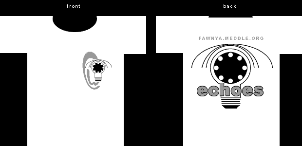
Heh...basically the explanation is that I was trying to play Storm T., and come up with a multi-layered design that would be evocative of PF without directly using any major Floydian imagery (for legal reasons, and because the last t-shirt design went that route). So what I did was try to combine some of the more minor images PF have used over the years in a new and hopefully interesting way.
So, on the back, you have a white circle partially covered by a black circle -- both an eclipse and an eyeball (the "whiskers" are the upper half of the eye...I want to modify them a bit so they also look more like waves of light coming out of the lightbulb). There are also echoes (pardon) of an umbrella -- not that that has any particular Floydian meaning. The smaller circles were meant to represent both the VariLights of Mr. Screen (that aspect stolen from the Pulse cover) and a phone (again, in combination with the "whiskers," as the handset). Didn't even think of the clock angle, but that's a cool idea, I'll have to add some more circles. And then yeah, as mentioned, the whole thing fades into a lightbulb (a literal DSoT cover reference, a harkening back to the Floyd's lightshow, and a symbolic reference to ideas, like the ones pervasive in PF's songs and like those we share on the mailing list) at the bottom...though because of the black circle up top, it also intentionally looks a bit like the hand mirrors everyone is holding in the "On the Turning Away" single.
The front is just a smaller version of the same design, with an "@" symbol distorted a bit into an ear shape to
All make sense now? Hey, if you didn't need to wonder what it all means, it wouldn't be Pink Floyd, right? ;).
(And think how much fun you could have explaining all this to some poor innocent who stopped you and asked what the design means!)
What I hope to do is get a few more suggestions (like your idea of the clock) and then produce a higher-quality, "final" design to be voted on. So if folks have ideas or other feedback. by all means please let me know...
ciao
matt