Homework
#8
1.
Considering
Fitt’s law, if asked to customize an operating system for a large widescreen
monitor, would you have the menu bar always at the top of the monitor (as in
the Mac) or included at the top of each window (as in the PC)?
a.
Given
that Fitt’s law states that the time required to move to a target is a function
of the target size and distance to the target, a large widescreen would better
be served by including the menu bar in each window. All users will have their
windows located in different places and it is impossible to predict how far
they will have to travel to reach the menu bar if it is placed at the top of
the screen.
(Universal Principles of Design – page 82)
2.
When
designing a door, what principal would you use to determine the form of the
handle or plate? If the door opens inward and you are on the outside, what form
would be most appropriate for this side?
a.
The
principal of affordance is a property in which the physical characteristics of
an object or environment influence its function.
b.
A
flat plate is most appropriate as this affords pushing, a handle would afford
pulling and confuse the user. Unfortunately, the university seems to not
understand this principal of design.
(Universal Principles of Design – page 20)
3.
In
the cogitative stage of skill acquisition, there are two principal mechanisms
by which people select operators to perform tasks. Please, name and describe
both of them.
a.
Difference
reduction – People select operators that will eliminate differences between
their current state and their goals.
b.
Operator
subgoaling – A subgoal is a goal pursued in service of a higher goal. People
set subgoals when operators do not work because some precondition is not
satisfied. For example, the subject may want to delete a word but must first
find where the word is.
HW8-Final Exam Questions
1.What are the five approaches to interface
design that you can use to increase the chance of a user engaging in flow?
CORRECT ANSWER:
Challenge
and require skill-must expend effort to acquire skills, and then apply them.
So, while playing tennis or programming are activities conducive to flow,
passive or relaxing activities such as lying on the beach aren't
Concentrate
and avoid interruption-must be able to focus their attention at length
on the task at hand. Concentrating on the task further enhances one's focus,
often enabling them to tune out other input. Activities such as reading or
painting, for example, are good at encouraging this kind of concentration
because they involve very little interaction with anything outside the
immediate task.
Maintain
control-must
be able to maintain control over the activity. Lack of control, such as when
driving in traffic is a sure way to destroy flow.
Speed
and feedback-must
allow the person to clearly set goals and receive feedback about their progress
towards those goals.
Transformation
of time-People
regularly report that their perception of time changes when they are in the
flow. This offers a direction to a possible metric for understanding flow.
2. Briefly explain what each of the elements
within GOMS are in correspondence to user behavior, and what family of methods
are associated with it?.
CORRECT ANSWER:
Goals: what the user is
setting out to achieve.
Operators:- the actions
that the software/system allows the user to take, also these are elementary
perceptual, motor or cognitive actions.
Methods: This
corresponds to sequences of sub goals and operators that can accomplish a goal.
Selection Rules: this is
used if several methods are available for a particular goal. This is not
subjective.
The family of methods associated with GOMS are
KLM, CMN-GOMS, NGOMSL, CPM-GOMS
3. What is the difference between Information
Visualization and Scientific Visualization? (Provide Examples) In addition what
are the key attributes for Information Visualization?
CORRECT ANSWER:
Information visualization corresponds to items, entities, and other things that do not have a direct physical correspondence, this can include things like basketball statistics, building attributes, and so on and so forth. While on the other hand scientific visualization corresponds to something tangible like the stresses on a girder, weather patterns, gravities effects on a structure. The key attributes for information visualization are Scale, Interactivity, and Tasks.
What is the difference between
a structured interview and an unstructured interview? When should you use each
one?
The structured
interview consists of the interviewer asking predetermined questions to the
testee, allowing little room for deviation from (typically) a specific goal.
You should use it when you want to know a specific parameter.
An unstructured
interview is the opposite; the interviewer promotes critical thinking and
open-ended discussion with the subject. You should use this in the early stages
of data collection while looking for areas of improvement.
What level of skill are the majority of users in? Describe
them. What are some HCI tools to support these users?
The
majority of users belong in the perpetual immediate in terms of skill. These
users know how to do common tasks well and know how to find help for features
they do not know how to use. Typically, they only use enough of a program to
suit their every day needs. Good tools to address perpetual intermediates are
references materials, tool-tips, and indications (but not elaborate
descriptions) of expert functions.
Describe the three stages of skill acquisition.
The first stage is the cognitive
stage. It involves a user with little effective previous experience on
accomplish a task. The user makes use of logic or a set of instructions to
solve the problem. The user typically will break a major task into subgoals
involving operators and states. He will then attempt to match a solution to the
current problem using instructions or generic skills.
The second stage is the associative
stage. At this level, the user no longer needs to logically think about each
subgoal. Instead, he develops a set of production rules that he uses to pattern
match a goal with a procedure (that he has previous experience with. In
addition, associate users tend to look at the input resources they are given
and gradually build a solution from the ground up (as opposed to novice users,
who first look at the theoretical end result and derive a solution from it,
resulting in a top-down approach).
The third stage is the autonomous
stage. At this level, the task becomes second nature to the user. The user
expends very little cognitive thinking in accomplishing the task as it becomes
autonomous. The user also has trouble explaining how to do the task because it
is done without conscious effort.
QUESTIONS
For the first two problems, refer to the following screenshot taken from Microsoft Word 2003:

(1) What Gestalt Principles are used successfully in this productivity software, and how? In addition, list any of the Gestalt Principles that are not utilized by this interface.
(2) Perform a KLM (keyboard-level model) analysis of the steps needed to produce the text listed above. You can assume that the user already has completely internalized the heuristics needed to perform the various formatting tasks. Also, state any assumptions you have for the time needed for the “keyboard” elements of this analysis.
(3) Even though Hick’s Law was not thoroughly discussed in class, its importance both to HCI and its relation to Fitt’s Law make it worth knowing.
i. Define (in English) Hick’s Law. How does it compare to Fitt’s Law?
ii. Let’s
say you are using the following application and are faced with the following
window:  For simplicity, our formula to calculate
Hick’s Law will be:
For simplicity, our formula to calculate
Hick’s Law will be:
 Using Hick’s Law, estimate the time needed to make this decision.
Note: These constants
were made up, so your answer may not make too much sense.
1.
a) Gestalt Principles present:
i) Proximity
For example, the formatting buttons (to the right of the font information) are all very close together.
ii) Similarity
For example, all of the buttons are the exact same shape. Even though all of the same-shaped-buttons are not used to the same end, the similarity works well in the grouping.
iii) Figure/Ground
Many of the buttons themselves use figure and ground (see the spell-check button)
b) Gestalt Principles not present: continuation, closure, symmetry
2.
Assumptions: 1.10 seconds to move mouse, 0.20 seconds to single-click mouse, 0.10 seconds for key, add 0.05 seconds for using shift and another key
|
ACTION |
OPERATOR |
TIME |
|
Move cursor to bold |
P |
1.10 |
|
Single-click mouse |
K |
0.20 |
|
Move mouse to “center” |
P |
1.10 |
|
Single-click mouse |
K |
0.20 |
|
Hit shift + “f” |
K |
0.15 |
|
Type “i” |
K |
0.10 |
|
Type “n” |
K |
0.10 |
|
Type “a” |
K |
0.10 |
|
Type “l” |
K |
0.10 |
|
Hit enter key |
K |
0.10 |
|
Hit enter key again |
K |
0.10 |
|
Move mouse to bold |
P |
1.10 |
|
Single-click mouse |
K |
0.20 |
|
Move mouse to italics |
P |
1.10 |
|
Single-click mouse |
K |
0.20 |
|
Hit shift + “e” |
K |
0.15 |
|
Type “x” |
K |
0.10 |
|
Type “a” |
K |
0.10 |
|
Type “m” |
K |
0.10 |
TOTAL: 6.4 seconds
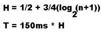
2. i. Hick’s Law is used to estimate the time needed to make a decision, based on the number of possible choices at hand. This is in opposition to Fitt’s Law, which predicts the time needed to make a movement [on a computer screen, for example] as a function of distance and the width of the object.
ii. There are four options. So our calculation will be:
H = ½ + ¾ (log2 (4 + 1))
= ½ + ¾ (log2 (5))
= ½ + ¾ (2.321928)
= ½ + 1.741446
= 2.241446
T = 2.241446 * 150ms = 336.2169 ms
(note: I went out on a limb with this problem. I am not so confident in
the result, but I feel that we glossed over Hick’s Law in class, and it seems
important).
The point breakdown is really meant to just reflect section length expectation. One of these questions could be doubled in points value to easily be a reasonable essay question.
1.
Fitts,Hicks, KLM analysis – 15 points
For each (Fitts, Hicks, and KLM) do the following:
a. Briefly describe the parameters and what they measure. (3 points)
b. Give an example where each law fails. Answers can range from the practicality of the method to situations where the method fails entirely. (1 point)
c. In what situations would each be superior to the others? (1 point)
Fitt’s Law
a.
Fitt’s Law is used to measure the time it takes for a user to point at something. This can be applied to mousing, pointing, or anything where the person is drawing a line from a start to finish area.
T = A+Blog(D/W)
A and B are constants dependent on the speed and accuracy of the device. These would change if a person were pointing with their finger as compared to pointing with a mouse.
D is the distance from start to center of the destination area.
W is the width along the axis of motion.
T is the time it takes to perform the pointing operation.
b. Fitt’s Law
Given an incredibly complex device performing a full Fitt’s Analysis would be very burdensome as the combination of motions to produce a result becomes exponential with each added option.
c. For relatively simple actions repeated over and over again Fitt’s Law gives the most accurate measure of the time it takes to perform that action. Any time there is a repetitive action Fitt’s Law can be used to optimize the time of that action.
Hick’s Law
a.
Hick’s law is used to measure the time it takes a person to make a choice when presented with a number of options.
T = Blog(n+1)
B is a constant
n is the number of choices present
T is the time it takes to make the choice
b. Hick’s law cannot be applied when the choices presented are unorganized. The logarithmic aspect of the equation relies on the ability of the person to eliminate sections of choices based on some organizational scheme.
c. By using Hick’s law you can figure out how to present lists of choices without having to create prototypes or make measurements. This makes it a good choice for early prototyping.
KLM
a.
K, P,B,H, and M are all constant times.
K is the time it takes to press a key on the keyboard. Varies greatly over user experience.
P is the action of pointing the mouse.
B is a button press/release.
H is changing tasks from keyboard to mouse.
M is the time it takes to mentally prepare for an action.
T is the time it takes to perform the series of actions.
b. KLM would be a poor choice for analysis of a very long task. As the task increases in complexity the accuracy of the KLM analysis result begins to deteriorate rapidly.
c. KLM analysis is great when you need a quick and dirty analysis of a system. Using KLM you can rapidly generate useful data instead of having to rely on HCI experts or cumbersome Fitt’s Law analysis.
2. Personas
and Ethnographic Interviews
What are the characteristics of a good persona? (6 points) Give an example of a problem developing separate personas solves? (3 points) How does the persona idea fit into the Ethnographic interview format? (3 points) (12 points)
Characteristics – at least two of the following should be discussed
- Archetypal – persona traits are based on research and information.
- Explore range of behavior – personas don’t seek to narrow the definition of a user to an “average” case but seek to understand the needs of people over a range of traits.
- Motivation/Goal based – by creating reasonable goals for personas it helps to better understand the needs of a range of people and adapt things for them.
- Narrative based – by creating a narrative for each persona it is easier to get inside the head of your proposed person, it encourages connection.
Problem
solved
Allow you to build items based on practical needs of one person which then fits into needs of multiple people. Ex, car being built for a mother with three kids instead of a car being built to try to satisfy many people’s needs and failing at all of them.
Ethnographic
Interview connection
Ethnographic interviewing is generally qualitative research. By performing good ethnographic interviews it becomes easier to develop fitting personas. Ethnographic interviews are concerned with how individuals interact within their environment, persona generation is concerned with creating reasonable people who can accurately represent the people they are supposed to. A good persona will use the items learned in an ethnographic interview to further guide the development of a product.
3.
Prototyping
a. What is prototyping? (3 points)
b. Is paper prototyping still relevant today? Explain your answer. (5 points)
c. What are some of the problems with having an early stage prototype look “sophisticated”? (6 points)
(14 points)
a. Prototyping is the process by which a design is verified by building some partially functioning version of a design. Prototypes range from low fidelity to high fidelity in their complexity. Prototypes are generally meant to be test subjects for in depth analysis.
b. Paper prototyping, like most low fidelity prototyping is still relevant today. Even in this era where computers are becoming increasingly sophisticated and powerful creating a paper prototype is an important step to verifying a design. By definition a paper prototype is simple to create and cheap. This allows for quick iteration of design before proceeding to a higher fidelity prototype. If the paper prototype is skipped and a design flaw is found to be missing later on the cost of redoing prototyping and time lost is much greater then if it had been found using paper prototypes.
c. If you skip the paper prototype phase and go straight to a sophisticated prototype that shows off some functionality several problems are encountered. First, your client may mistakenly believe that you are farther along in your process then you really are. This can lead to undue excitement and disappointment. Secondly, there is the cost issue. If you create a sophisticated prototype that has a great deal of polish then it is safe to assume some degree of significant effort went into creating it. This makes redoing the whole prototype expensive and time consuming. Lastly, if you expend a great deal of effort into creating a prototype often times it is recycled when in reality prototypes are meant to be thrown away.
Final Exam Questions:
1. What is Operator Sub-goaling and which of the three stages of Skill Acquisition does it occur in?
Operator sub-goaling happens in the Cognitive stage, and is the process of breaking down a problem into smaller problems. The solver focuses on solving the sub-goal to the main goal in an effort to achieve it.
Anderson- Memory. Pages 321 & 319. Week 6
2. Suppose you are doing a survey measuring the effectiveness of certain aspects of a new website. Under what circumstances would you select a structured interview, as opposed to unstructured, to get these results? Why?
You would want to create a structured interview when you want to quantify the responses to certain details you are already aware of. This would allow you to consistently compare the close-ended answers to the questions across interviewees.
Preece. “Data Gathering”. Page 299. Week 11
3. At this point you should be familiar with Fitts’ Law and KLM. Explain why movement times differ so much when using these two different models.
The Fitts equation contains two variables that are obtained from measuring the data, but the other two deal only with physical differences. KLM on the other hand has about 5 static variables which take into account various aspect of a single movement, not just the distance to the destination.
“High Level Theories”. Slide 6. Fitts Law website, Week 6.
Question 1
Question:
Define direct manipulation and describe its intentions. Give an example of a direct manipulation interface and explain why it is a direct manipulation interface.
Answer:
Direct manipulation is an interaction style in which objects are understood by their visual characteristics by using good affordances, good conceptual model, and convincing metaphors. In addition, every action is immediately responded by producing a rapid, incremental, and/or easily reversible visual feedback on the screen. The intention of a direct manipulation interface is to directly engage the user in performing the task. The user would get the feeling of working directly on the task and there is no need for the user to know the implementation details.
An example of direct manipulation is the trash icon on the desktop. Users can see the trash icon as well as files or folders that can be deleted. When the user wants to delete a file, he/she can drag the file into the trash icon. Once the file is placed in the trash, the file is no longer on the desktop. When the trash is empty, the icon is shown as an empty trash can whereas the icon would be shown as occupied when there is one or more files in it.
Justification:
The description of a direct manipulation is from slide #10 from the Conceptual Models lecture slides. The example is actually taken from a short essay from 2002 by Jennifer Golbeck. It can be found at http://www.cs.umd.edu/class/fall2002/cmsc838s/tichi/dirman.html. Students can give any direct manipulation example they can think of as long as they provide an appropriate explanation to support why it is a direct manipulation interface.
Question 2
Question:
Describe what to do before, during, and after the experiment to perform a successful qualitative evaluation.
Answer:
Before the experiment, have everything ready and set up so that it doesn’t waste the user’s time. Have consent forms ready for the users to read and sign them (if necessary). You should always explain the goals of the experiment and answer any questions that the users may have about the experiment or the process.
During the experiment, the tester or evaluator should always stay neutral so the users aren’t led to produce certain results. Testers should always make the users feel comfortable, allowing for breaks when needed and keeping a steady pace in a relaxed atmosphere. When the experiment becomes too unpleasant for the user, stop the test immediately. It is best if the tester allows the user to navigate his/her way through the experiment. But if the user does have a question about performing a particular task, the tester can use his/her judgment whether to guide the user.
After the experiment, debrief the users and inform them of the goals of the experiment. Once again, answer any questions they have. And pay the participants whether they have completed the study or not.
Justification:
The information that supports the answer to this question can be found in slides 3-5 in the Qualitative Evaluation slides as well as in the reading for that lecture. Also, students have conducted their evaluation for the projects in phase 3.
Question 3
Question:
Describe the differences between qualitative evaluation and quantitative evaluation. When should each evaluation be used?
Answer:
A qualitative evaluation helps to develop understanding of human experience when using the product. Usually a qualitative evaluation would only be tested on a limited amount of users. But you can find out much more information about the experience user would have when using the product.
A quantitative evaluation objectively measures human performance. A quantitative evaluation involves many test subjects to gather performance measurements. Because a controlled experiment only tests subjects on a few variables, the information gathered from a quantitative evaluation is often small compared to a qualitative evaluation but can be very significant.
A qualitative evaluation is useful when you are trying to learn about how the user would perform with a product in a real world situation. A quantitative evaluation is useful when comparing two or more different subjects or tools and evaluating which one performs better
Justification:
The
answer is mainly found in slide 1 of the Quantitative Evaluation lecture
slides. Other little information describing both evaluations can be found in
both evaluation lecture slides.
HW 8 -- Design my own final
1) What was the main point of Dr. Golbeck's PhD research? Why would this result be non-obvious if a researcher was to approach the problem with solely quantitative analysis methods?
2) What is GOMS? What would be a more appropriate ordering of the GOMS abbreviation? Is it still used today? Why or why not?
3) The fate of the universe rests on the shoulders of a student is trying to measure the distance from his cursor to a 3cmx3cm button as shown below.
x y![]()
![]()

(figure not drawn to scale; NOTE: the button is a square!)
Where x and y represent the horizontal and vertical distance from the cursor to the edge of the button respectively. The value of x has been measured to be 3 cm, and the value of y has been measured as 4cm. The student has used the following formula to calculate the estimated time it would take to reach the button.
In a surprise plot twist, evil aliens have harvested the student's entrails and it has consequently fallen upon you to solve this problem and save the universe.
Using the following formula find the Fitt's Law average time for reaching the button given a = 2, and b = 1. Assume the button is not at a corner of the screen.
![]()
Answers: (since they're not really math based with the exception of #3, I will just list points that should be covered in each answer)
1) Dr. Golbeck's research dealt with trust networks, and trying to quantify/use an algorithm to effectively measure trust.
a) The main point was that using the best and worst movies to measure a person's trustworthiness in recommending movies was actually better than using overall data.
b) This was a non-obvious point because to a person using solely quantitative methods because they would not think to measure trust as anything but the average similarity of all movie ratings.
2) Goals, Operators, Methods, Selection Rules.
a) OMSG, because it is more chronologically sound.
b) No, GOMS as a method to measure usability is worthless predominantly because it is very exact and works almost exactly like a computer program. GOMS models by definition allow for no error on the part of the user. GOMS models also labor under the assumption that users always know what to do, i.e. expert users.
3) Trick is to realize that you need to use x and y and make a triangle that shows distance to the square button:
z = 5cm.
However, this is not the distance to the CENTER of the button which is what's important in FItt's Law calculation. So we use the button dimensions and find half the diagonal to be
c = (3/2)sqrt(2) = 2.12cm
adding these 2 quantities yields the distance, D = 7.12 and S = 4.14 from c*2
the answer is now:
T = 2 + log2((7.12/4.14)+0.5) = 2+1.15 = 3.15
1) Perform a KLM analysis on this process: Looking up a word on a page of a dictionary.
MPMP. First you have to make a cognitive step to decide which column to look down, then point. Then you make another cognitive step to determine where in the column to stop.
2) If given two interfaces, one with a multitude of options and one with a simple design, which is likely to be the “best” interface considering only Ockham’s Razor?
The simple interface, as Ockham’s Razor states that simplicity is preferred over complexity.
3) In information visualization, why is scale important?
When the difference between two points is very small, but still significant, it can be hard to see if the scale is incorrect. The scale must be small enough in order to make the difference visible.
QUESTIONS
---------
1. From: Higher level model.pdf, class website
KLM-GOMS uses five different heuristics when measuring the keyboard
reponse of a user.
a. Where should M's be placed initially?
b. When should the M's be removed?
c. if a string of MK's belong to a cognitive unit, we should delete
all M's but _____________
d. When a K terminates a constant string, which M should be deleted?
e. Whena K terminates a variable string, which M should be kept?
2.From: "Show Me! Guidelines for Producing Recorded Demonstrations"
pp.6-9
Ten guidelines should be used when performing recorded
demonstrations. List any four, and describe the importance of each
one.
3. From: Usability Testing" pp.183-184
a. Describe what a "play by play" is.
b. List four of the nine tricks used in a "play by play."
SOLUTIONS:
---------
1.
a. An M should be placed in front of all K's, and in front of all P's
selecting a command
b. M's should be removed between fully-anticipated operators.
example: PMK -> PK
c. "all M's but the first"
d. Delete the M before the terminating K
e. Keep the M before the terminating K
2. Answers for eight of ten (two didn't have any justification):
1) Provide procedural information instead of conceptual. Procedural
information describes steps required to complete a task, while
conceptual information provided important theoretical information, but
not necessarily critical information.
2) Keep segments short. This keeps users engaged and minimizes the
information a user needs to remember.
3) Coordinate demonstrations with text documentation. Text
documentation can provide more details and may be preferred to explain
concepts that aren't interactive.
4) Use spoken narration. Users can easily attend to narration while
watching a demonstration.
5) Use highlighting to guide attention. Using queues the guide the
user's attention helps them more effectively trial the interface.
6) Ensure user control. Users should be able to skip parts that are
not useful to them or that they are familiar with
7) Keep file sizes small. Response time has to be good, since users do
not have a large amount of patience.
8) Strive for universal usability. The largest user base needs to have
access to the technologies being used.
3.
a. A "play by play" is a verbal reinforcement of any user
action that
might not have been obvious or visible to observers.
b.
1) Encourage questions, but don't answer them.
2) Use the users' vocabulary
3) Use open-ended questions
4) Listen for nonspecific utterances
5) Make use of "hourglass time"
6) Learn when to shut up
7) Let users decide when they're done
8) End taks early if appropriate
9) Consider allowing between-task discussion
CMSC 434 HW 8
1. What principles could conceivably be used to help computers perceive things similar to the way humans do?
Gestalt principles, especially the laws of similarity, proximity and symmetry should be relatively easy to implement. The remaining laws: closure, continuity, and common fate would be a little more difficult, as there is more inferring taking place, but should still be possible.
2. Why is paper prototyping a useful tool, when visual design packages are available and easy/quick to use?
Even though these packages are easy and quick to use, rarely are all the required actions as quick as putting pen/cil to paper, and moving scraps of paper around. Additionally, the packages encourage a more implementation-driven design as they are often tied to certain languages, whereas paper prototypes are conducive to a more high-level view of the design, as it is more abstract.
3. Why do orderings on different criteria of the same data set provide such different insights?
The ordering (such as the choices for the axis) provide explicit grouping that make it easy for humans to perceive trends. This goes back to gestalt theory: proximity and continuity help us see these things.
Question 1:
What are 2 protocols that must be followed when doing human
experimentation?
Answers
Individual
test results will be kept confidential
–Users
can stop the test at any time
–Users
are aware (and understand) the monitoring technique
–Their
performance will have not implication on their life
–Records will be anonymous
•Videos and recordings must be explicitly
approved
Taken directly from the qualitative experimentation slide, more specifically slide #3.
Question 2:
Write the KLM
interpretation of (Insert action here) and calc you time based on
K=.2
P = 1.1
H=.4
M = 1.35
R = t
Answer :
Answer will vary based on action but it will result in a list of K P M H R’S and a time
Taken from slides on Higher level models, slide #6
Question 3
What is this graph good for ?
Answer:
Depending on the graph answer could range from like discovery, exploration to noticing trends or displaying specific trends over time.
1)
Use
the Stanford Prison Experiment to explain how a similar approach or comparable
methods should NOT be used in an interviewing process for validations and the
effects it could have on the final results or outcome.
a. When the interviewer exercises too much aggressive authority, users could
be intimidated and as a result become compliant, therefore, giving answers they think the interviewer desires rather than truthful responses. This would then lead to false results.
b. In the Stanford Prison Experiment, a process of legitimizing ideology was used. This process takes an idea or product and makes it legitimate or acceptable by bringing a sense of normalcy, tolerance, or merit within a group or society. An interviewer, using this process could glean the results he prefers by communicating a certain value on the desired result, and putting a negative spin on an undesired result. This can be done through body language, voice tone, facial expressions, and actual word usage.
Source: http://www.prisonexp.org/ and
http://en.wikipedia.org/wiki/Stanford_prison_experiment
2)
Give
an example of a common misunderstanding of the discovery process from “Setting
the Stage for Discovery” by Hatton.
a. One of the misconceptions is the idea of being at the right place at the right time or chance is how discoveries are made. The reality, according to Hatton, is that discoveries come from rational and carefully planned inquiry. Most discoveries that were thought to be found by chance (such as penicillin) were, in fact, realized through recognizing interesting problems, observing carefully, and interpreting unexpected results. Then, using rational scientific methods, these results were verified.
Source: Setting the Stage for Discovery by Hatton and Plouffe, pages 109-113.
3)
According
to Bederson, what does “Staying in the Flow” mean and explain an idea that
could be used with a product or interface that incorporates his approach.
a. According to Bederson, when someone is “staying in the flow” it means they become so fully immersed in that activity, product, or interface, to the exclusion of all else, it is as if time does not exist. One approach to “staying in the flow” is to develop the design of a product or interface to avoid interruptions and to prevent the user’s concentration being broken in any way. Casinos are good examples of this being implemented in every aspect – the building interiors, lights, games, etc.
b. Another approach is to challenge the user by requiring skills to be used. Using levels, such as beginner to expert, must balance this in order to allow the user to control the intensity of the challenge. This prevents boredom but creates an environment that engages the user to develop his skills to progress to higher levels.
Source: Interfaces for Staying in the Flow, by Bederson.
1. Q) When evaluating an interface or
design without users, what are three useful approaches?
A) Cognitive Walkthrough, a task oriented technique. Action analysis, which
allows a designer to predict the time that an expert user would need to perform
a task. Lastly, Heuristic Evaluation, a kind of check-list approach that
catches a wide variety of problems but requires several evaluators who have
some knowledge of usuability problems.
Justification: I believe this is a good question because people who studied
will be able to answer this question well while people who did not study will
easily be stumped. This question is also good because if the person studied,
but can't recall them exactly, they can still creatively think of a good answer
and draw from other HCI knowledge for potential partial credit. This is from
the Lewis Reading homework on Evaluating the Design Without Users.
2. Q) Name two of nine heuristics presented
by Nielsen and describe it.
A) The nine
possible ones are:
Simple and natural dialog - Simple
means no irrelevant or rarely used information. Natural means an order that
matches the task.
Speak the user's language - Use words and concepts from the user's
world. Don't use system-specific engineering terms.
Minimize user memory load - Don't make the user remember things from
one action to the next. Leave information on the screen until it's not needed.
Be consistent - Users should be able to learn an action
sequence in one part of the system and apply it again to get similar results in
other places.
Provide feedback - Let users know what effect their actions
have on the system.
Provide clearly marked exits - If users get into part of the system
that doesn't interest them, they should always be able to get out quickly
without damaging anything.
Provide shortcuts - Shortcuts can help experienced users
avoid lengthy dialogs and informational messages that they don't need.
Good error messages - Good error messages let the user know
what the problem is and how to correct it.
Prevent errors - Whenever you write an error message you
should also ask, can this error be avoided?
Justification: I believe this is a good question because these are important
heuristics to consider and something very applicable easily applicable to real
world work. The question has flexibility, and does not punish kids who studied,
but did not memorize every single detail. It is a reasonable and pertinent
question. This is from the Lewis Reading homework on Evaluating the Design
Without Users.
3. Q) What are nonspecific utterances and why
are they important?
A) They are vocalizations like hmm, ah, oh, or oops/ They are important because
they can represent the tip of a cognitive iceberg. Along with nonverbal
gestures (like wrinkling one's brow), they are a sign of a good time to ask
"what's going on in your mind right now?"
Justification: This is a good question for two reasons. First, it is good to
know how to articulate what a nonspecific utterance is. If one is to be able to
run tests on human subjects, non-specific utterances are a very likely
occurrence and it is good to know what they are. Second, it is important to
recognize the signifigance of them. Most people think nothing of an ah, oh, or
oops, which is not smart. The question is something that anybody who did the
reading or paid attention in class would get, and people who did not will not
be able to figure it out This question comes from the Snyder Reading.
1.
Discuss this exam using at least three design principles from the
Lidwell text.
It has solid entry points for each question, using the numbers
as progressive lures to guide you from one to the next. The pages create a progressive disclosure,
giving you a few questions on common topics to think about at the same time so
that you don’t look at the test all at once and panic. It has good readability, due to the use of
conversational language and concise questions.
2.
Describe two practical real world applications of Hick’s Law.
In Martial arts, the more moves a person knows the more options
they have to choose from, and that causes their reaction time to increase. On menu bars in computer applications you
have a limited number of tabs, and each tab contains a dropdown menu, so that
you have a smaller number of things to choose from for each choice, making the
choices faster.
3.
Describe how motor programs work in terms of “Learning and Memory” (the
Skill Acquisition paper).
Once a person has come to understand a process in the cognitive
stage, and then become proficient at it in the associative stage, the process
becomes seemingly automatic by practice as the user reaches the autonomous
stage.
Homework #8
1. According to the Human Information Processor model, write out all the steps required to accomplish the following task: A guitar player is told to play a chord, and then plays it. Assume the guitar player knows how to play the chord, he is already holding the guitar, and that the task begins right before the chord is spoken. Include a description of each step along with which type of process it is.
Solution:
a. Hear the spoken words. (Perceptive)
b. Determine which chord was spoken. (Cognitive)
c. Determine where to place fingers. (Cognitive)
d. Move fingers to correct position. (Motor)
e. Strum the strings. (Motor)
2. This is the stage of skill acquisition in which cognitive involvement is gradually eliminated, and the person may lose the ability to verbally describe the action.
Solution: autonomous stage
3. If turning a car’s steering wheel to the right makes the car turn left, it is an example of poor ___________.
Solution: mapping
1. (From Lidwell page 110)What is Iconic Representation. Define and give an example of each of the four types of iconic R=representation.
Iconic representation is the use of pictorial images to make actions, objects, or concepts in a display easier to find, recognize, learn, and remember
a. Similar – Icons that are visually analogous to an action, object, or concept. For example a right turn sign with a bent or bending arrow.
b. Example – Icons that use images of the thing they exemplify or a re commonly associated with an action, object, or concept. For example scissors to represent a place to cut, an airplane to represent an airport, or a camera to take a picture.
c. Symbolic – Icons use images that represent an action, object, or concept at a higher level of abstraction. For example a padlock icon on the locking mechanism on a car or a broken glass to represent something is fragile.
d. Arbitrary – Icons use images that bear little or no relationship to the action, object, or concept the represent. The relationship must be learned. For example the radiation icon, and male and female symbols
2. (Shneiderman Designing the User Interface page 214) What are the defining elements in a direct manipulation interface. Give three examples of direct manipulation interfaces.
Direct manipulation interfaces are characterized by the visibility of the objects and actions of interest; rapid, reversible incremental actions; replacement of typed commands by pointing actions.
a. Dragging a file to the trashcan.
b. Driving a car
c. Video games
3. (Evaluating the design without users)For each of the following define the term and describe when it is most effective or a situation for which it would not be effective.
a. Cognitive walkthrough
The cognitive walkthrough is a formalized way of imagining people's thoughts and actions when they use an interface for the first time. A single task is selected and a story is told about the user trying to accomplish this task. Motivations must be given for all of the actions the user takes and must be based only on messages that appear or visible elements of the user interface. If a believable story can not be told, then it is not a good interface. It is effective for examining a single specific task conducted by a novice user.
b. “Back of the envelope” Action analysis
List a series of action to accomplish a task and analyze them. This is done informally. This analysis is effective in determining if there are too many steps in a task or if the user is forced to remember too many things in-between steps of a task.
c. Heuristic analysis
Analyze a design based on several, predetermined Heuristics. This analysis should be done by a few HCI professionals in order to identify the majority of the problems and is good for identifying major problems that might cause a user to make mistakes, as well as smaller problems that might slow down the user.
4. (And one more just for fun)Provide a student with a picture of one of the teams phase 3 projects or their own. Ask them to analyze the design and justify improvements based on design principals learned this semester.
Answer is specific to each project, but credit is given if an honest attempt is made.
Q1.
Give 3 examples of feedback and describe why feedback is important.
A1. -Visual: when someone clicks something on the screen, it changes color.
-Audio: when a button is pressed, a sound is created to signify the press of the button.
-Tactile: when a button is pressed and released, you can feel a click on your finger.
-Feedback is important because it lets the user know that he/she did something, which can help establish causality and also help a user figure out how they got to an undesirable state so that they can reverse it.
The answers to this question can be found in slides 02, on slide 13 and in the reading, Psychopathology of everyday things pg 27. I think that being able to recall all three types of feedback is reasonable because as long as someone can remember what feedback is, even if they can only remember one or two from reading, they can imagine the remaining ones.
Q2.
List two different ways that the design process can be “centered” (ex
“animal centered design”) and explain what makes each selection different from
the other.
A2. There are three:
-“System Centered Design” which focuses on what can easily be built on a certain platform, what can be made form the available tools/technology, or what a given programmer or team finds interesting to work on.
-“User Centered Design” which focuses on a user’s abilities and real needs based on context. The design process is a collaboration between designers and customers. The goal of this process is a satisfied customer.
-“Designer Centered Design” which poses the assumption that experts know best and that users can’t see past what they know and don’t really know what they need.
The answers to these questions can be found on slides 03, slides 5-8. Please note that only one aspect of each design paradigm is sufficient to show knowledge of how it is different from any other design paradigm chosen. I think being able to remember two of the three is reasonable.
Q3.
List and briefly describe the function of each of the three processor
types associated with the human information processor model.
A3. -“Perceptual Processor” is the part that receives information in the form of sensory data (vision, hearing, sound, tactile, taste) and stores it in the brain for further processing.
-“Cognitive Processor” is the part of the brain that processes sensory information. It can only focus on one task at a time.
-“Motor Processor” is the part that can execute motor programs. It receives input from the cognitive processor and is basically a form of auto-pilot because it can run multiple “programs” simultaneously.
The answers to these questions can be found in slides 09-10, on slides 3-15. This question is good because it only asks general questions about the model which someone who has not studied it will not be able to answer.
1.
Define “system centered design”, “user centered design” and “designer centered
design” and explain the differences between the three. Which is the best approach to have as a
designer?
Answer: System centered design is design
based completely on the system you are
designing for and with. It asks:
what can be built on the system? What
can I build with the tools I have, and
what do the programmers find interesting?
Designer centered design is
design that assumes the users don't know what they're talking about and
that experts know best. User centered design is the best approach to
have as a designer. It views the user as the central figure in the
equation, acknowledging that the result of a
good design is a satisfied user, that designing is a collaborative
process between user and designer, and
that the user and the designer should stay in constant contact throughout the process. (Lecture 3, Brainstorming, slides #5-8)
2.
What makes mobile devices so hard to design for?
Answer: Mobile devices are important, but they are
very difficult to design for for a
number of reasons. First, they
have restrictions on input and output (small size of buttons and small screen), limited resources,
a very diverse context of use (people use
them in all kinds of different situations), a wide range of forms and
styles for mobile devices, and people
usually have limited attention to devote to their mobile devices (they are often used in multi-tasking
situations. (Lecture 19, Mobile Devices, slides #4- 8)
3.
Why is visual design often a better way to communicate data than through
something like a spreadsheet? And what
are the key attributes of information visualization?
Answer: Humans are visual creatures, and
therefore visual information can be
processed much faster than other information. We can easily see trends, patterns and outliers in the data when it is in visual
form, but all that is hidden in something like a spreadsheet.
This facilitates communication and discovery. The key attributes of information visualization are scale (how do
you make sure to keep a meaningful scale
when data set becomes large?), interactivity (to be able to show
multiple takes on same data), and what
tasks you want to support (ideally discovery, decision making and explanation).
(Lecture 18, InfoVis, slides #3-6)
1.
Question:
According to the guest speaker which
person would you be more likely to trust in giving movie recommendations, and
explain why.
Person A
Had completely different ratings on
your favorite and most hated movies, but exactly matched on all movies
inbetween.
Person B
Matched your favorite movie and most
hated movies, but had completely different ratings on everything else.
Answer:
Person B. While person B might only have 2 movies in
common, a user is more likely to trust the opinion of some one who tends to
agree on the movies that lie on the extreme ends of a rating scale. If a user received a recommendation for a
movie a Person X really likes, this user would distrust Person X if he/she
ended up really hating that movie.
Source:
From the 4/30 talk on social networking
and trust.
2.
Question:
How are nonspecific utterances helpful
in evaluating the effectiveness of a user interface?
Answer:
Nonspecific utterances are words like
“uh”, “ah”, “hmm”, “oh”, etc. Users tend
to unconsciously say these words when they use an interface. The interviewer should take note of these
verbal cues, because they reveal when users encounter some type of difficulty
with an interface.
Source:
From the 4/14 reading.
3.
Question:
In a Likert scale, name 2 issues
involved in selecting the number of options.
Answer:
1.
Whether to use an even or odd number of
options. Selecting an odd number of
options gives users a middle point.
However, with an even number of options, the user is forced to choose a
side.
2.
The number of options. Having a large number of options provides a
greater level of precision in an answer, but people, when faced with a large
number of options tend to select points towards the center. It's also difficult to accurately choose the
right option among a large number of choices.
Source:
4/16 reading
You
are given the following data: height in cm for each student in the class for
the past decade. (I couldn’t find the data in the file)
1. Sketch a
visual representation of the average height per year and explain how you used
the following principals:
A. proximity
B. effective mapping
C. alignment
2. Applying
View Transformations, describe a way to show all of the past ten years of data
in a table to the user via a interactive display.
3. Describe
two examples of a mobile phone applications that are conductive to “being in
the flow.” What properties do they share? What is a common counter-example?
1. Lidwell,
et al pp 22, 160 12 – card – readings in info vis.pdf p 23 (Shneiderman)
A sorted
(alignment) bar graph ( effective mapping) with good spacing and labeling
(proximity).
2. 12 – card
– readings in info vis.pdf p 31 (Shneiderman)
The
Bifocal Lens and Information Mural are two possible ways of showing mass
amounts of information and allowing the user to focus in on what they want.
3. http://www.acm.org/ubiquity/views/v5i27_bederson.html
(towards
the end of the abstract)
Games and
Productivity applications are among two examples .They are conductive to flow
by challenging the user to learning with either increasing difficulty or
techniques for data entry, keeping the users concentration, having good
feedback, allowing the user to maintain control of their actions, and letting
the perception of time slip away.
A counterexample
is getting a phone call, which is possibly the definition of interruption on a
mobile device.
1) What is affordance, in the terms of this
course? Provide an example.
-Affordance is a property in which the
physical characteristics of an object or environment influence its function.
-Affordance can be found in outdoor
lighting. While the design of the device is to provide light, its overall
design affords its usefulness to birds as a perch.
2) What are direct-manipulation interfaces?
In class, the possibility for a blurred boundary between direct and
non-direct-manipulation interfaces. This was raised with the video game
example. Make a short argument of why video games may not be a
direct-manipulation interface.
-Direct manipulation interfaces are
those which allow more intuitively “physical” actions to accomplish a task,
rather than obscure keystrokes (in the case of computer programs) or other
non-intuitive operations.
-Video games can possibly be considered
as non-direct-manipulated. With the exception of systems like the Nintendo Wii,
most games use a set of button-pressing which is nothing close to any real
experience simulated in the game.
3) What is progressive disclosure? Give an
example of its successful usage in something you've seen.
-Progressive disclosure is a strategy
for managing information complexity in which only necessary or requested
information is displayed at any given time.
-In the Nero Express 6.0 cd-burning
application, when you are at the "burn" stage, advanced options are
hidden by a drop-down tab. It can be easily activated to show these options ,
but by default, the options are hidden.
May 12, 2009
Q. Define augmented reality.
A. Augmented reality is a system which enables users to see the real world with an overlay of additional information.
-Augmented reality is quite different from virtual reality because users have an augmented view of what they are using. Augmented reality has a lot of uses because users are interacting with real objects vs. virtual ones.
Source - http://www.cs.umd.edu/~bederson/classes/hci/handouts/08%20-%20shneiderman%20-%20DTUI.pdf – 22/24
Q. Given that a square, diamond, and square of equal size and color are placed next to each-other. We know that the human mind will perceive the shapes to be of different sizes. Which shape will be perceived to be the largest?
A. Square
-According to the readings the human mind perceives straight edges to be larger than rounded edges which are perceived to be larger than angled edges.
From Slides – Graphic Design – 12/24
Q. Explain Change Blindness as it relates to information Visualization
A. Change Blindness is a phenomenon in which a person takes a long amount of time, approx 15s or more to recognize a gross difference between two items. This is very important to information visualization because it requires users to examine change.
-Information Visualization requires users to examine change. People designing the implementations must take phenomenon such as change blindness into account.
Source - http://www.cs.umd.edu/~bederson/classes/hci/handouts/12%20-%20spence%20-%20information%20visualization.pdf 7/16
1.
Mobile Devices (20 points) [From April 28th Slides)
a. List three key challenges with designing
interfaces for mobile devices (5 points):
This is from slide #4. The answer can be 3
of the following:
-
Limited I/O
-
Limited Resources (CPU, money, bandwidth, battery)
-
Diversified Context of use
-
Different Activities
-
Limited Attention
b. Based on what we discussed in class
about affordances and mobile devices, describe 3 affordances made my mobile
devices and for each affordance, give an
example of a device that failed in understanding each individual affordance to
design a good interface [From April 28th slides and “The
psychopathology of everyday things”] (15 points)
The answer to the list of affordances is
on slide 10 of the April 28th class. One must know the meaning of
affordances from the artcile “The Psychopathology of Everyday Things.”
-
Small screen / varying resolution: Mobile devices have small resolutions
so that they can show only the most important information. Many websites such
as Facebook, Gmail and other popular websites have designed interfaces that are
easy to read for mobile devices (I.e. have larger fonts, only important
information displayed). However, an example of an interface that did not
address this affordance is the Nokia website for downloading add-ons. The
website is very wide and requires the user to navigated to the left and right
to view the desired information.
-
Many mobile devices are designed to use while driving- However, until
this day there are companies that design their mobile car interfaces with touch
screens, which makes this very difficult.
-
Speech Input- This is the primary purpose of many phones, to talk into.
However, there are still many phones that only allow the user to speak into for
actual speaking, but do not have voice enabled commands that would enable the
user to speak into while driving a car for instance.
2. Evaluating the Design Without Users [from Evaluating the Design without Users]
-
List the 4 things
that are needed before you can perform a cognitive walk through
-
1) You need a description or a prototype of the interface. It doesn't
have to be complete, but it should be fairly detailed. Things like exactly what
words are in a menu can make a big difference.
(2) You need a
task description. The task should usually be one of the representative tasks
you're using for task-centered design, or some piece of that task.
-
(3) You need a complete, written list of the actions needed to complete
the task with the interface. (4) You need an idea of who the users will be and
what kind of experience they'll bring to the job.
-
What should
you look for during a cognitive walk
through?
-
Will users be trying to produce whatever effect the action has?
-
Will users see the control (button, menu, switch, etc.) for the action?
-
Once users find the control, will they recognize that it produces the
effect they want?
-
After the action is taken, will users understand the feedback they get,
so they can go on to the next action with confidence?
-
List Nielsen and
Molich's Nine Heuristics and describe each one:
Simple and natural dialog - Simple means no irrelevant or rarely
used information. Natural means an order that matches the task.
·
Speak the user's language - Use words and concepts from the user's
world. Don't use system-specific engineering terms.
·
Minimize user memory load - Don't make the user remember things
from one action to the next. Leave information on the screen until it's not
needed.
·
Be consistent - Users should be able to learn an action
sequence in one part of the system and apply it again to get similar results in
other places.
·
Provide feedback - Let users know what effect their
actions have on the system.
·
Provide clearly marked exits - If users get into part of the system
that doesn't interest them, they should always be able to get out quickly
without damaging anything.
·
Provide shortcuts - Shortcuts can help experienced users
avoid lengthy dialogs and informational messages that they don't need.
·
Good error messages - Good error messages let the user know
what the problem is and how to correct it.
·
Prevent errors - Whenever you write an error message you
should also ask, can this error be avoided?
3. Information Visualization
a- Based on Information Visualization
discussion in class, provide an example of a great visualization discussed and
a visualization that was a catastrophe.
Good Visualization: Illustration of John
Snow's deduction that a chlorea epidemic was caused by a bad water pump. The
Dots on his map indicated location of deaths.
Bad Visualization: History of O-Ring
Damage in Field Joints for Space Ship.
1. After learning to drive manual shift and driving for several years, Jim Bob finds it difficult to precisely explain the process to his friend who is now learning. What stage of skill acquisition is making it hard for Jim Bob to help his friend out, and why is that stage making things difficult?
Jim Bob’s skill of driving a stick shift has reached the autonomous stage. At this stage there is little cognitive involvement in application of the skill so it is hard for Jim Bob to relay what he is actually doing to his friend.
2. List three common practices of a successful brainstorm and why they are important.
- Everyone has an equal role and status in the brainstorm. This encourages innovative and radical ideas to come to light that otherwise may have been restrained because people felt their opinion was not of equal importance.
- Write the flow of ideas down in a medium visible to the whole group. Brainstorming is an intensely group-oriented process, and the facilitator’s rapid scribing is one of the focal points that hold the group together.
- Number your ideas. It motivates participants before and during the session by giving them a goal to shoot for, and it’s a great way to jump back and forth from idea to idea without losing track of where you are.
3. One of the Iphone’s major boasts is that it only sports one hardware button. Why would more hardware buttons, from an interface point of view, possibly be more efficient?
Hardware buttons are still the fastest way to access commonly used applications. Navigating an interface, no matter how clean and well organized, will always be slower than the one or two-click navigation a hardware button provides.
Note: Each “question” is a list of questions
pertaining to one topic (bolded) in a reading or lecture.
1. Source:
Reading 4/2/09, “Interfaces for Staying in the Flow”
·
What does it mean for a user
to be “in the flow”?
o When a user is “in the flow,” they are engaged
and in control of an activity.
·
What are activities that are
conducive to flow?
o Any activity that requires skill and effort
§ Example from the text: playing tennis and
programming
§ NOT relaxing or lying on the beach (any passive
activity)
·
(1) What is an example of an
application that goes against the general idea that interfaces should be simple
enough to use without documentation? (2)
Why does this application continue to be successful regardless of this idea?
o (1) Photoshop, Emacs
o (2) Usability issues are minimized. Once the users have mastered this
application/tool, they can use it as if it is an extension of their body,
allowing the user to complete a task without the interruption of flow by
usability problems.
o Note: This question may be too specific for the exam.
·
(1) How does interruption
while completing a task affect the user’s perception of time? (2, similar to question 1) How does the user
perceive time when “in the flow”?
o (1) The user perceives the task to take longer
to complete when interrupted than when not interrupted.
o (2) The user perceives the task to take less
time when not interrupted (loses track of time).
·
(1) How does the role of
feedback change when expert users use keyboard shortcuts? (2) During what stage of skill acquisition
does the role change?
o (1) The users do not rely on feedback when
doing a task.
o (2) Autonomous stage (Basic idea: Users do not
need feedback in this stage because the action and its result are learned).
2.
Source: Reading 4/30/09, “The Reader-To-Leader
Framework: Motivating Technology-Mediated Social Participation”
·
What are the levels of social
participation in online social activities? Describe each level and its role in
the spread of social participation.
o Reader
§ Readers visit, search, and learn the basic
functionality of the social networking sites.
If their reading experience is effective, they will encourage the growth
of the social networking site by spreading information about the site through
word-of-mouth. Readers often search for
the information that contributors provide them (i.e. customer reviews, blogs,
etc).
o Contributor
§ Contributors add to the social networking site
through corrections to wikis, photograph tags, ratings, status postings,
etc. Their contributions are essential
for drawing in new readers.
o Collaborators
§ Collaborators describe contributors that work
together to share information on a social networking site (i.e. working
together to develop a Wikipedia page on a certain topic). Their contributions are also essential for
drawing in new readers.
o Leaders
§ Leaders are the most active contributors. They start discussions and arguments that
attract the participation of other contributors. They encourage increased activity from all of
the levels beneath them. Leaders tend to
have to monitor the activity of other contributors, mediating the disputes
spawned from their discussions.
3.
Source: Reading 3/31/09, “Evaluating the Design
Without Users”
·
(1) Which method of evaluating
the design without users is most directly tied to KLM/GOMS? (2) Describe this method. (3) What problem(s)
with the interface does this method identify?
o (1) Action analysis
o (2) In action analysis, the physical and mental
steps the user needs to do are compiled and then analyzed for problems. The simplicity of the action sequence and
steps executed help in evaluating the efficiency of the interface. The list of steps also helps identify what
the user has to learn in order to use the interface (and therefore, the ease of
use is evaluated).
o (3) Action analysis reveals efficiency problems
(whether the task takes too many steps or the steps take too long to execute).
CMSC434
5/12/09
Homework 8
1)
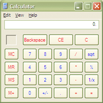
A user wants to find 8 squared using this calculator. How could the time it
takes to do this be improved in terms of:
a) Fitt’s Law
b) KLM
2) Describe the three phases of skill acquisition and why each one is faster than the last using the human information processor model.
3) A common design mistake is to group thing by placing a box around them. What is wrong with this and what is a better way to show that objects are in a group?
Answers
1) Source: Fitt’s law stuff, “High-level Theories” slides, and “Information Processing and Skilled Behavior” reading.
a) Make the buttons larger, especially commonly used ones like equals, and move them closer together.
b) Add an “x2” button to the calculator to reduce the number of steps it takes.
2) Source: “Human Information Processor” and “Skill Acquisition” readings.
a) Cognitive phase: the user has to think declaratively about each step in the process and how to proceed to the next step. This is slow because the user must take several cognitive steps figuring out what action to use, another cognitive step deciding to actually use the action, and a motor step to perform it.
b) Associative phase: the user no longer has to cognitively decide what action to take next because they have learned the correct actions from experience. However, they still have to consciously perform the action. This is faster because it eliminates one or more cognitive steps in deciding what action to perform.
c) Autonomous phase: the action has become instinctual and the user no longer has to think about it at all. This is ever faster because it eliminates the cognitive step entirely; the user simply moves from one motor step to the other by instinct.
3)
Source: “Graphic design” slides and
“Organization and Visual Structures” reading.
Placing a box means the user has to see the box and then look at which objects
are contained within the box to tell that they are grouped. It is much better
to use gestalt principles such as proximity or similarity because the user will
instantly see that they are grouped without having to think about it.
1)
Q: In recent years,
interface design for mobile devices has become prominent. Why are so many
people concentrating on mobile interface design, and what are some of the major
challenges faced when doing so?
A: Interface design for
mobile devices had become popular because cell phones are bought and used much
more often than computers. Some of the key challenges faced by mobile interface
designers include limited resources (such as CPU and memory), limited attention
by mobile users, a wide range of forms and styles to design for, and a much
smaller display screen to work with.
Source:
2)
Q: Many copy machines
today have a Copy button which is labeled “Copy”, has a different color than
the other buttons on the interface, and is a little bigger than the other
buttons. Assume you are about to do a cognitive walkthrough for a particular
copy machine interface, but unlike other copiers, its Copy button is the same
color and size as the other buttons, and is not labeled. One desired action is
to make a simple copy. For this simple action, at what stage(s) could you find
problems with the design of this interface?
A: You would most
likely find problems at stages 2 and 3. Stage 2 deals with whether the users
see the control. Because the button is similar in size, shape and color to the
other interface buttons, the user may completely overlook it since it doesn’t
stand out. Stage 3 deals with recognizing that the control produces the desired
action. Even if they do see the button, the lack of any label (or other sign)
means the user may never know that this particular button is meant for copying.
Source: Evaluating the
design without users (Lewis & Rieman)
3)
Q: When designing an
interface for Address Book software on a handheld device, many times the “Add
Contact” button is right there, while the “Delete Contact” option can only be
accessed after going through one or several menus. Why do designers sometimes
give unequal layers of accessibility to controls with equal but opposite
functions?
A: The functions may be
equal, but may not be used equally frequently. For instance, in the example
above, Haitani argued that the “Add Contact” feature would probably be used
much more often than “Delete contact”, and so “Add Contact” button should be
highly accessible. Deleting a contact, anticipated to be used more rarely,
should be less accessible.
Source:
Designing
the Palm Pilot (Eric Bergman)
- Why was the butterfly ballot a
poor voting interface? Suggest an improvement that could be made to
improve the interface.
- ANSWER: The butterfly ballot had
poor alignment. It caused confusion about which bubble to fill in about
which candidate. Aligning the names onto one page instead of having the candidates
alternate on pages could have solved this problem.
- Are the following good interview
questions?
- Which color scheme do you like
better?
i. ANSWER:
This is a good question. It is open ended and doesn’t suggest a specific
answer. It is beneficial since the user will give his actual opinion.
- Why is this interface bad?
i. ANSWER:
This is a bad question. It suggests that the interface is bad, when in fact the
user might actually like the interface. A better question would be “what do you
think about this interface.”
- Define a mental model.
- ANSWER: Mental models are mental
representations of how people understand and interact with systems and
environments developed through experience.
1. What are TWO of the key challenges of mobile
devices? List an example of each
challenge and briefly explain.
a. Limited resources
i.
CPU – The processor power of a
mobile device will be very limited compared to a desktop or laptop. Applications will have to be made to run fast
and meet the real-time requirements of mobile devices.
b. Limited attention
i.
Driving – Mobile device users
who use the device while driving for applications like GPS will require the
device to be able to give them all the information they need in the small
window of time that they can keep their eyes off the road and on the device to
receive their information. If the device
cannot provide information within that window of time, the application and
device is useless to that user while driving.
2. Describe the concept of information
visualization.
a. Information visualization is the concept of
providing tools that present data in a way to help people understand and gain
insight from the data.
3. What is the difference between information
visualization and scientific visualization?
a. Scientific visualization primarily relates to
and represents something physical or geometric; Information visualization
relates to items, entities, things which do not have a direct physical
correspondence.
1. List 6 of Nielsen’s 10
heuristics, and briefly elaborate on how each can be achieved.
Solution:
- Simple and natural dialog -
Present information in natural order, remove or hide irrelevant or rarely
needed information on screen
- Speak the users’ language - Use
meaningful mnemonics, icons and abbreviations.
Try to use language compatible with the user’ conceptual model
- Minimize user memory load -
Promote recognition over recall and describe expected input clearly. Use general commands that can be applied to
all interface objects
- Consistency - Make sure there is
the same action and same effect in equivalent situations. Be consistent in input and output
format. Make sure similar tasks are
handled in similar ways
- Feedback - Users should always be
aware of what is going on, but do not overburden users. Provide redundant information.
- Clearly marked exits - Cancel
button or Esc key for dialog, and make the cancel button responsive. Universal undo.
- Shortcuts - Keyboard and mouse
accelerators, toolbars and tool palettes, and navigation jumps.
- Prevent errors - Design modeless
interfaces. Provide undo mechanisms
instead of confirmations. Check for
reasonable inputs and make entering an incorrect format impossible. Make the current goal clear.
- Good error messages - Explain the
problem in terms in the user conceptual model.
Don’t make the user feel stupid.
Offer a way to correct the problem.
- Provide help and documentation -
Use reminders and a clear learning path.
Have a quick way to access critical information.
-
-
(Usability
Heuristics I slides #9-27)
2. List the 4 terms in which GOMS describes user
behavior and briefly elaborate on each.
Solution:
- Goals - A thing that the user
wants to accomplish.
- Operators - Elementary
perceptual, motor or cognitive actions
- Methods - Sequences of sub-goals
and operators that can accomplish a goal
- Selection - Should be objective,
and used if there are several methods that are available for a given goal.
(High-level
Theories slides #2)
3. Describe the differences between Working
memory and Long-term memory.
Solution: Working memory has a limited attention span
and is content dependent. It is also
accessed in chunks, depending on the task at hand. It is also relatively small in capacity. Long-term memory, on the other hand, has very
large capacity, and has associative access.
The context at the time of acquisition of information is key for the
retrieval of that information. There is
no half-life but retrieval might fail if no associations can be found.
(The Human
Information Processor I slides #12 and 13)
1.
Cognitive Walkthroughs
a.
What four things are needed
before performing a cognitive walkthrough?
3/31 – Usability Heuristics I, slide 3; Task-Centered User Interface Design, Ch 4.1.2 and 4.1.3
1.
Description or
prototype of interface
2.
Description of
task
3.
List of actions to complete task
4.
Background of user
b.
What four questions should
designers ask themselves during the steps of the walkthrough?
1.
Will users know to perform the
given action?
2.
Will users see the control
(button, menu, switch, etc.) for the action?
3.
Once users find the control,
will they recognize that it produces the effect they want?
4.
After the action is taken,
will users understand the feedback?
2.
Information Visualization
4/23 – Information Visualization, slides 3-6; Card: Information Visualization: Using Vision to Think, pg 2.
a.
Define the term “information
visualization.”
Information visualization is a method of presenting
information in a way that provides viewers with additional insight and
understanding. This type of data aggregation is defined by interactivity and
scalability based on a specific task set that allows viewers to discover and
explain ideas about the information. It is useful in identifying patterns and
trends in data sets, especially those with many variables, those with large
data sets, or those whose dependence is not obvious.
b.
Which types of information are
better suited for information visualization? Which for scientific
visualization? Give an example and explain why this type of visualization
works.
Information visualization lends itself to
multi-variable data or items that do not have a direct physical correspondence,
especially when identifying changes over time. Climate changes would be suited
for information visualization because many variables (high temps, low temps,
rainfall, differences in temperatures, water levels, etc) can be presented on
one medium, and the most important factor, time, can be used to identify
gradual trends.
Scientific visualization is usually used with items
that are physical, finite, and well-defined; with scientific visualization, the
key is to present one’s findings with data, not necessarily examine the data
for new findings. One example is the number of college students who enter
college with Undecided majors. There is nothing to glean from this information;
it is merely a set of data that can be plotted along finite axes.
3.
ICDL Project
a.
Define four of the six
fundamental design goals, give an example, and explain how your ICDL
implementation was designed to fulfill them.
1/29 – Design of Everyday Things (slides 7-14), 2/3 – Norman: Psychopathology Of Everyday Things (POET).
1.
Provide the right affordances – The affordance of an
object conveys to the user what an object is for: its possible uses, actions,
and functions (Norman 9). A ball affords throwing, rolling, kicking, bouncing,
etc.
2.
Provide the right conceptual model: A conceptual model is
the way that the user imagines an interface will work and allows one to predict
the effect of an operation (Norman 12-13). The conceptual model of a doorknob
may be that turning it clockwise and pushing forward will open a door.
3.
Provide a good mapping: A mapping is a relationship
between two objects, and providing good mappings easily establish relationships
between controls and their outcomes (Norman 25). The mapping between a steering
wheel and the resultant movement of a car is natural and easily learned;
turning the wheel right or clockwise moves a car to the right.
4.
Make things visible: Visibility refers to whether
the features of an object or interface are apparent to the user. Toolbars do
not provide full visibility, as most of the actions are hidden inside menu
options.
5.
Provide feedback: Feedback should communicate
to a user the result of an action that he or she has completed. (Norman 27).
Dialing a phone number on a cell phone provides auditory feedback in the form
of a tone for each button press and visual feedback by displaying each digit on
the screen.
6.
Recognize causality: Causality involves providing a response or
feedback to the user that his or her action results in an action. If the action
cannot be immediately completed, the user should be provided with a response
that indicates that their action was received.
b.
Give four of the Gestalt
design principles and explain how each was used in the implementation of your
project.

Proximity, similarity, continuity

Closure, Area, Similarity
Alignment
c.
Perform a cognitive
walkthrough of one feature that was added to the webpage during your ICDL
implementation. Limit your response to
one specific task.