AGIL
ACTIVE GLUCOSE INSULIN
CONTROL SYSTEM





The first stage of the development process was to find out exactly what the current systems on the market offered, and to research what users would really want and need in an advanced diabetes management system. What we found was that nothing like AGIL currently existed on the market, and we could not find any plans available publicly that showed that something like AGIL was even being developed. This was good in the respect that we wanted to create something innovative, but it did not give us much to go on in terms of development ideas.
What we did was create a list of possible tasks that we envisioned AGIL being used for. We specifically chose tasks that highlighted features of AGIL we wanted to implement, but which were not features of currently existing products. From this, we were able to determine the system requirements that would be necessary to implement such a product.
Task Examples
1.) A new user sets up his insulin delivery schedule.
John, a teenage high school student visits his physician with his parents. Up until recently, he has used insulin injections to control his blood sugar level. He is just starting to use a full time glucose pump in conjunction with the AGIL Software, and wants to set up two initial presets for basal insulin delivery: one for school days, and one for weekends. John and the physician together enter key parameters, specific to John’s blood sugar needs, and create the two delivery programs. John and his parents are shown how to make minor adjustments to the presets if necessary.
Discussion: This task is very important, but occurs infrequently. Over long periods of time, the presets might need adjustment, but the hope is that this will not happen very often, and that it automates the process of insulin delivery to some extent. The user will most likely need help with this step, as the entire process will be brand new to them.
2.) A user delivers a dose of insulin before a meal.
Stacy, a middle-aged woman, sits down for lunch. She starts the AGIL Software and checks to see if she already has a preset programmed for the meal she is about to eat. She finds that she has not set one up yet, and does not really have the time to do so at the moment. Instead, she enters the amount of carbohydrates she is about to ingest, and the AGIL Software calculates the amount of insulin necessary to balance out the meal. After reviewing the amount that the software suggests, she accepts, and a bolus of insulin is injected through the glucose pump. This data is recorded for her.
Discussion: This task will most likely be one of the most frequent performed by the user, and one of the most important. The only piece of data the user must have is the carbohydrate count of their meal.
3.) A user checks his blood sugar level.
Joe takes a break between classes to check his blood sugar level. From the numerical data, he sees that it is currently slightly low, although not low enough for the software to signal an alarm. To give himself an overall idea of when it started to drop, he looks at the day’s level chart. He finds that his blood sugar dipped after his last meal, and concludes that he may have taken too much insulin in his last bolus dose. He decides to flag the current reading as an important one for later review.
Discussion: This task is not as frequent as the others are, but still of moderate importance. Graphs make it easier to see where a user’s levels have been, and where they currently are.
4.) User sends data to doctor for analysis.
Stephanie delivers repeated insulin doses, but her high blood sugar level remains unaffected. Attempts to adjust her basal rate and deliver a corrective bolus have proved ineffective, so she decides to contact her doctor. While speaking with her on the phone, the physician requests a record of Stephanie’s sugar levels for the entire day. To avoid any potential errors in manually reading the data over the phone, Stephanie has the AGIL Software email her doctor in plain text all the readings for the day. The physician is able to review the accurate data before Stephanie even enters the doctor’s office.
Discussion: This task is important, yet infrequent. The ability to transfer a large amount of data to a doctor in an accurate way could be very helpful in a situation where the user is unable to stabilize their blood sugar level themselves.
5.) User adjusts their insulin delivery for an exercise routine.
Kyle decides to make an unscheduled stop at his gym for a quick workout. He picks out a treadmill, and then realizes he should adjust his basal insulin delivery rate so that his insulin levels do not drop too low during his exercise. Using the AGIL Software, he chooses a delivery rate corresponding to moderate exercise, and then enters the amount of time he plans to run. He initiates the delivery program, and then starts to use the treadmill.
Discussion: This task is of moderate importance, and will occur at varying frequencies depending on the specific user’s lifestyle. Someone who exercises at a consistent rate and on the same days of the week every week could factor that in to their initial presets (see task 1). Unscheduled exercise or physical activity however would require a task like this one.
6.) User checks a patient’s information at a nursing home.
Mary is asleep, and it is time for her sugar levels to be checked. A nurse walks into her room, and runs the AGIL Software on the PDA already located in the room. The nurse checks Mary’s current level against the data on her chart, and sees that it is right where it is supposed to be. Mary does not even need to be woken up.
Discussion: This task is of minor importance, but shows the convenience the software can provide. Frequency would depend on the user and their needs. A child could be monitored by its parents in a similar way.
Required
· PocketPC 2002 or later – A modern, color Personal Digital Assistant (PDA). Unit must be fully functional with the ability to vibrate.
· A device added onto the PocketPC to enable it to communicate with the insulin pump
o This device should also display the latest blood sugar level constantly independent of the main device screen, so that the PDA’s batteries are not needlessly wasted just to see one number
· Insulin Pump, capable of communicating wirelessly with the PDA.
Optional
· Cellular phone capabilities.
Required
· .NET Compact Framework
· AGIL Software
- Wireless internet capabilities, either through Wi-Fi or Bluetooth.
Low Fidelity Prototype
From the task examples and system requirements, we were able to develop a low fidelity prototype. We hand drew approximately 95% of AGIL’s screens, keeping in mind what we wanted the system to be capable of. A few of these original drawings are shown below; the rest are available in AGIL’s design portfolio.
Click on a thumbnail to view a larger image.
|
|
||||
|
|
||||
|
|
||||
|
|
|||||


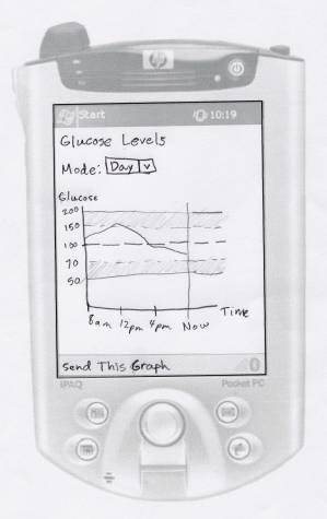

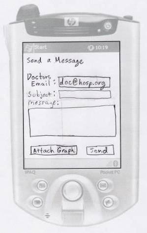
It was our original intention to create two completely different hand drawn prototype designs. After designing the first prototype however, we decided it would be better to do an unofficial review with a diabetic to get some suggestions for changes and improvements. These suggestions were than incorporated into a short design document for a second prototype. Although the second low fidelity prototype was never actually drawn, many of the concepts we had for it were combined with our drawings to build the final high fidelity prototype.
High Fidelity Prototype
The high fidelity prototype was developed in Visual Basic .NET 2003, using the low fidelity prototype as a guide. As the system was built, it was clear that some changes were necessary to increase functionality, and to make AGIL easier to use on the small screen of the PocketPC. While some of AGIL’s screens largely resemble the low fidelity drawings, many had to be altered.
AGIL’s code was developed in two parts. In one, the setup process was created. The setup process is where users tailor the system to their specific needs. This only needs to be done by a user one time, but it is still extremely important. The data that is entered controls all aspects of how AGIL functions later on, so we felt it was necessary to make the process as clear and easy as possible. In addition, the setup process would be any user’s first contact with AGIL, and we wanted to make sure it did not scare anyone by being bloated or overly complicated. The setup screens were designed with all these issues in mind.
The second part of AGIL’s code development was implementing the actual functionality of the system, so that users could complete the tasks that AGIL was designed to handle. This consisted of developing the home screen, and all of it’s linked screens, where users would spend the majority of their time.
Once the high fidelity prototype was created, the usability test was initiated.
Our usability test was conducted using a high fidelity prototype of the AGIL software, on actual PocketPC units. This was done so that the test conditions would mimic real world conditions as closely as possible. It was also important to us that we see how users would respond to a PocketPC device, since it was our impression that most of AGIL’s target audience had most likely never used one. That assumption turned out to be correct.
The tasks used for the test are listed below. They are modified versions of the tasks listed under Task Examples, changed so that they all cover events a user might encounter in a single day (except for the first task of setting up the system, which a user would only need to complete once.)
1. Your doctor has provided you with some parameters for setting up the AGIL Control System. Setup the device using these parameters:
Personal Information
If you do not have diabetes: Choose Type 1
Doctor
Information
Name: Bob Johnson
Email: bjohnson@doc.com
Office Phone: 410-555-1234
Emergency Phone: 410-555-4321
Waking Schedules
You’ll need to create four schedules. The names and rates for each one
are listed below.
Normal .2
Exercise .25
Elevated .4
Morning .55
Sleeping Schedule
Sleeping Rate Schedule is .4
Daily Schedule
Default schedule is Normal, Use your morning schedule in the morning for
1 hour.
Blood Sugar levels
Tolerable Max.: 150
Target Max: 132
Target Min: 81
Tolerable Min: 45
Responses
When you’re blood sugar level leaves the target range, you don’t need
the unit to issue any type of warning.
When you’re blood sugar level leaves the tolerable range, you should have it quickly warn you with an audible alarm.
2. You are about to eat a meal containing a total of 36 grams of carbohydrates. Deliver the appropriate amount of insulin.
3. You have been inactive most of the day, but now you want to engage in some light exercise. Change the basal insulin delivery rate (schedule) to one appropriate for this level of activity.
4. Your doctor has requested a graph of your glucose levels during the week of October 18. Send him this information along with a message saying what it is.
5. Keep the device in your pocket or lap, out of sight, for 2 minutes and respond to any alerts that it generates in whatever way you feel appropriate. The experimenter will notify you when this time has passed.
When choosing test subjects, we felt it was more important to cover a wide area of our target audience, than it was to necessarily test many diabetics. One of the most important features of the AGIL system is that it is designed for a huge target audience. As stated earlier, anyone who is capable of testing their own blood sugar and delivering insulin shots is a candidate for AGIL. This means we needed to test users male and female ranging in age from teenagers to the elderly, and most important, with varying degrees of experience with PocketPC’s and technology in general. It is very plausible that new users of the AGIL system may actually be using a computer for the first time.
With this in mind, we sought to have at least 25% of our subjects be diabetic, and made the other 75% as diverse as possible with regard to the factors mentioned above.
Below are some details about each of our test subjects. What is written below focuses on the pretest for each user, as well as various comments made and actions taken during the test.
Subject 1: The first subject tested was a 21-year-old female, non-diabetic. She had never used a PDA of any type before participating in this test, and rated her comfort level as low as our pre-test allowed. She needed a small amount of help with the basic functionality of the PocketPC (namely how to activate the keyboard for text entry).
On the first setup screen (doctors information), she started to enter her own personal information and did not realize her mistake until getting to the text boxes for Emergency Phone. Other than that, the test went very smoothly. All the tasks given to her were completed quickly and more than once she seemed surprised that she had already finished a task.
Subject 2: Subject 2 was an 82-year-old female with Type 1 Diabetes, which she has had for 2 years. She had no experience with a PDA, and commented verbally that she was not comfortable using a computer of any kind. In the past, she had used oral medication and injections to control her diabetes.
The setup process for subject 2 went very slow. Like subject 1, she needed help with the basic functionality of the PDA, and attempted to fill out her own information on the Doctor’s Information screen. She had trouble with the small characters on the on-screen keyboard. She seemed comfortable with the terminology used throughout AGIL’s interface.
After getting through the setup, the rest of the test went fairly well. The tasks were completed quickly, accept during the fourth task where a fatal bug occurred. It was necessary to correct this before other users were tested. The only other problem occurred when the fifth task (a semi-random event) occurred before the subject had read the directions for the fifth task.
This subjects only other complaint was that some font sizes were too small.
Subject 3: The third subject tested was a 56-year-old male, non-diabetic. He had no experience with a PDA, but had been using a desktop computer for about 5 years.
This subject encountered some of the same problems as the first two users. As in the last two subjects, he entered his own information on the doctor’s information screen, and needed help using the onscreen keyboard. He also needed help with some of the diabetes terminology throughout the test. Another problem he had was that he did not know what to do during the last task where the user is asked to respond to a notification screen. That task took longer than the others did since he spent some time studying the screen, trying to understand what action he was supposed to take. A very small modification was made to the instruction sheet after this subject’s test, so that it was a little clearer that we were testing the device and not the user.
Subject 4: The fourth test subject was a 58-year-old male, non-diabetic. What made him substantially different from subject 3 was that he stated he had a great deal of experience with a PocketPC, and that his occupation was a pharmacist.
Because of his experience not only with PocketPC’s, but also with the terminology involved with diabetes, subject 4’s test went faster than any before it. As with all the others, subject 4 did attempt to enter his personal information on the doctor’s information screen, which by this point we had to come to expect. Other than that, he had absolutely no problems. He seemed enthusiastic about the system after the test, and stated he had not seen anything similar to it.
He did have some suggestions, one of which was to implement an alternative (or user definable) color scheme. Until this point, we had not directly dealt with the issue of color blindness. In addition, subject 4 informed us that users with glaucoma would have a significantly hard time with the blue scheme we had selected.
Subject 5: The fifth subject tested was a 17 year old female, who has lived with diabetes for over two years. She rated her PocketPC comfort level as five out of seven. During the test, the subject made several comments about features they would like to see implemented, and changes they thought that should be made. These included:
- User wanted different response settings for glucose level going high or low.
- User noted there were too many possible numbers in the ratio setting.
- User thought that the insulin dose precision was unrealistic.
Like everyone before, she entered her own information first instead of the doctor’s. She also attempted to enter her entire name in one field. During the test, the program crashed because of a bug in the basal rate spinner.
Subject 6: Subject 6 was a 14-year-old female, non-diabetic. This subject stated in her pre-test that she had monthly PocketPC experience. This test went smoothly, although the user did enter her personal information on the doctor’s information screen. Other errors that occurred:
- User added her sleeping schedule to the waking schedules section during setup.
- User did not choose the correct day in the graph task.
- Finally, the user accidentally skipped the response screen during the final task.
During the test, it was noted that the user had some trouble with opening and closing the on-screen keyboard, a problem that could be remedied by having the keyboard open and close automatically when necessary. This user did not complete the final task because she accidentally closed the response screen by clicking Ignore before reading everything on screen.
Subject 7: The seventh subject was a 50-year-old female, non-diabetic with no PocketPC experience. This subject was the first one to correctly fill out the first screen, although she did attempt to enter her first and last name into a single field.
There were some minor problems with this user’s test. She was confused by the concept of naming schedules, and during the fourth task, did not choose the correct graph date. This user also noted that she wanted to be able to use the TAB key on the on-screen keyboard to move from field to field. Finally, this subject took a longer period of time to locate the Advanced tab on the Home screen then other users did.
Subject 8: The last subject tested was a 60-year-old male, non-diabetic. Although he stated that he had monthly experience with a PocketPC, he still rated his comfort level at 2 out of 7. This subject had numerous problems throughout the test, some of which were seen with other subjects. They are listed here:
- Entered first and last name in one field.
- Had problems with onscreen keyboard, and finding the @ character.
- Did not choose correct graph date in fourth task.
- Was confused because rates do not show up on schedule list view, only schedule names do.
Overall, we were happy with the results of the usability test, as well as the feedback we received from the post-test. We now have a clear picture of what people liked and disliked about the system, and what needs to be fixed. Below are the averaged results for each question on the posttest (on 7-point scales).
1. Overall, how would you rate the AGIL system?
6
2. How would you rate the overall aesthetics of the system?
5.5
3. How easy was it to navigate the system?
6
4. How reasonable was the amount of time needed to complete the tasks?
6
5. How easy was it to read the text in the system?
6.5
6. How easy was it to understand the terms used in the system?
5
7. How consistent were the terms used in the system?
4.75
8. How complete was the set of functions available in the system?
5
9. How intuitive was data entry in the system?
5.5
10. After participating in this test, how likely are you to use a system like this one?
5.5
Below is an itemized list of common problems we encountered during the usability test, and possible solutions for each. Each problem is rated on importance and effort required to fix the problem. Both are rated on a five-point scale, where 5 is most important and highest effort.
- The notification system has a flaw, in that if the
user happens to be clicking around the screen when it appears, they could
accidentally ignore it, or take an action that they do not mean to. A
solution for this would be to have the buttons disabled for a very small
amount of time when the notification occurs, so that users do not
inadvertently select something too quickly. Another solution would be to
have an intermediate screen, where the user is warned that a notification
is occurring. This screen could be shown for a few seconds, and then the
actual notification could displau. (This problem was fixed in the
final prototype.)
- Importance: 5
- Effort: 2
- Users tended to fill out their personal information
on the first screen, “Doctor’s Information.” An easy and obvious fix for
this problem is to flip-flop the Doctor’s Information screen with the
Personal Information screen. Even though the setup process is only
completed one time, the frequency of this problem shows that it is an
important one to fix. (This problem was fixed in the final prototype.)
- Importance: 5
- Effort: 1
- Older users commented that some text was too small.
There would need to be very significant changes made to some areas of the
system to accommodate larger, or adjustable font sizes.
- Importance: 4
- Effort: 5
- Users had a hard time finding the icon to activate
the on-screen keyboard. A simple message on the introduction screen
should fix this problem.
- Importance: 4
- Effort: 1
- A method needs to be created for users to have more
control over the color scheme of the system, specifically to help users
with glaucoma. This is an option that could be added to the preferences
area.
- Importance: 3
- Effort: 4
- Some users (especially older ones) found the
on-screen keyboard difficult to use. The one we used for AGIL is a
built-in feature of the PocketPC. It might be necessary for a custom
keyboard to be created in the future, which is created with older users in
mind. Another solution would be to provide instructions to the user on
how to use the PocketPC’s built in transcriber, which would let them write
full screen in their own handwriting, instead of using the keyboard.
- Importance: 3
- Effort: 4
- Some users felt opening and closing the on-screen
keyboard manually was cumbersome. This could be remedied by having the
keyboard open automatically when a user enters a field that requires text
entry, and close when they leave the field.
- Importance: 3
- Effort: 3
- One user wanted to be able to use the Tab key to
move between fields. This functionality could be added, and in the
process, it might be wise to map one of the buttons on front of the actual
PocketPC to the Tab key. This way the user could use their primary hand
to “type” while the secondary hand holds the unit and tabs between fields.
- Importance: 3
- Effort: 3
- Some users were confused by the Target response and
Tolerable response screens; they had trouble understanding what the
difference was at first glance. An easy fix for this would be to
highlight in some way, or underline the words Target and Tolerable, so
that they stand out. This would help the user recognize that the two
screens are in fact different. (This problem was fixed in the final
prototype.)
- Importance: 3
- Effort: 1
- One user requested a way to set responses, not based
on target and tolerable ranges, but whether the blood sugar level went
high or low. The Response setup screens could be modified to accommodate
this.
- Importance: 2
- Effort: 2
- Attaching a graph was a little complicated for the
users. They were unsure if they should go to Send a Message, or View My
Levels first. We made it possible for them to do it either way, which
makes the problem of little importance.
- Importance: 1
- Effort: 3
- Some users attempted to enter their entire name into
the one field. This problem could be solved by creating shorter name
fields. (This problem was fixed in the final prototype.)
- Importance: 1
- Effort: 1